B Gavin
Veteran Member
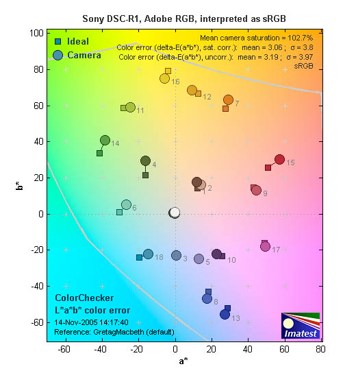
I'll be photographing some artwork later this week and so set up my version of a copy stand and thought I'd post the R1's rendition of a MacBeth ColorChecker just for interest. This is JPG right out of the camera and was only resized to 800 x 600 pixels for upload.
Shot with four Metz 40 MZ flashes at 45 degrees and with polarizing strips accross the reflectors. A B+W polarizer was on the Sony R1 which was rail mounted on Manfrotto 3D head over the target. WB was done using a Studio WhiBal card as a target, but I wasn't happy with the initial rendition of the MacBeth card and added some MIRED adjustment in-camera.

On my screen I can see a slight differences in the rendition of the primary red, blue, green and yellow but the other colors are extremely close. Can't adjust the primaries without affecting the others so this might be as good as it gets - and its actually pretty acceptable IMO.
Comments and / or suggestions welcome!
BG
--
A squirrel in the hand is much harder to shoot than two in the bush!!