River Side
Senior Member
- Messages
- 2,068
- Reaction score
- 0
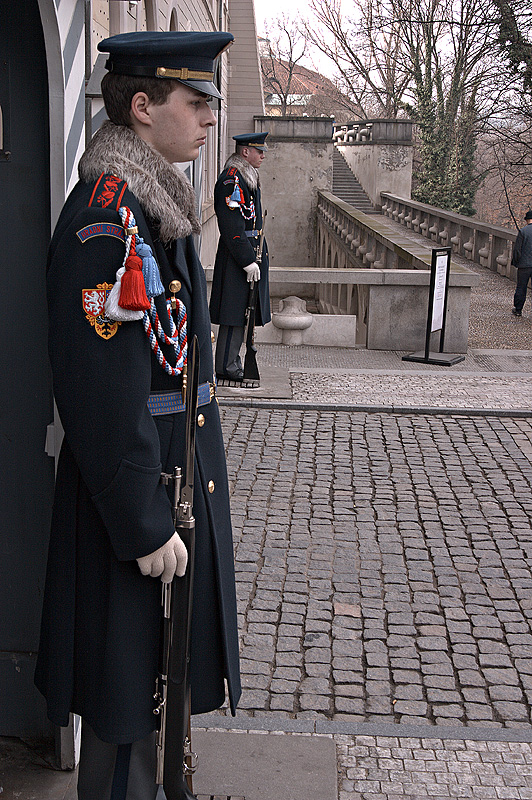
Paul's crop

My effort.. done with dcraw


My effort.. done with dcraw

Follow along with the video below to see how to install our site as a web app on your home screen.
Note: This feature may not be available in some browsers.
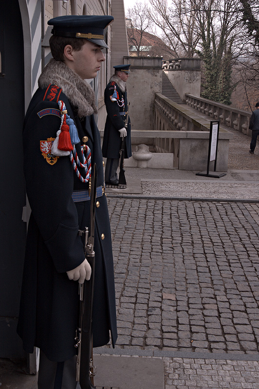
--Paul's crop
My effort.. done with dcraw
")
--Paul's crop
My effort.. done with dcraw
Paul
------------------------------------------------
Pbase supporter
Photographs at: http://www.pbase.com/pbleic
--------------------------------------------------
Unless specified otherwise, all images are Copyright 2003, 2004
All rights reserved.
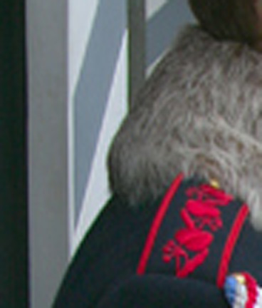
--What artifacts? You said mine was way oversharpened as well, butBut the shoulder is definitely oversharpened. Lots of artifacts in
the red and lion.
you didn't mention any specifics as to why you assert this.
I agree. As soon as I saw that I thought, not bad, just pull back on the sharpening somewhat. The glove looks artificial, and the tassles look speckled with oversharpened noise. Maybe we just have differing ideas on what sharp should be though!The redindividual tassles have white sharpening halos around them -
actually pretty severe compared with all the others. The outline
of the white lion is very "jittery" looking with some noise in the
orange - also sharpening artifacts

The threads in the red tassle are actually surrounded by dark, not white. There is light coloring on the threads, but nothing white. I do see a pattern of alternating light and dark pixels. This is typically a Jpeg artifact.The redindividual tassles have white sharpening halos around them -
Again, what I see is an alternating light/dark pattern, typical Jpeg artifact. This is not sharpening artifacts, unless, the image was saved as Jpeg, reopened, and then sharpened, in which case it is still Jpeg artifacts enhanced by a sharpening filter. But it may simply be Jpeg artifacts.actually pretty severe compared with all the others. The outline
of the white lion is very "jittery" looking with some noise in the
orange - also sharpening artifacts.
--What artifacts? You said mine was way oversharpened as well, butBut the shoulder is definitely oversharpened. Lots of artifacts in
the red and lion.
you didn't mention any specifics as to why you assert this.
Paul
------------------------------------------------
Pbase supporter
Photographs at: http://www.pbase.com/pbleic
--------------------------------------------------
Unless specified otherwise, all images are Copyright 2003, 2004
All rights reserved.
I agree. As soon as I saw that I thought, not bad, just pull backThe redindividual tassles have white sharpening halos around them -
actually pretty severe compared with all the others. The outline
of the white lion is very "jittery" looking with some noise in the
orange - also sharpening artifacts
on the sharpening somewhat. The glove looks artificial, and the
tassles look speckled with oversharpened noise. Maybe we just have
differing ideas on what sharp should be though!
Don
--In order to match the lightness of yours better, I've added a
curves adjustment. I show my new version first, then yours, then my
original.


Paul
------------------------------------------------
Pbase supporter
Photographs at: http://www.pbase.com/pbleic
--------------------------------------------------
Unless specified otherwise, all images are Copyright 2003, 2004
All rights reserved.
--I agree. As soon as I saw that I thought, not bad, just pull backThe redindividual tassles have white sharpening halos around them -
actually pretty severe compared with all the others. The outline
of the white lion is very "jittery" looking with some noise in the
orange - also sharpening artifacts
on the sharpening somewhat. The glove looks artificial, and the
tassles look speckled with oversharpened noise. Maybe we just have
differing ideas on what sharp should be though!
Don

Victor:
To answer your question about your picture, above - yes, I believe
it is heavily oversharpened for my taste, and for many people.
Looks like a P&S. That is the subjective part - you may like it.
No problem.
As for sharpening artifacts, look at this 200X of your picture -
look at your own photo if you think I am talking about JPEG
artifacts. The thick white ghost along the stripes and the
uniforms is a pretty significant sharpening artifact:

--
Paul
------------------------------------------------
Pbase supporter
Photographs at: http://www.pbase.com/pbleic
--------------------------------------------------
Unless specified otherwise, all images are Copyright 2003, 2004
All rights reserved.
--What about the zoomed pictures? Do you think they are oversharpened?
Victor:
To answer your question about your picture, above - yes, I believe
it is heavily oversharpened for my taste, and for many people.
Looks like a P&S. That is the subjective part - you may like it.
No problem.
As for sharpening artifacts, look at this 200X of your picture -
look at your own photo if you think I am talking about JPEG
artifacts. The thick white ghost along the stripes and the
uniforms is a pretty significant sharpening artifact:
--
Paul
------------------------------------------------
Pbase supporter
Photographs at: http://www.pbase.com/pbleic
--------------------------------------------------
Unless specified otherwise, all images are Copyright 2003, 2004
All rights reserved.
Agreed. Magne's profiles are a good addition to C1 to fix the color problems. Personally, I use a custom profile I made with Profile Prism although I don't recommend that for most people...it takes too much knowledge and care to make a good one...better to just buy Magne's profiles (which didn't exist when I started).But, EVU conversion (linear/non linear) cannot save a few precious
photos where the highlights are slightly blown.
And while C1 can do the same, the colors are sometimes just dead
wrong using the standard profile and has been admitted as much by
them.
--Agreed. Magne's profiles are a good addition to C1 to fix theBut, EVU conversion (linear/non linear) cannot save a few precious
photos where the highlights are slightly blown.
And while C1 can do the same, the colors are sometimes just dead
wrong using the standard profile and has been admitted as much by
them.
color problems. Personally, I use a custom profile I made with
Profile Prism although I don't recommend that for most people...it
takes too much knowledge and care to make a good one...better to
just buy Magne's profiles (which didn't exist when I started).
I also use C1's often forgotten "linear mode" rather than their
standard film curves. Much better shadow/highlight detail and a
better basis for tonal range "touch up" later in Photoshop IMHO.
I've also played with EVU/FVU linear mode conversion with custom
profiles but I don't like the workflow compared to C1 and the
improvements are so marginal I no longer bother. I prefer to spend
the energy trying to take a better picture!!!
First, I assume we are talking about
http://cakili.image.pbase.com/image/29742781/original.jpg
Yup, that was the file... and looking closer at it, getting right up to the screen, it DOES look like it might be jpg artifacts. I notice it now too on the crest, in the red around the lion. Hmm... from my normal viewing distance the tassle looks like it has lots of sharpened noise. It may be in fact a high compression jpg artifact. In which case I will reserve judgement on the sharpening! It would be nice, as Paul suggested, (I think) to see a low compression file with no jpg artifacts, to be able to judge properly!The threads in the red tassle are actually surrounded by dark, not
white. There is light coloring on the threads, but nothing white. I
do see a pattern of alternating light and dark pixels. This is
typically a Jpeg artifact.
It's very close to Paul's, but I think the linear conversion from EVU is a smidge better. But what a pain of a workflow.