Color Theory/Complementary Colors/??

Selex

Senior Member
Messages
1,002
Solutions
1
Reaction score
424
Location
Miami, US
Hello.

Not trying to start a storm, so if you are very much emotionally invested in the "color wheel" please disregard. If you like thinking and looking and maybe even photographing out side the box here is a line of inquiry.

The complementary colors don't seem so complementary to me at all. The fact that two colors are arranged on the opposite sides of the color wheel is not sufficient justification. It is an artifact of simply choosing to display the colors in a circle, from original "boring" color line. Someone took the two ends of the color line, put them together and voila, they made a color wheel. But there is absolutely NO meaningful relationship between colors on that wheel, especially at the "break", where the lower wavelenghts suddenly transform into the higher wavelenghts.

On the color line the colors are displayed as a progression of tones in accordance with their wavelenghts. That is a PHYSICAL /OPTICAL phenomenon and is a helpful shorthand for scientists that work with different wavelenght light. It is not a photographic phenomenon. It is not an aesthetic phenomenon at all. Most importantly, there is no cognitive visual reason why the lowest wavelenghts colors would suddenly perceptually transform into the shorter wavelenghts of the blue/violet. So closing the short line and making it into a circle is "cute" and "fun" and "looks nice" but is meaningless and divorced from actual color perception as how it relates to the emotional response of the brain.

If for some reason the original color line was arranged alphabetically, then the color order would be different, and closing that line into a wheel would produce completely different "complementary" colors by picking opposing pairs off that new wheel.

Examples of how "nice" red goes with blue are in my opinion based on "shocking" the visual system into seeing a very contrasty image, one that is not usually available in nature. But that is not complementary, which would imply some mutual enhancement. It's like having a very loud engine revving up next to a person singing. It sure is contrasty, but is not complementary, most would prefer to hear a guitar or violin next to a human voice, even though the frequencies of musical instruments are actually very much closer to the voice. So maybe complementary colors are adjacent, not opposing?

Is anyone aware of a more coherent color scheme that is more rooted in human visual and cognitive science rather than the gimmickry of the "color wheel"? Something closer to the way we actually perceive color from the three different receptors in our eyes?
 
Last edited:
The color circle or color wheel as used in the arts, is just a logically arranged sequence of hues that is used to create visual harmony and/or an emotional response. That's its function.

In science, hues are also arranged in basically the same order around a perimeter that defines a color perception volume. That's the CIE L*a*b* color space. That color model is at the heart of PhotoShop. That, to use your words, is a coherent color scheme that is rooted in human visual and cognitive science. However, the CIE L*a*b* color space does not help the artist create visual harmony and/or an emotional response since that's not its function.

You can get more info on the color wheel and harmonies here:

 
No!!!! Not this one again :-D Just kidding. No two people see colour the same way. Colour is what we create from the lightwaves the enter our eyes. Age, genetics, deficiencies, injuries all play a factor.

I use my camera's profile because I find it pleasing but it may be to another person. If you want accuracy then you have to apply the models science has created.
 
The color circle or color wheel as used in the arts, is just a logically arranged sequence of hues that is used to create visual harmony and/or an emotional response. That's its function.

In science, hues are also arranged in basically the same order around a perimeter that defines a color perception volume. That's the CIE L*a*b* color space. That color model is at the heart of PhotoShop. That, to use your words, is a coherent color scheme that is rooted in human visual and cognitive science. However, the CIE L*a*b* color space does not help the artist create visual harmony and/or an emotional response since that's not its function.

You can get more info on the color wheel and harmonies here:

https://www.colormatters.com/color-and-design/basic-color-theory
Great website, confirms and expands on my thoughts and is helpful.
 
I do not use the color wheel primarily for esthetic purposes, even if makes sense also in that regard. ( I do not need a wheel to determine what pleases me, I know it by heart). It is very useful when editing an image in an RGB environment. If your image has a green tint you can reduce the green or also based on the color wheel and additional properties of color do it by reducing red and blue. Understanding this helps you edit an modify the colors in an image for instance by the use of curves. Equally very useful in Nik by using the R, G and b sliders, as well as any software that allows you to manipulate the primary R, G and B color components.

--
Kind regards
Kaj
http://www.pbase.com/kaj_e
WSSA member #13
It's about time we started to take photography seriously and treat it as a hobby.- Elliott Erwitt
 
Last edited:
a3ab5c281e3c4bdbbe2af1c5f0ff1820.jpg.png

I am unfamiliar with the wheel you refer to. This is the only color wheel I have ever used, and the one I was taught. All the colors are primary, and all are complementary. Cyan, Magenta and Yellow are referred to as complementary colors because they are the opposite of those called primary in color printing. Red, Green and Blue filters are used to control the color balance of a negative and each of the complementary colors are used to cut off the exposure of the individual primary colors. Filters are thrown into the light path to cut off the exposures. If you combine equal parts of RGB in a projector, you will get white light. Combine the 3 complementary colors you will get black. I don't know if Kodak still has the books or the movies(possibly videos now) that show this. Kodak also produced a little color booklet with the same information. Hope this helps. gc
 
93c2c1a78dbf41de82e11ab0aebfb1b0.jpg

Here is another color wheel that shows the relationship between the colors. Interesting that this shows that two secondary colors can combine to create each of the primary colors, and it also shows that the secondaries create black when combined. gc
 
The posts are mixing up what the OP was referring to.

I believe he’s referring to the aesthetic aspects of color rather than the science.

i.e. He spoke of complementary colors - which is one color combination- there are others e.g. split complementary, double split complementary, triadic, analogous, etc.
 
93c2c1a78dbf41de82e11ab0aebfb1b0.jpg

Here is another color wheel that shows the relationship between the colors. Interesting that this shows that two secondary colors can combine to create each of the primary colors, and it also shows that the secondaries create black when combined. gc
Used this one a lot. Worked in print media. I used to do basic customer orientations especially around the transition from film digital. We had to get them off of holding a pair of bluejeans up to a monitor and the printed example and wonder why nothing matched. My favourite thing to do was set up a monitor with 4 squares. Red, green, blue and white. I'd get them to look through a 50X magnifier pressed up against the screen. First they looked at the colours first and then the white. I liked their reactions.
 
Somebody with a lot of time and a high tolerance for scientific writing style, please read this and give a summary.


I think it says that when real humans with good eyesight are tested for color preferences, they say that complimentary colors suck. But I'm not sure.
 
Somebody with a lot of time and a high tolerance for scientific writing style, please read this and give a summary.

https://www.ncbi.nlm.nih.gov/pmc/articles/PMC3037488/

I think it says that when real humans with good eyesight are tested for color preferences, they say that complimentary colors suck. But I'm not sure.
The paper tries to quantify color preference relative to color harmony.

From an aesthetics point of view they are separate in that you can like, or dislike, various color combinations yet still recognize and appreciate their color harmony or lack thereof.

For example, you may look at my photos and discover that many make use analogous or complementary color harmonies.* You may have a preference for images that have a specific type of color harmony and so you may be biased towards liking the photos that make use of that particular harmony. But irrespective of your preference you should still be able to recognize and appreciate the expression of a given harmony. That capability is an aspect of visual literacy.

*This is something I discovered by looking back at my snaps - it wasn't something I was doing on purpose when choosing subject matter or setting up to take a photo.

--
———————————————————————------
"View their gallery before accepting their comments."
———————————————————————------
My photos: http://www.gordonpritchard.blogspot.com/
 
Last edited:
The standard colour HUE wheel usually seen, as well as the related colour systems that consider chrominance / luminance also (or whatever other terminology) is far from a gimmick.

But equally, it is not the only way to look at things perceptually.

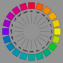
Another colour hue wheel which gained considerable traction especially in the mid 20th century, is the Munsell one - which affirms a closer match to typical human vision and aesthetic preference.


aesthetic colour organisation according to Munsell

aesthetic colour organisation according to Munsell

You'll see that compared with the usual wheel with its azure blue / flame red / lemon yellow RGB primaries distributed 120 degrees apart, and treatment of other hues as mixtures, there is a different attempt at progressive equality of the hues as well as a redistribution of emphasis (e.g., the graduation through the blue-greens takes up a greater angle out of the 360, than with the usual wheel).

And which hue sits diametrically opposite which, is different with this wheel. All things considered, I feel the notions of complementarity that it proposes, rather more apt and rather more aesthetically / pictorially useful... remembering still. that any such colour system can be mapped and translated onto any other, when it comes to the objective practicalities of measuring and representing colour.

The real strength of the Munsell wheel, IMO, is that it does a much better job than the standard "pure RGB" one, of organising the subjective "warmth" and "coolness" of the hues. The visually warmest range sits directly opposite the visually coolest range, and the rest graduate nicely in terms of that aspect.

RP
 
Thank you for this and I see you got a lot of great responses. Off topic but do you have any idea what makes up pastels exactly? Thank you.
 
aesthetic colour organisation according to Munsell

aesthetic colour organisation according to Munsell

...

The real strength of the Munsell wheel, IMO, is that it does a much better job than the standard "pure RGB" one, of organising the subjective "warmth" and "coolness" of the hues. The visually warmest range sits directly opposite the visually coolest range, and the rest graduate nicely in terms of that aspect.

RP
That is a truly wonderful wheel!

Combinations of opposing hues are extremely aesthetically pleasing to me.

Thank you

Shane


--
"The simple things are also the most extraordinary things and only the wise can see them."
 
This is closer to what I was talking about, arranging colors based on visual aesthetics.

Helpful, and I will experiment with it and continue learning.
 
Somebody with a lot of time and a high tolerance for scientific writing style, please read this and give a summary.

https://www.ncbi.nlm.nih.gov/pmc/articles/PMC3037488/

I think it says that when real humans with good eyesight are tested for color preferences, they say that complimentary colors suck. But I'm not sure.
Great article.

It explains nearly everything I wanted to know and shows me both the use/benefit of the wheel and its limitation.

Thank you, exactly what I was looking for.

Thanks everyone, question answered.
 
I did not understand what you were trying to say in the OP, but the color wheel, or any color wheel, cannot accurately portray the harmonies of colors when mixed together(not literally but in a photo) If someone created a wheel showing the gradual changes between the colors, it might stretch interminably and would be useless to most of us. The man who taught me color made me see that there could be more than one way to print a color photo. He would show me a print and it looked great. Then he would throw another print of the same photo but with different shades of color and it would look better than the first, then he would throw in a third. Same effect. I still do the same experiment today on photos I edit for others, going through several iterations before settling on a final. So if you were referring to the color wheel seemingly having no relation to the actual colors mixed in a photo, it makes sense. I just never looked at the wheel in that manner, only thinking of it as a reference, but there does have to be a starting point for the individual colors, and none should dominate, rather they should harmonize or fit. Amateur photo labs usually had warm color balance in their printers. Pro labs had cold color balance in theirs. It took me awhile to get accustomed to the cooler balance, and it is more difficult to create a cool balance than a warm, but that might be due to the human tendency to see warm as more natural than is cool. gc
 
Thank you for this and I see you got a lot of great responses. Off topic but do you have any idea what makes up pastels exactly? Thank you.
Traditionally a "pastel" colour is where a relatively clean and strong-hued pigment or dye, is lightened and muted by the admixture of some clean white pigment - though not by so much, as to overwhelm the clarity of its hue.

One can mix a pastel version of any bright and full bodied colour, but not of a grey.
 
Someone took the two ends of the color line, put them together and voila, they made a color wheel.
That someone was Sir Isaac Newton, the same someone who coined the term "spectrum", and who showed that the spectrum results from separation of components or "rays" of sunlight of differing refrangibility.

Newton published his colour circle to illustrate his "center of gravity" principle for the colour of mixtures of rays. If a light contains rays in about the same balance as sunlight it appears colourless (white), while if the balance is biased towards any part of the spectrum the light appears coloured, and the more strongly biased, the more saturated the colour. In his experiments Newton split the spectrum into two parts in various ways and found that the parts appeared coloured, but when recombined made white light. For example the least refrangible (what we now call long-wavelength) part might appear orange-red, and the remaining part blue-green, and so on. The term "complementary" was introduced around 1800 for this relationship, and means "completing", that is, together making white light. The word has nothing to do with looking good together, that's complimentary with an "i"!

It's a long running debate whether complementary colours look good together but they certainly look contrasting. The Munsell hue circle posted earlier is based on perceptually even spacing but comes very close to showing true additive complementary pairs (yellow-blue, red-cyan, green-magenta etc), certainly much closer than the traditional red-yellow-blue colour wheel.

The circular sequence of hues is actually a direct result of having three receptor types. The hue of a light is the way in which we perceive a direction of bias in its balance of wavelengths, and with three receptors we can detect biases towards the long-, middle-, short- or long- AND short-wavelengths of light and their intermediates, and this set of possibilities forms a loop. Those of us with only two receptor types can only detect biases towards long- or short- wavelengths, that we see as only two hues.

I've discussed different aspects of this in various parts of my website, for example here http://www.huevaluechroma.com/014.php
 
The meaning of the original post was this.

Blindly picking opposing colors off the wheel, as suggested by software and some less than sophisticated tutorials/advice and claiming they are "complementary" with an implication that they "harmonize with each other" is not entirely correct, or possibly completely incorrect.

If I have a model wearing a dark green coat standing next to a car. What color should I make the car to complement/harmonize with her coat. According to the "wheel" you just grab the dark green, go to the other side and bam, you have the "best complementary color" that will produce the best visual harmony and therefore will be most visually appealing.

That is wrong. The opposing color choice will produce maximal amount of visual chroma contrast. It will not produce the most "aesthetically pleasing" image. (although the definition of "pleasing" is debatable and somewhat subjective there are still generalizations that hold true).

So the image of the model in a green coat standing next to a bright orange/yellow car might be very high in contrast but will not be "pleasing" in a way that good painters choose colors to play off each other, to enhance each other, to balance each other off in a pleasing way.

Interior designers/decorators know that. They don't pick opposing colors or you would have a seizure and feel like you are in a circus when they decorate your apartment.

Hope that helps those that thought about it the same way that I did.
 

Keyboard shortcuts

Back
Top