i'd take the Canon FVU over that any time of the day...
screwed-up shadow details, posterization, and the dreaded
"watercolor effect" that CaptureOne never got around with.
lalalalalalala..............
Reading mode:
Install the app
How to install the app on iOS
Follow along with the video below to see how to install our site as a web app on your home screen.
Note: This feature may not be available in some browsers.
-
Welcome to the new forums! Please read this first. For known issues we are working to resolve, click here.
You are using an out of date browser. It may not display this or other websites correctly.
You should upgrade or use an alternative browser.
You should upgrade or use an alternative browser.
C1 DSLR... *wow!*
- Thread starter Petteri Sulonen
- Start date
Well, I finally bit the bullet and bought CaptureOne DSLR LE. After
a bit of playing with it, all I can say is WOW! The control it
gives, the easy with which it gives it, and the quality of the
result is really sump'n else.
Almost makes me regret not shooting RAW until late last year. The
guys who made it really knew what they were doing -- both from a
usability/user interface design POV, and an engineering POV.
Petteri
--

Portfolio: [ http://www.seittipaja.fi/index/ ]
Pontification: [ http://www.seittipaja.fi/ ]
Petteri Sulonen
Forum Pro
Chief wrote:
[snip]
Petteri
--
Portfolio: [ http://www.seittipaja.fi/index/ ]
Pontification: [ http://www.seittipaja.fi/ ]
[snip]
Thanks a big bundle, Chief. You just saved me a couple of hours of hunting and probably a couple of days wasting time. I had decided to try to find a free profiler first, and see how far that and my eye will get me. I'm not anal about getting it perfect (impossible anyway, as the colors shift depending on which light I have on or if there's daylight coming through the window), so close enough is good enough for me. I think this is just the ticket!Before you spend lots of money on a Spyder, try Praxisoft WYSIWYG
software to produce your own profile. Works great, and its free.
Use it per these directions:
http://www.normankoren.com/makingfineprints1B.html#Gamma_wizi
http://www.normankoren.com/makingfineprints1A.html has great info
on calibrating your own monitor.
You might as well give it a shot, it won't cost anything but a
little time.
Petteri
--

Portfolio: [ http://www.seittipaja.fi/index/ ]
Pontification: [ http://www.seittipaja.fi/ ]
Magne Nilsen
Senior Member
Not so sure about that my friend.Accurate is accurate, and as difficult as color management is in
the world of digital photography, folks shouldn't pay to induce
more inaccuracies in thier photos. Let's call Magne's profile what
it is, his interpretation of how to make 10D portrait shots look
pleasing. At this, it works. I use it for portraits as it does
make nice skin tones. But I do not use it for landscape or product
photos. But if you are buying it for accurate colors, you are
making a mistake.
My profiles are made to be accurate and not pleasing, and you still haven't quite understood the effect contrast adds to your colors and their perceived saturation. I am not talking about you adding contrast to your conversion, I am talking about the RAW software adding some contrast even when they say "No Contrast" - and I sure hope you are not using the V1.3 C1 default curves, since they add a LOT of contrast.
If you don't believe me, then believe the $10000 equipment used to measure my target charts. Unfortunately the measurements made with any spectrophotometer are rather flat, since they don't carry any artificially added contrast, but cameras and RAW converters will do. Below are the results of 3 conversion crops, WB-clicked on the same spot, and then run through from left Adobe PSCS, C1 with LoSat and C1 with the HiSat profile.
Below them is the spectrophotometer target measurements values for the exact chart photographed. On the left the same level of contrast is added back using the Lightness channel only, on the right using Curves in RGB-mode, and in the middle a 50/50 combination of the two.
I've also typed in the Hue and Saturation readouts from a red patch. HSB is rather more interesting than RGB values, since RGB values will vary with the color space in use, and are hard to discuss. That PS CS red Hue error is very consistent in the 8 different 10D's I used to make the profiles, and it's definitely not accurate.
PS CS is off in these areas: a) red Hue is too blue and b) yellow saturation is way too low, combined this makes for rather odd caucasian skin colors. If you constantly prefer the PSCS rendering believing it to be more correct, I have to tell you - you are not getting accurate reds at all, or your monitor has a bigger problem than you think. Oh - and my profiles are not only used by portrait photographers, but is also very popular among photographers doing product shots and catalog stuff - where accuracy is not just nice, but an absolute necessity.
(This is a sRGB screen-dump, visually OK, but not that useful for measuring patches)
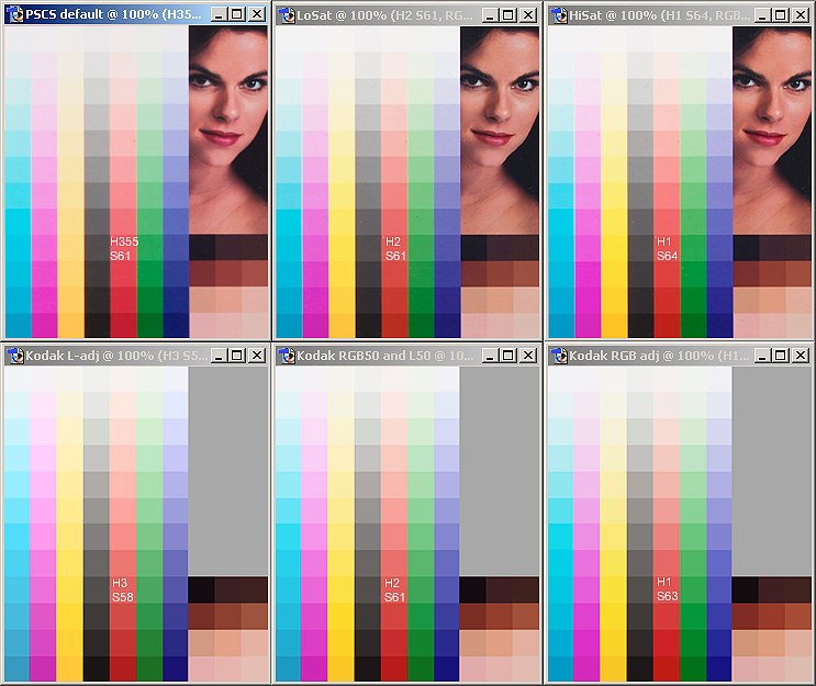
Heres another sample, where the effect of removing RGB contrast and replacing it with a Lightness channel only contrast is shown on the right, while the right image is the effect of adding a Red Hue error of -5 from the image in the middle. If there is consistency in what you tell and feel, the left image should then be you preferred image for "accuracy", and that would also be very identical to what PSCS would have presented. If I were to make a "NoSat" profile the result would be more like the right image, and not like the left one...

~~~~
Magne
The default film curve has changed. The "film standard" now has much more contrast, color sat, etc. than it used to giving the default result a much different look. I believe, from reading the Picture Flow forums, and from playing with it, that the "film extra shadow" curve is the old "film standard" from 1.2. I would try changing it and seeing if your results aren't what they used to be. Personally, I like the new film standard for certain shots, and it's easy enough to batch change the curve to extra shadow if needed.
You may also want to check out the Picture Flow forums as I believe there is a thread on how to use the curves from 1.2 in 1.3.
Hope this helps some and is what you were looking for.
Steve
You may also want to check out the Picture Flow forums as I believe there is a thread on how to use the curves from 1.2 in 1.3.
Hope this helps some and is what you were looking for.
--I did upgrade to 1.3 (trial for now) and now IQ sucks!
1.2 did so smooth images with really swell sharpening, but now with
1.3 I have spots and bricks in image. I can't get rid of them.
I have tried without sharpening... bad. With sharpening... horrible!
Totally not acceptable.
I probably have to downgrade back to 1.2
What happened?
Tomi Toivonen

Steve
Chief
Senior Member
I NEVER use FVU nor did I EVER mention it. You are not only rude but an idiot.here ya go. you use fvu for your landscapes? well here's a wakeup
call.
Chief
Senior Member
Nor did I EVER mention film, you did. If you have questions about film, ask someone who claims to know film. This discussion is not about film, its about C1 profiles and their accuracy. I haven't shot one exposure with film since buying a 10D 8 months ago.still you havent pointed out any film that has accurate color. nor
will you be able to.
Banana Chips™
Leading Member
see that "watercolor efffect?" it's really obvious here. especially in the eyebrows. the C1 conversion kind of reminds me of how Genuine Fractals does its upsampling.
and look at the shadows by the lower cheek on the right side...those artifacts...that's the screwy shadows i'm referring to. it may be JPEG compression, whatever...but it sure isn't on the FVU conversion!
i can't really comment on the "accuracy" of the color...because i was not there when you shot it. and besides, why does "accuracy" matter to you now? a few threads ago you just mentioned that "accurate is boring." you seem to have contradicted yourself.
your photos suck.
and look at the shadows by the lower cheek on the right side...those artifacts...that's the screwy shadows i'm referring to. it may be JPEG compression, whatever...but it sure isn't on the FVU conversion!
i can't really comment on the "accuracy" of the color...because i was not there when you shot it. and besides, why does "accuracy" matter to you now? a few threads ago you just mentioned that "accurate is boring." you seem to have contradicted yourself.
--the left is fvu 100% unsharp mask in photoshop.
the right is C1 100% unsharp mask in photoshop
she is not YELLOW. shot with a 550ex and custom white balance using
a combination of an expodisc and a white card.
the shot on the right is 100% accurate to her skin tone..although
soft due to user error.
there is far more detail evident in any c1 conversion than either
an fvu of BB conversion.

--but see the post by Jack_DC...it's a clear example of the
watercolor effect. it looks like it's "sharper" but look again.
as for the posterization and screwed-up shadow detail, try to
convert some images that's been lit with incandescent (yellow)
lights and or flash in Av mode (balance flash with ambient
lighting) and look at the lower midtones and shadows. that's at
least how i get it in the C1 conversion i've tried. see the
samples in this photo.net thread:
http://www.photo.net/bboard/q-and-a-fetch-msg?msg_id=006xlA
i really wanted to like C1...but i can't. you're right, in terms
of workflow speed/efficiency (multi-threading) it's great, but at
the end of the day, it's the quality of the output...and IMHO FVU
is still better.
YMMV.
--Care to show some samples of the problems you describe?i'd take the Canon FVU over that any time of the day...
screwed-up shadow details, posterization, and the dreaded
"watercolor effect" that CaptureOne never got around with.
lalalalalalala..............
Petteri
--
Portfolio: [ http://www.seittipaja.fi/index/ ]
Pontification: [ http://www.seittipaja.fi/ ]
your photos suck.
http://jrg-imaging.com
'Film is cheap compared to the trauma of a missed shot.' - Brian
Peterson

your photos suck.
I strongly recommend measuring WB off a white card, not grey cards, and to make sure that the partial metering fields covers the measured surface completly. Grey cards work too, I know, but the results will be less accurate.I use manual White Balance when shooting, but also I take the first
shot to Kodak greyscale (Q-13).
kudos
Member
interesting thread. thinking about using RAW in future too.
I have done very, very little in RAW, so can you explain what youI use CS, but today only after C1 conversion.One option is to go for PS CS for its RAW processing capabilities
-- have you used CS, and if so, how does C1 compare, and if C1 is
better, in what way? Workflow? Controls?
ron
Here's the reason:
I had a feeling that CS ads some scratches in conversion and took a
test.
There is no way to fix that problem by PSCS converter settings.
Believe me I've tried. Compare is done with CFVU just because it's
free. Today I use C1 and I think it does the best quality.
If you use greycard when adjusting, C1 is the converter for you.
What a beautiful workflow.
C1 is the best converter, but Photoshop CS is the best image
manipulation software. With these together I think you have the
best tools available.
Tomi Toivonen
mean be using a greycard in conversion? Thanks.
--
Regards,
DaveMart
Please see profile for equipment
Keyboard shortcuts
- f
- Forum
About
Editorial content
Cameras & Lenses
All content, design, and layout are Copyright © 1998–2025 Digital Photography Review All Rights Reserved.
Reproduction in whole or part in any form or medium without specific written permission is prohibited.
When you use DPReview links to buy products, the site may earn a commission.
©GPS Media - Guides, Products, Services.
Reproduction in whole or part in any form or medium without specific written permission is prohibited.
When you use DPReview links to buy products, the site may earn a commission.
©GPS Media - Guides, Products, Services.