Aria Patel
Member
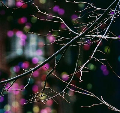
I know art is subjective, but when you look at this picture below, what are your thoughts? I am unsure because I am a beginner and I haven't started trusting my work yet... please critique openly. I want to get better.

Follow along with the video below to see how to install our site as a web app on your home screen.
Note: This feature may not be available in some browsers.
I think it has merit, but of course this sort of arty shot will always divide opinion. It's technically well executed. It might have been improved had you framed a little more left as that would include the tip of the main branch, giving the viewer somewhere to lead to and also remove the red glow in the bottom right which i find a little distracting.I know art is subjective, but when you look at this picture below, what are your thoughts? I am unsure because I am a beginner and I haven't started trusting my work yet... please critique openly. I want to get better.
")
Thank you, NN! I think I may have a problem with not knowing how to frame. I could use your knowledge on another picture of mine if you don't mind...NNIt might have been improved had you framed a little more left as that would include the tip of the main branch, giving the viewer somewhere to lead to and also remove the red glow in the bottom right which i find a little distracting.--

some post to work out those skin tones and that one goes in the portfolio.
It is a more interesting shot than your first (limb) shot but is ruined by the "arms".Thank you, NN! I think I may have a problem with not knowing how to frame. I could use your knowledge on another picture of mine if you don't mind...NNIt might have been improved had you framed a little more left as that would include the tip of the main branch, giving the viewer somewhere to lead to and also remove the red glow in the bottom right which i find a little distracting.--
I was at a parade this weekend and I was trying to focus on the lady smiling in the middle and another lady jumped in front of her and I shot them both. In such a scenario, who would you have framed? The one in the middle or the one to the right?

Good point, will remember this advise!First of all, what is the subject in this image? It is not obvious.
I was taught that if I didn't know anything else to do for the photo, to make sure that it had a foreground, a mid-ground, and a background.
The skin tones of the smiling face have some green reflection on them, and the white balance in general is a touch cool.Thank you, SoCalWill. What do you mean by work out those skin tones? Do you mean retouch/smooth face?
It's great that you're trying to be creative and that you're asking for honest opinions. In general terms, a photo of tree limbs in front of buildings doesn't usually make for an interesting subject. It's something everyone sees everyday. However, the photographer can turn it into more than that. I'll mention some things I see that are interesting in this photo and show you how I would bring them out.I know art is subjective, but when you look at this picture below, what are your thoughts? I am unsure because I am a beginner and I haven't started trusting my work yet... please critique openly. I want to get better.
WOW!!! This more than helps! It definitely looks much more interesting now. Thank you very much for taking all the time to do this. I appreciate it!It's great that you're trying to be creative and that you're asking for honest opinions. In general terms, a photo of tree limbs in front of buildings doesn't usually make for an interesting subject. It's something everyone sees everyday. However, the photographer can turn it into more than that. I'll mention some things I see that are interesting in this photo and show you how I would bring them out.I know art is subjective, but when you look at this picture below, what are your thoughts? I am unsure because I am a beginner and I haven't started trusting my work yet... please critique openly. I want to get better.
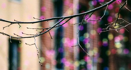
One thing I like is the interplay between the limbs and the colorful lights in the background. Simply cropping to remove distractions makes that aspect of the photo much clearer in my opinion. I hope you don't mind, I did a quick crop to illustrate:
Composing a little more carefully could take this to another level by lining things up so that the lights appear to be growing off of the limbs more consistently.
Going back to the original image, I also like the way the background goes from light to dark moving from left to right. It could be seen to symbolize the passage of time. Going with that thought, a crop like this could be used to bring out the transition.
I don't want to come across as if I'm implying that you should always crop your photos, although simplifying is generally a good idea. The main point is to find what really interests you about the scene and then find a way to bring that out. Removing distractions is a good start. Also, use contrast of all kinds: light vs. dark, sharp vs. blurry, big vs. small, new vs. old, warm vs. cold, etc. to bring out the subject. If this scene doesn't get your creative juices going at all, find a subject that generates an emotional reaction and try to express it in your own way.
I hope this helps,
jbf
Well, what to do with photobombers?Thank you, NN! I think I may have a problem with not knowing how to frame. I could use your knowledge on another picture of mine if you don't mind...NNIt might have been improved had you framed a little more left as that would include the tip of the main branch, giving the viewer somewhere to lead to and also remove the red glow in the bottom right which i find a little distracting.--
I was at a parade this weekend and I was trying to focus on the lady smiling in the middle and another lady jumped in front of her and I shot them both. In such a scenario, who would you have framed? The one in the middle or the one to the right?

With all due respect to Bobby's opinion (and he's no fool), but the above, I think, is a rough guideline for landscape photographers. Many images - especially as abstract as your first and a portrait such as your second - are unlikely to have, or need, three layers.First of all, what is the subject in this image? It is not obvious.
I was taught that if I didn't know anything else to do for the photo, to make sure that it had a foreground, a mid-ground, and a background.
some post to work out those skin tones and that one goes in the portfolio.
Those are excellent suggestions and anyone could learn something from reading them.It's great that you're trying to be creative and that you're asking for honest opinions. In general terms, a photo of tree limbs in front of buildings doesn't usually make for an interesting subject. It's something everyone sees everyday. However, the photographer can turn it into more than that. I'll mention some things I see that are interesting in this photo and show you how I would bring them out.I know art is subjective, but when you look at this picture below, what are your thoughts? I am unsure because I am a beginner and I haven't started trusting my work yet... please critique openly. I want to get better.
One thing I like is the interplay between the limbs and the colorful lights in the background. Simply cropping to remove distractions makes that aspect of the photo much clearer in my opinion. I hope you don't mind, I did a quick crop to illustrate:
Composing a little more carefully could take this to another level by lining things up so that the lights appear to be growing off of the limbs more consistently.
Going back to the original image, I also like the way the background goes from light to dark moving from left to right. It could be seen to symbolize the passage of time. Going with that thought, a crop like this could be used to bring out the transition.
I don't want to come across as if I'm implying that you should always crop your photos, although simplifying is generally a good idea. The main point is to find what really interests you about the scene and then find a way to bring that out. Removing distractions is a good start. Also, use contrast of all kinds: light vs. dark, sharp vs. blurry, big vs. small, new vs. old, warm vs. cold, etc. to bring out the subject. If this scene doesn't get your creative juices going at all, find a subject that generates an emotional reaction and try to express it in your own way.
I hope this helps,
jbf
I know art is subjective, but when you look at this picture below, what are your thoughts? I am unsure because I am a beginner and I haven't started trusting my work yet... please critique openly. I want to get better.