What I dislike the most in this illustration and looks like what I get in many, many, of my shots is the color variations in the area around her mouth. Especially the small area below her inferior lips.
Now I see it. I agree that it looks greenish, not necessarily because it is;
probably because it is surrounded by pink and red - but it does look unnatural.
Yeah, might be the reason why it looks 'too green' to me!
If so, that's the simultaneous contrast issue that Iliah mentioned earlier.
Yes, got it.
")
By the way, there are imperfect standard observers for constant-color fields, but, AFAIK, there are no standard models for simultaneous contrast color effects, and it is certainly possible (and I think, likely) that the quantitative effects are different in different people. This would not be detected by any color normalcy testing that I know of.
Jim
I know that I'm very sensitive to color contrast. Let's say a car which was partially repainted, I might spot it. (Even if I have to admit that sometimes it is really, really, well done and invisible.)
But I always thought it was more a question of temperament, demanding nature and attention do details...
In the case of the 'hue shift' accross faces, this makes me feel uncomfortable. Like if I was looking at sick people. Really unpleasant (but highly subjective and maybe cultural).
It's quite amazing, because for example when I did my first CCSG shots, results were sh** due to glare. This gave me oversaturated skin tones...but after hours looking at the same images, I could not see it anymore.
On the other hand, a slight variation accross the face: I feel uncomfortable. I also try the other way around, using Capture One Pro Color Palet or DxO Photo Lab HSL tool to 'uniformize' hue a bit: it's even worse.
All that said another problem I have is how the color rendering of skin tones seems to variy with different lighting. I have an old stock of Canon 300D (mly first DSLR), Canon 350D and Canon EOS 40D photos of the same persons photographed with different lighting, including catastrophic mixed lighting (for example natural light + integrated flash for fill-in) and skin tones much more consistent from shot to shot. It's with Canon in-camera processing through or it's DxO Photo Lab/Lightroom/Capture One Pro sibbling. So it remain to be seen what it would look like withotu all these subjective adjustments Canon do...
I'll try to find or make a more 'neutral' profile and see...
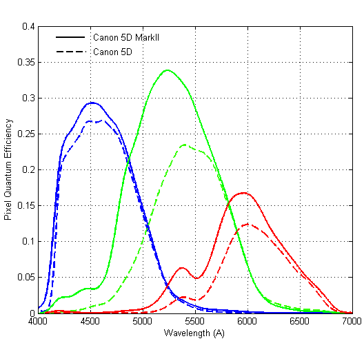
I would recall that I have seen an article by TheSuede on the Fred Miranda forums about CFA designs.
What he sort of said that Canon has taken a route that works well for mixed light while some other sensors were optimized for like shooting in the studio.
I would recall that both TheSuede and Iliah Borg pretty much considered the CFA design on the Sony A900 to be a pretty decent compromise regarding color rendition and SNR.
I had some discussions regarding the color rendition of the Phase One P45+ back I have with Tim Parkin. Tim Parkin and his friend Joe Cornish had issues with yellow contamination of chlorophyll greens. I have seen that, too, but I hoped that DCP profiles would be able to handle that.
In the end, we have found out that Tim and I had different interpretations of color, although I must say that I would lean to Tim being right.
One of the things I considered was that the IR filter (or hot mirror) design may have played a role.
Interestingly, a couple of years ago, Phase One introduced a new back, called 'Thricomatic'. They produced some explanations that ignored pretty much all color science ever developed. But, reading between the lines it may be concluded that there were modifications to the 'hot filter'. What I have seen from real worlds samples, the new Thrichromatic back did not have that yellow contamination of vegetable greens I have seen on my P45+ back and on the IQ 3100 MP I have seen tested.
Lime green seems to have extreme characteristics in the near IR (infra red) region. That was one of the reasons I include lime green in my 'tricolore' tests. But I found that all the three sensorsi tried (Phase One P45+, Sony Alpha 900 and Sony A7rII) did a decent job on that lime.
In the end, I don't pretend to know...