http://www.varis.com/StepByStep/RGB_SkinTone/RGB_SkinTone.html
post on retouch pro:
"
v.bampton
Member
Join Date: Nov 2004
Location: Southampton
Posts: 78
We have a portrait and wedding studio, and whilst there are benefits to correcting in CMYK, we do almost all of our adjustments in RGB. Because of the difference in the size of the gamut, converting to CMYK and then back to AdobeRGB for our lab does affect some of the colours. If you're concerned about watching the CMYK numbers, then make sure your info palette will show RGB and CMYK, and the same rules will apply. There's also a speed factor - I don't have time to convert everything back and forth when I'm working on hundreds of images a week.
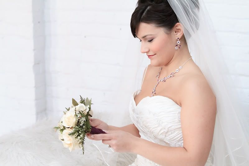
I've got perfectly good results using RGB, sometimes boosting the saturation, more often just adjusting the red and yellow slightly (highlights and slight midtones in levels or curves) to give a healthy warm glow. Most of it I have set up as actions, so whilst we do retouch every image we sell, it's usually only minor tweaks that we need to do manually."
Here is a tutorial that describes what I do in Photoshop CS5. Even though I remain in RGB, I look at the CMYK values to get the skin tones in proper range.
http://www.graphicconnectionkc.com/skin-tone-correction.html
In ACR or LR, you can't observe the CMYK readout so you will have to look at the RGB readout which I find is not as helpful for me. (Hopefully CS6/ACR or LR4 has corrected this) Anyway, in ACR or LR, making Red 20% more than Blue and Green close to the middle is a good starting point for average Caucasians. For color changes in ACR/LR, use the Temp, Tint, and HSL sliders to adjust the colors. Don't forget that luminous changes affect the colors also. For the final tweak, though, your eyes are the best guide, in my opinion.
Ronny