JohnLindroth
Senior Member
Hi all.
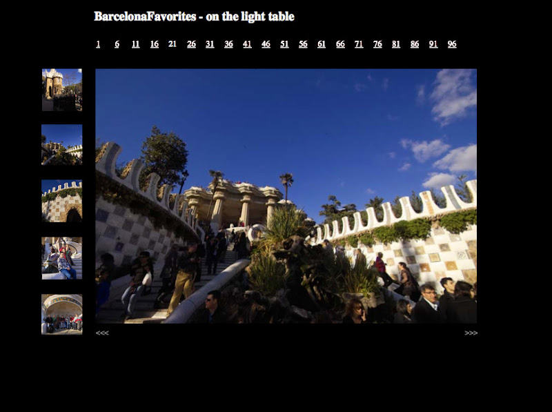
I've been working on a new cgi app for my website to display image galleries. I'm going for a "slide table" feeling.
PLEASE let me know what you think. Especially the BAD stuff.
The overall interface is there, but I'm still working on the control graphics. Also need to add code for individual image titles and will add EXIF data in the future.
Here's a link:
http://www.johnlindroth.com/slidetable.cgi?gallery=BarcelonaFavorites
If you're willing then thanks for taking the time to help me.
-John
--
http://www.johnlindroth.com/gallery/
[email protected]
My future starts when I wake up every morning ...
Every day I find something creative to do with my life.
--Miles Davis

")