Petteri's Photo Class: Lesson Zero [1/2]

Petteri,

I am going to disagree with you just a bit. Though "master-apprentice" is indeed a proven way to learn a craft, that is not what I had in mind. "Mentoring" might be closer to what I had in mind, though it wasn't even quite that.

To my thinking, "master-apprentice" is very much about passing on the master's skills and way of doing things...and quite likely much of the master's style goes along with that. The apprentice will likely modify the style when they strike out on their own, but to some degree the apprentice is a continuation of the master.

To my mind, Ansel Adams and one-time student John Sexton ( http://www.onlinephotography.com/sexton.html ) fit this profile.

And Mentor? I tend to believe that mentoring is more about a person with some amount of experience not especially passing on what they know, but rather undertaking the task of assisting a another person to find their own unique way of doing things. The mentor may present things they themselves have done, but it is to be taken as one type of example among a larger set of examples. The actual focus is really on the person who is being mentored--the mentor is just one possible agency of that. In fact, I have done some of that online...the people involved had visions and talents that were theirs, not mine. If there was a goal, it was to help them find their own way. But really, it was done more along the line of ongoing conversations--explicit photographic craft entered into things to a quite minimal degree. In the post above, my environment for "photographic vision" is a slight modification of that for small group circumstances. Perhaps it could be considered a seminar for twelve people--give or take up to four members. And, yes, it would be best done in physical surroundings and conversations. However, it could be stripped down to function at some level in online circumstances. But their would be a loss in going online. (What would be lost are the truly important things: the music, the group dynamics, the real-time interplay of observations about historic artworks.

The sad thing is that the online world has so many voices, so many points of view, so many conflicting things opinioned that a person may not know how to filter. So many institutions that have sprung up that, while seemingly about photography, are really about anti-photography. Here is a philosophical post about one of these new traditions: http://forums.dpreview.com/forums/read.asp?forum=1005&message=805969 – the post was made by one of dpreview's true Master Photographers shortly before he left the site. I think for online education of a group, the primary thing to somehow teach people could be to ignore near * everything * presented on the web as truth. :^)

Actually, you are not terribly far from an online seminar in your approach. The difficulty is that, in my estimation, the work is being undertaken to further a trap. But we have had that particular discussion, and I truly admire you for making the effort to pass on what you believe is worth while. (By the way, I'm curious to see of you get around to "dynamic balance" as one compositional goal:


; or capturing "space" – warning, this is 825 Kbytes and your monitor should be set so you can see an image 1200 pixels wide without scrolling:


; )

By the way, I tend to think that developing "photographic vision" could be done as an online seminar if all involved (including the host of the seminar) looked at the work of each and made an effort to really look at what was presented without passing on positive/negative evaluative comments about the photographs presented. Again, this is not about composition, it is about strengthening the ability for a photographer to see what is about them. Assignments - some easy, some quite obscure - would be tailored to putting all the participants in situations where they would be asked to "see".

Ed

--
http://www.blackmallard.com/cal_ls/
California Light and Structure

http://www.blackmallard.com/o_barn/
One Barn
 
[snip]

You are just kidding yourself by thinking that anyone can free
themselves of these structural compositional rules and create their
own personal direction in any meaningful way.
That is why we see so many compositionally bad photographs, and
paintings as well, which ignore most compositional rules of
painting and photography. How many self-taught painters or
photographers have ever considered that perhaps the shape of
negative "background" areas are as important as the foreground
images?
Barry,

Sadly, we all tend to argue from our preconceptions.

http://www.blackmallard.com/cal_ls/cls16.html

Clearly, you are thinking mainstream thoughts...

Best,

Ed

--
http://www.blackmallard.com/cal_ls/
California Light and Structure

http://www.blackmallard.com/o_barn/
One Barn
 
I posted 21 hours ago, but in a reply to another student's assignment. I should have posted under my own new thread, so here it is:

---------------------------------------------------------------------------------------------------

Okay, here's my homework, Prof.

http://www.pbase.com/rommaker/comp_class

All shots taken with Minolta A1 set to "P"rogram. Contrary to some, I did use the zoom feature. All shots were taken late afternoon on the campus of the University of Alabama.

Best #1 - This is a shot of one of my favorite buildings on campus, Clark Hall. I just love the architecture.

Best #2 - I like the suggestion of rest by the benches in the foreground. Not sure about including the sun in the shot, but what do you think?

Best #3 - Probably the shot of the day, IMHO. I purposely framed the name of the library between the trees. Otherwise, I think it would have been a washout.

Best #4 - The President's Mansion - yes, it's leaning, but shooting from the hip, it's an easy mistake to make ... at least for me.

Best #5 - Love the lines of this building, plain and simple.

And the ugly ...

Worst #1 - A jumbled mess, to be sure. The walking bridge is lost in the dullness of the winter trees. Yech!

Worst #2 - The building looks as if it's falling over .. a disaster.

Worst #3 - Possibly the worst shot ever of Denny Chimes ... underexposed with little detail. The best thing about this shot is the sky.

Worst #4 - Should have ventured across the street and got a better shot, but it's such a pretty structure. Actually, I did walk across the street and got my "Best #4".

Worst #5 - The shot is uninteresting ... I expect better of myself.

What say you? :-)

--
Rommaker
 
Good timing, there -- I just finished reading your original post and checking out your photos.

I tend to like your "worst" batch of photos (as a whole) better than your "best" batch, but that's just my taste. It felt like your "worst" photos were just a bit looser, less formal than your "best." It felt like you were trying really hard to compose these images, rather than just grab what caught your eye.

I also think that rather than trying to grab shots of large scenes, how about taking shots of smaller things? For instance, rather than a whole building, how about a door or a window? What about a light fixture? What about looking up? Down?

Just my 2¢

Nancy ;-)

----------
I posted 21 hours ago, but in a reply to another student's
assignment. I should have posted under my own new thread, so here
it is:

---------------------------------------------------------------------------------------------------

Okay, here's my homework, Prof.

http://www.pbase.com/rommaker/comp_class
:: snip ::

--
- - - - - - - - - - - - - - - - - - - - - - - - - - - -
Bad spellers of the world - Untie!
- - - - - - - - - - - - - - - - - - - - - - - - - - - -
 
[snip]

You are just kidding yourself by thinking that anyone can free
themselves of these structural compositional rules and create their
own personal direction in any meaningful way.
That is why we see so many compositionally bad photographs, and
paintings as well, which ignore most compositional rules of
painting and photography. How many self-taught painters or
photographers have ever considered that perhaps the shape of
negative "background" areas are as important as the foreground
images?
Barry,
Ed.

I am arguing fact not preconceptions or just mainstream thoughts. True, they relate more to Painting then Photography - although today that difference has become more and more blurred.

There is more than 600 years of proof that every great painting or musical composition has sprung from certain constructional "equations", which of course have been adapted through time by stylistic and creative evolution.

There has never been an important painter who has just appeared out of the blue - without being influenced by someone before him. That's why Goya was influenced by Greco, and Picasso by Goya etc... One has learned from the work of the other, and a part of that learning (not all of course) included their use of compositional solutions, style and interpretation. For that reason, many painters are influenced by Greco or Picasso - or both, but don't paint like them. Composers are still influenced by the "mathematics" of Bach, but would no longer compose like him. I personally mention El Greco because as a painter I was more influenced by his work than by anyone else.

I cannot see photography as being any different. True, it is a more spontaneous media than painting, but it is not just a simple matter of pressing the shutter-button to obtain impressively creative results. If that were the case we would all be great photographers.

Telling novice photographers that they don't need to concern themselves with learning the basics of composition is wrong in my opinion.

That is not to say that I believe one should never deviate from these compositional rules. I believe one should - once they have a basic knowledge of composition and photography first. That's when the personal element and style come into play. That's what separates a superior, trained photographer from a novice.

I'm not too sure how much we disagree about this, but I suspect it is not very much. I am not adverse to personal expression in any way. I just believe that one should have learned the basics of photography first. I write this as someone who is just an amateur photographer, and I try to listen to my brain and what I would consider a fairly discriminating eye when using my camera, rather then just randomly shooting and hoping for the best. That is not to imply that I've got too many "keepers" to show for it so far. But without the basics one would only produce the equivalent of what we used to call a "Sunday Painter".
Barry
Sadly, we all tend to argue from our preconceptions.

http://www.blackmallard.com/cal_ls/cls16.html

Clearly, you are thinking mainstream thoughts...

Best,

Ed

--
http://www.blackmallard.com/cal_ls/
California Light and Structure

http://www.blackmallard.com/o_barn/
One Barn
 
grin We wouldn't want our mentor to not get enough sleep through being busy at his day job and then having to come home and wade through lots of homework unaided, would we?! This is supposed to be fun for Petteri as well!

Since I suffer from insomnia anyway, I may as well respond first, if that's ok. :) I don't know about everyone else, but personally I've been looking forward to hearing your viewpoints just as much as Petteri's.

1. I had fun with the "grab-a-shot" approach - a new slant (literally) to taking shots of the same old park where we've walked the dog for years and years. After I'd taken a few shots with the camera round my neck, I decided they'd all be boring if taken at eye-level, so some I took at hip height, and one or two I ducked down quickly and took 'em nearer ground level. I did embarass my husband and get a few funny looks from passers-by. But it can't be coincidence that the "best" ones weren't taken at eye-level. That's the main thing I got out of this exercise I think. From now on I shan't be a slave to having the camera round my neck. :)
Anyone else feel the same?

Dislike: Being unable to think about composition and exposure as I normally would! However, my husband was pleased about this as it meant less time waiting around for me to get on and take the shot!

2. I am not exactly sure what you mean by "who" - those who have contributed homework so far? Or "who" as in "a photographer who prefers to take a particular type of picture" e.g. still life or candid?

I thought it worked really well for Jerry Hazard and hinius. Am I right in thinking it worked best for people who felt they managed to "switch off the composition button"? I would like to know why Dana felt that a lot of her shots were "truly abysmal".

3. I like the way the homework has produced a lot of unusual viewpoints and angles - for example:
http://members.iinet.net.au/~emeritus/Lesson1/worst%201.htm

Sorry hinius, I know you have this down as "worst" but I like the flowing line of the carved wood contrasted with the blurred straight lines of the roof beams. I also particularly liked a couple of Jim Rickards' shots - B2 and W1 - both of everyday things which convey to me a mood of space and also isolation.

On the minus-side, I think there are quite a few shots which have suffered from us not framing them as we normally would - I think most of these are affected because they feature wonky vertical or horizontal lines with nothing within the photo to distract from the fact that the "wonkiness" just looks messy.

Anyhow, that's my 0.02$ (or 2d as we say in the UK). Anyone agree/disagree?
THanks
niamh.
But please, I'd like to get you going on each others work as well
as your own. In case you can't think of things to discuss, here are
a few:

1. What is there to like or dislike about the experience of
shooting pictures this way?

2. Who do you think can benefit most from it?

3. What do you like or dislike about particular pictures that come
out of it?

Petteri
--


Portfolio: [ http://www.seittipaja.fi/index/ ]
Pontification: [ http://www.seittipaja.fi/ ]
 
Ed.

I read this post after answering your message to me. It should have been the other way around, because we do not in fact disagree based upon what you have written below. I believe that a really good teacher should try to teach you to think. That is the most important thing of all, because most of us don't really know how to.

I was taught at art school by what you refer to as a "Mentor", and they are the best teachers one could possibly have. A good "Mentor" talks about everything else but what they are supposedly teaching.

But at this stage of the game, without first learning the basics of photography as well, one would not have a clue as to how their ideas would develop in the future, and it would be far too early to think that anyone's mind would have developed to the point where they could go off by themselves and develop that "personal style" that everyone wishes they had. That takes years and a considerable amount of maturity to happen - assuming it ever does.

Passing on the Mentor's thoughts and ideas would be more productive then passing on his skills and personal style. Of course, most students are influenced by the work of their teachers. That is normal, and in art school I was never allowed into my teacher's studio for that very reason. Yes it is more important that people critque each other's work and try to spit out their ideas. This could be very stimilating and informatitve.
Barry
Petteri,

I am going to disagree with you just a bit. Though
"master-apprentice" is indeed a proven way to learn a craft, that
is not what I had in mind. "Mentoring" might be closer to what I
had in mind, though it wasn't even quite that.

To my thinking, "master-apprentice" is very much about passing on
the master's skills and way of doing things...and quite likely much
of the master's style goes along with that. The apprentice will
likely modify the style when they strike out on their own, but to
some degree the apprentice is a continuation of the master.

To my mind, Ansel Adams and one-time student John Sexton
( http://www.onlinephotography.com/sexton.html ) fit this profile.

And Mentor? I tend to believe that mentoring is more about a
person with some amount of experience not especially passing on
what they know, but rather undertaking the task of assisting a
another person to find their own unique way of doing things. The
mentor may present things they themselves have done, but it is to
be taken as one type of example among a larger set of examples.
The actual focus is really on the person who is being mentored--the
mentor is just one possible agency of that. In fact, I have done
some of that online...the people involved had visions and talents
that were theirs, not mine. If there was a goal, it was to help
them find their own way. But really, it was done more along the
line of ongoing conversations--explicit photographic craft entered
into things to a quite minimal degree. In the post above, my
environment for "photographic vision" is a slight modification of
that for small group circumstances. Perhaps it could be considered
a seminar for twelve people--give or take up to four members. And,
yes, it would be best done in physical surroundings and
conversations. However, it could be stripped down to function at
some level in online circumstances. But their would be a loss in
going online. (What would be lost are the truly important things:
the music, the group dynamics, the real-time interplay of
observations about historic artworks.

The sad thing is that the online world has so many voices, so many
points of view, so many conflicting things opinioned that a person
may not know how to filter. So many institutions that have sprung
up that, while seemingly about photography, are really about
anti-photography. Here is a philosophical post about one of these
new traditions:

http://forums.dpreview.com/forums/read.asp?forum=1005&message=805969 – the post was made by one of dpreview's true Master Photographers shortly before he left the site. I think for online education of a group, the primary thing to somehow teach people could be to ignore near * everything * presented on the web as truth. :^)

Actually, you are not terribly far from an online seminar in your
approach. The difficulty is that, in my estimation, the work is
being undertaken to further a trap. But we have had that
particular discussion, and I truly admire you for making the effort
to pass on what you believe is worth while. (By the way, I'm
curious to see of you get around to "dynamic balance" as one
compositional goal: 
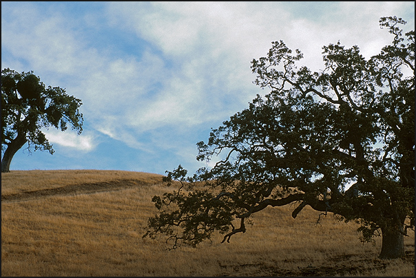
http://www.blackmallard.com/film/oakbits.jpg
or capturing "space" – warning, this is 825 Kbytes and your
monitor should be set so you can see an image 1200 pixels wide
without scrolling:


; )

By the way, I tend to think that developing "photographic vision"
could be done as an online seminar if all involved (including the
host of the seminar) looked at the work of each and made an effort
to really look at what was presented without passing on
positive/negative evaluative comments about the photographs
presented. Again, this is not about composition, it is about
strengthening the ability for a photographer to see what is about
them. Assignments - some easy, some quite obscure - would be
tailored to putting all the participants in situations where they
would be asked to "see".

Ed

--
http://www.blackmallard.com/cal_ls/
California Light and Structure

http://www.blackmallard.com/o_barn/
One Barn
 
Unfortunately, ImageStation responds awfully slowly from where I am
right now, so I haven't really been able to look at all of the
full-size ones. However, FWIW, here are some quick comments, based
partly on the thumbnails.
It is slow. I'll find a different hosr for the next assignment.
There were three shots in your gallery that immediately caught my
eye: Better2, Better3, and Worse2. There's one more where there's a
lot to look at: stare at it for a while, and Things begin to
emerge. This is Better4.
Would you mind telling me why did Worse4 catch your eye?
Better2 has a really nice sense of color and form; the delicate
shading on the object at left looks almost three-dimensional. It's
all about tone and color -- two of the most important elements in
photography. In addition, the pane of glass and the snow add
atmosphere and context; you get a feeling as if of someone looking
wistfully at something he can't quite grasp. I like it a lot. It
would make a great postcard. It's almost like a photographic
watercolor painting.
Er, what?

That is the problem. I saw none of that when I took the picture. I just thought, "hmmm... those too objects look nicer than the rest". Even when I selected the pictures they didn't evoke the emotions you describe. Should have taken that art appreciation class instead of all that math, physics and CS...
I like Better3 for its strong sense of motion and "graphism"
[...]
I took the liberty of playing with it a bit: I did a quick
conversion to black and white. What do you think?
I think that I am fortunate to have you as a teacher :-)
Better4 is an emotionally extremely powerful image;
[...]
I took the liberty of giving it a quick touch-up in post-processing
too -- again, the drabness you're worried about is a simple matter
to fix. And no, it's not cheating.

A quick technical tip, by the way: you'll find much of the
"drabness" goes out of your "snow shots" if you set auto-exposure
compensation to +1 or so (if your camera has it).
Yes, but (1) the terms of the excercise did state "auto" and (2) I'm yet to get the feeling of when and how to compensate.

If getting technical in an artistic discussion is allowed then let me ask you this. Do you think it is just the exposure or is the white balance off too? It looks a bit bluish to me.
In other words, you're really too hard on yourself. Your images
have lots of atmosphere.
I don't know. I think these were flukes as at the end of the day I had a problem picking the better and the worse pictures. Maybe at the end of the course I'll know what to look for and, with practice, develop a feeling for it.
If you want to improve your photography, in your case I don't know
if it's as much a matter of learning to shoot them better, rather
than learning to recognize what's good in them.
Maybe both?
You do have an
instinct about it, both the pictures and your personal ranking of
them shows that much. What you need is a bit more confidence. I
hope you'll stick around and maybe this course will help you
achieve that.
Ya betcha!

Thanks again.

Best wishes,
Alex.
 
Dana,

In the spirit of the students discussing the other students work, I thought I'd pitch my own 2 cents in regarding your homework.

First of all, I very strongly agree with your decisions for "best" and "worst". My favorites of your "best" photos were:

1. The girl (is this you?) looking up - PICT1035.JPG. I'm interested in this picture - it's not just a "vanilla" face looking out at you from the center of a picture photo. I like that she's looking at something that we can't see, but our focus is on her instead.

2. The trees against the blue sky - PICT1029.JPG. I like the lines of the trees against the very empty, very blue sky. I like the contrast there. I wonder how this picture would look if it were less veritical in orientation, and the trees had a little more diagonal slant to them?

3. The white house - PICT0913.JPG. What makes this picture interesting for me is the tree shadow right across the front of the house. It might be fun to try to try different angles and play with that shadow a little bit. I'd love to try to somehow draw more focus to that and shut out some of the other things going on in this pictures (toys in the yard, deck next door, etc).

Anyway, that's my extremely amateur opinion on your pictures. Thanks for sharing them with the class!

Chris
Sorry for posting this a second time - last time, I replied to the
wrong message!

I went for a walk this afternoon to take pictures for the
assignment, and got rather carried away: I simply kept snapping
pictures of everything I happened to see, until my entire memory
card was full. Since I have a half-gigabyte card, the result was a
total of 155 pictures. Most of them were truly abysmal!

I've posted my five best ones and five worst ones here:
http://wabe.cs.umd.edu/2003/composition-lesson-0
 
Wow, there's a lot of work being handed in. Please, folks -- step
in and help; there's no way I can give all of these the thought
they deserve: I do have a day job too. ;-)

I'm currently looking through the various galleries people have
posted, and getting a bit overwhelmed.
...
I would imagine so! I'm very happy that you're willing to take on such a daunting task, and hope it doesn't eat up all of your spare time :-)
But please, I'd like to get you going on each others work as well
as your own. In case you can't think of things to discuss, here are
a few:

1. What is there to like or dislike about the experience of
shooting pictures this way?
Overall, I had a lot of fun with it. It was frustrating occasionally: sometimes I really wanted to stop and compose a picture, and had to tell myself no. However, I got a kick out of just taking pictures without worrying about whether they were any good or not, and it got me thinking about picture-taking in a different way. 90% of my pictures weren't worth much - but since I took a huge number of pictures, I still was able to find five that I liked.
2. Who do you think can benefit most from it?
I imagine it would be someone who has talent but whose skills are undeveloped. I don't know if the first part of that applies to me, but I think the second part does - I'm pretty sure my skills aren't very well developed :-) I found two things useful about the exercise: I realized I could be freer in my picture-taking than I've been in the past; and I found it useful to go through a large catalog of pictures and try to figure out what worked, what didn't, and why.
3. What do you like or dislike about particular pictures that come
out of it?
I'll refer to my pictures as #1 through #10, in the order that they appear on my web page. The URL is
http://wabe.cs.umd.edu/2003/composition-lesson-0

My five best:
  1. 1: I liked the contrasts among the colors of the house, door, trees, and sky. I really liked the pattern of the shadow of the tree on the house. I might have liked to get the camera more level, but I'm glad I didn't get the house straight-on; that would have been boring.
  1. 2: I liked the pattern of the bridge railings and their shadows, and the way that these patterns paralleled the trees and their shadows. I liked the three bands of differing brightness - the bright sky, dark woods, and bright foreground. I liked having the person in the picture distance; it made the picture more interesting. However, I also liked it that she was in the distance, because it gave the picture a kind of lonely and meditative quality that I liked. I had another picture in which she was closer, but didn't like it as much: it made the picture more about her and less about the scene.
  1. 3: I like this one a lot. Again there are three bands of brightness: the bright sky, dark woods, and even darker ground. I liked the flash of color given to the picture by the house - and having the house far away behind the trees gives it a mysterious quality that I like.
  1. 4: I like the contrast between the trees and the sky, and the way that most of the bigger branches curve out to the right as if trying to reach for something. I had another similar shot of a more conventional tree - and while I liked it, I didn't like it as much.
  1. 5: I like the way Janet is looking up - it makes one wonder what she's looking at. I like the contrasts among her pink face, dark brown hair, black clothing, and the muted background colors. I like her being off-center, but think it might have been a nicer picture if it didn't look like the tree was growing out of her face :-)
My five worst:
  1. 6: Things I don't like: uninteresting subject, uninteresting background, picture is blurry. One thing I do like is that it certainly fit the assignment: I took it quite spontaneously.
  1. 7: Same as #6.
  1. 8: There nothing in the picture for it to be "about".
  2. 9: The picture is blurry and overexposed, and there's a problem with lens flare. I suspect it may have been a more interesting picture were it not for those problems. Although the house looks kind of ugly from this angle, it also looks imposing in a way that might be interesting - it's hard for me to judge how interesting, because I'm finding the problems with the picture to be too distracting.
  1. 10: Again it's not about much of anything. I suppose the pattern of leaves might be somewhat interesting, but the blurriness prevents me from appreciating it. On the far left, I find the edge of the black jacket distracting, but I suppose it would be easy enough to crop it out.
 
Good timing, there -- I just finished reading your original post
and checking out your photos.

I tend to like your "worst" batch of photos (as a whole) better
than your "best" batch, but that's just my taste. It felt like your
"worst" photos were just a bit looser, less formal than your
"best." It felt like you were trying really hard to compose these
images, rather than just grab what caught your eye.

I also think that rather than trying to grab shots of large scenes,
how about taking shots of smaller things? For instance, rather than
a whole building, how about a door or a window? What about a light
fixture? What about looking up? Down?

Just my 2¢

Nancy ;-)
---------------------------------------------------------

Points well taken, Nancy. You are probably correct in that I tend to be a creature of habit, and the old habit of composition is indeed difficult to break. I appreciate your critique.

Maybe I need to take the test over? ;-)

--
Rommaker
 
grin We wouldn't want our mentor to not get enough sleep through
being busy at his day job and then having to come home and wade
through lots of homework unaided, would we?! This is supposed to be
fun for Petteri as well!
Oh gosh, I thought the objective was to drain him dry :-)

Seriously, you're quite right. I think it's amazingly generous of him to take on the project - I can imagine it eating up a lot of his time.
I've been looking forward to hearing your viewpoints just as much
as Petteri's.
Good point - I don't know how much my viewpoint will be worth, but will try to contribute when I think I have something useful to say.
... I would like to know why Dana felt that a lot of her shots ...
Actually I'm a him, not a her. Because of my name, that has happened to me a lot. I once got a letter from the World Who's Who of Women asking if I wanted to be listed in their book!
... were "truly abysmal".
Sorry, my fault! I read through Petteri's instructions too quickly, and missed the part about discussing what I liked and didn't like about my pictures. In another message, I've now corrected that. Here's the URL:
http://forums.dpreview.com/forums/read.asp?forum=1018&message=7262759
 
Thanks for your message! Here are a few responses.
1. The girl (is this you?) ...
Actually it's my wife. You may be amused by my related comment in http://forums.dpreview.com/forums/read.asp?forum=1018&message=7263079
... looking up - PICT1035.JPG. I'm
interested in this picture - it's not just a "vanilla" face looking
out at you from the center of a picture photo. I like that she's
looking at something that we can't see, but our focus is on her
instead.
Thanks - that's what I liked about it too.
2. The trees against the blue sky - PICT1029.JPG. I like the lines
of the trees against the very empty, very blue sky. I like the
contrast there. I wonder how this picture would look if it were
less veritical in orientation, and the trees had a little more
diagonal slant to them?
Below, I tried rotating it 20 degrees. You're right, it's an interesting viewpoint. Unfortunately, I had to crop a large part of the picture to get rid of the white space; you can still see some of it in the upper right-hand corner.


3. The white house - PICT0913.JPG. What makes this picture
interesting for me is the tree shadow right across the front of the
house. It might be fun to try to try different angles and play
with that shadow a little bit. I'd love to try to somehow draw
more focus to that and shut out some of the other things going on
in this pictures (toys in the yard, deck next door, etc).
How's this?

 
...
Points well taken, Nancy. You are probably correct in that I tend
to be a creature of habit, and the old habit of composition is
indeed difficult to break. I appreciate your critique.
I'm still very amateur at this - but for what it's worth, I agree with Nancy's opinion. I also liked most of your "worst" ones better than most of your "best" ones.
 
...
3. The white house - PICT0913.JPG. What makes this picture
interesting for me is the tree shadow right across the front of the
house. It might be fun to try to try different angles and play
with that shadow a little bit. I'd love to try to somehow draw
more focus to that and shut out some of the other things going on
in this pictures (toys in the yard, deck next door, etc).
How's this?
...
Oh, I forgot - here's another close-up, this time at an angle like you suggested. I'm not really sure which of the two I prefer.

 
1. What is there to like or dislike about the experience of
shooting pictures this way?
Can't really say there's something about it I didn't like. It was uncomfortable at first, because I had this feeling that I was forcing myself to overlook or give up possibilities for other images. But I took a path that I walk every day, so I can always go back and maybe the images will present themselves again.

What I did enjoy was, once I was used to the process, I couldn't really stop. I rarely shoot so spontaneously, maybe I made myself believe it's not my style or something. By doing the excersize, I learned that I can shoot from the hip so to speak, and also it became clear that I've been very rigid in the way I approach my image making up to this point.

Time to loosen up a bit !
2. Who do you think can benefit most from it?
I think anyone can benefit really. Whenever you do something 'different' like this, you can contrast that with the way you normally shoot - and it reveals certain things about the way one shoots. Doesn't matter if you are keen on landscapes or people or... Even you, Petteri, noticed some things about how 'normally' shoot. Everybody has room to grow...
3. What do you like or dislike about particular pictures that come
out of it?
I like that managed to grab at least a couple of images that I liked in what seems such a random manner. Such a contrast to my usual images. I think eveyone was bit surprised at how well, and how 'not so well' their images turned out - seems everyone grabbed some images they were happy with.

I also liked that I captured some environments that I will return to later to explore more in detail, since, heh, I can sit here and compose and roam around the setting while it's on my screen !

what I didn't like was probably the ones that missed, missed really bad. I created some bad images that made me wince! Not that I'm a stranger to making bad images, but not in such large numbers. Still a great learning experience.

I repeated the exercise on my walk this evening, I think for just the fun of shooting than an attempt to capture a winner...
--
Take Care!

Jerry
 
Well, if you have the time to do that, it would probably be of some value. I suspect Petteri would know better than I.

It's so difficult to work in a way that is different than what you are used to doing. However, it always seems like when I'm pushed to do something like this, I gain the most insight.

Nancy

---------
Good timing, there -- I just finished reading your original post
and checking out your photos.

I tend to like your "worst" batch of photos (as a whole) better
than your "best" batch, but that's just my taste. It felt like your
"worst" photos were just a bit looser, less formal than your
"best." It felt like you were trying really hard to compose these
images, rather than just grab what caught your eye.

I also think that rather than trying to grab shots of large scenes,
how about taking shots of smaller things? For instance, rather than
a whole building, how about a door or a window? What about a light
fixture? What about looking up? Down?

Just my 2¢

Nancy ;-)
---------------------------------------------------------
Points well taken, Nancy. You are probably correct in that I tend
to be a creature of habit, and the old habit of composition is
indeed difficult to break. I appreciate your critique.

Maybe I need to take the test over? ;-)

--
Rommaker
--
- - - - - - - - - - - - - - - - - - - - - - - - - - - -
Bad spellers of the world - Untie!
- - - - - - - - - - - - - - - - - - - - - - - - - - - -
 
Dana,
1. The girl (is this you?) ...
Actually it's my wife.
Whoops. My bad. grin . You've got one of those names that can go either way - like "Chris" (I stand with you, my brother). :)
Below, I tried rotating it 20 degrees. You're right, it's an
interesting viewpoint. Unfortunately, I had to crop a large part
of the picture to get rid of the white space; you can still see
some of it in the upper right-hand corner.

I do like the diagonal lines in this re-composed picture, but I think it loses the sense of "reaching" that your original picture had. This has a very different feel to it and I don't think I like it as well as your original. Very interesting though.
How's this?

I do like this crop. I think the nice sharp 90 degree and 45 degree lines of the house are a great contrast against the more natural lines of the tree shadow and the trees behind. I think your crop enhances the effect (really draws my focus in) and I like it very much. I think the effect is diminished when you rotate the house (in your other post), so for me personally, I like the one above the best.

Nice work, Dana!

Chris Miller
 
Hi Rommaker!

Images that stuck out to me are a mixture of both...

In your best gallery, I liked number two. Inviting in a way, I think the sun in the frame helps the image along, adding a little more depth and also helps describe the setting. And the last one with the peaked rooftops; of course I dig the lines, but also the contrast with brick, foliage and sky. I think the others here are fine too, but those two stuck out to me.

in the other gallery, I actually liked 3, 4, and 5.

even though the third maybe underexposed and lacking detail, but really I just like view upwards, and wonder if it would be possible to capture it as almost a silhouette, but still have the white architecture at the top light enough to show the columns and details. I dont know, I explored that image for a while...

I like the fourth image because it's taken so far away. it's another image that makes you want to get closer (which of course you did) and explore around. maybe a little too much road at the bottom, but when shooting like this, it's not anything one can 'fault'. It would probably be a neat image to print very large.

The fifth one is my favorite of all your images. Yes, it's bit empty, but that's the beauty of it. the ramp draws you eyes to the water, and the reflection makes my eyes explore the rest of the image trying to see what's being reflected. I also like that water is smooth up close, but out beyond, the ripples kill the reflection. It might also be a keen place to try to compose an infra red shot when the leaves are all there.

Only thing that seems to draw my eye out of it is the area to the left, where the trees are bare, and the houses show through a bit. But again, with the way it was shot, not sometihng one could pick out while shooting it.

Hope you don't mind my commenting, but I think the more people talk about the images, the more we can get out of the excersize, even it we see things differently, which we seem to do !

[snipped]
--
Take Care!

Jerry
 

Keyboard shortcuts

Back
Top