Reading mode:
Install the app
How to install the app on iOS
Follow along with the video below to see how to install our site as a web app on your home screen.
Note: This feature may not be available in some browsers.
-
Welcome to the new forums! Please read this first. For known issues we are working to resolve, click here.
You are using an out of date browser. It may not display this or other websites correctly.
You should upgrade or use an alternative browser.
You should upgrade or use an alternative browser.
Classic Landscape DOF Problem
- Thread starter Greg7579
- Start date
Rodenmg
Veteran Member
That's what I'm talking about.I always carry some kind of table top tripod in my bag if for some reason I don't have my full sized one. You can do wonders, if you have it!
")
But ask me if I've never been in that situation like Greg. It happens.
Valued Customer
Leading Member
- Messages
- 892
- Reaction score
- 424
Agree. It is so helpful.I always carry some kind of table top tripod in my bag if for some reason I don't have my full sized one. You can do wonders, if you have it!
Sal Santamaura
Active member
- Messages
- 65
- Reaction score
- 57
Thanks for that, Paul. I've missed your contributions since you left the Large Format Forum. This post helped make a decision. Toying with purchase of the 45mm f/2.8 PC-E for my D810, solely to make use of its tilt capability, you tipped the balance against. Vertical lens adjustments in post handle lack of rise/fall nicely, but I shied away from stopping down for tilted image planes. Cash not spent on the Nikkor will buy a lot of ink and paper.Tilt would make this effortless. Everything in this scene is very close to being on a single, angled plane.
Many photographers these days seem to consider movements a specialized, esoteric subject. I used to use nothing but a view camera, and it was rare to not use movements. Spend a little time with that ability, and you really miss it.
Nevertheless, I haven't had a lens that tilts for a digital camera. Just some shift lenses. All my experiments say: stop down. Way down. All the reviewers and testers and MTF data say your image will be destroyed if you inch past f11, but it will not. I can show you 24" wide prints from a 36mp Nikon, shot at f16, that look like contact prints.
My takeaway: diffraction blur responds nicely to sharpening. Out-of-focus blur doesn't.
You may have to develop some sharpening skills for maximum effect. I do minimal capture sharpening in Lightroom (just to make sure things look sharp in a natural way at 100% view). Anything that gets printed goes into Photoshop, where I resize to actual print dimensions at the native resolution of the driver. This lets me see what's actually going on. Output sharpening is all done on a layer, with luminance blending mode, and the deep shadows and bright highlights blended out. I choose a sharpening radius based on minimum viewing distance (0.1mm for anything that will be looked at closely, which corresponds to 5 lp/mm).
I have never once regretted stopping down too far in situations with lots of depth. I've often regretted not stopping down enough.
For the situation in your picture, I'd probably assume f16 or f11 depending on focal length. I'd play with focus until the MF focus aid highlight all the things. Then I'd check by going into DOF preview, and zooming in on something near and something far.
Alternatively, you could use an app. Use the distance scale in the camera and figure out the near and far points. Put in your focal length and aperture and desired CoC, and focus at the distance it tells you. I've got J.M Gurgel's free Depth of Field app for iPhone. It seems pretty well designed, but I haven't tested it in the world yet.
DavidMillier
Forum Pro
I visited Iceland for a couple of weeks with family and a friend right back in 2009. I had wanted to go there ever since I saw Michael Reichmann's articles from 2002 https://luminous-landscape.com/iceland-a-photographers-paradise/Agree to disagree. No hard feelings!Disagree. Go look at my Iceland Album and tell me it is folly.9,000+ images? To me, that's folly.
Marco
Plus, in post, I get a choice of several versions at various points of focus and F stops.
Anyway, it doesn't seem like you actually read my post in full.Are you trying to save money on film? Hey, this ain't ancient cave man days.
It's got nothing to do with "saving money". It just helps me get more keepers (and better photos) in the end.
I appreciate it may be different for you.
Peace.
I would argue that if you feel the need to take multiple pictures of the same subject using all those different focal lengths, then your critical and pre-visualization skills while in situ are not very well honed...Think about it Marco. You are in Iceland for 5 weeks. You shoot all day every day and you take 30,0000 dollars' worth of camera gear. You can take one shot of the iceberg or you can take 4. You can turn one direction and shoot or you can turn ten directions. You can shoot the scene at 250, 200, 150, 100, 80, 70, 50, 45, 30, 23, 20....
Fair enough!It's part of the fun.
For me too! I just have more fun discarding suboptimal options in my head before tripping the shutter... to each their own.
Also, on resolution: to me, that's for printing large. Not for zooming in on a small section of the image on screen, and thereby lose the ability to see it in its entirety.I'm doing it for fun,, not money. If I wanted money, I could have sold my entire GFX portfolio to that stock agency.... LOL.
What are you going to do? You are there so shoot. Don't shoot 1. Shoot 6.
I also disagree with whoever said pixel peeping is pointless except to check the point of focus. Really? This is GFX man. What do you think it is that separates us from the barbarian hordes with their cell phones?
I look at every image at full res on a big 4K monitor and can't wait to see what it looks like on my incoming 6K 32-inch Dell. It will knock your eyeballs out. If you ain't peepin' you ain't doing it right. Might as well go APSC and Fuji X, which is pretty darn good by the way....
Besides, I misreported. I took 12,000 thousand images and kept 6,000.
The 6,000 I deleted were PTG (Pretty damn good). LOL.
To each their own.
Tourism had taken off by the time I went, so no kipping on the grass and eating from truck stops required for me, thankfully.
It is such a target rich place, that most photographers would go completely hyper, mashing the shutter release. I don't blame anyone getting over excited and shooting 50,000 pictures an hour; it's the nature of the place.
However, 20 years on, Iceland has been a magnet for just about every world class landscaper on the globe. And that's a problem for the rest of us, I feel.
All those world class landscapers have produced a body of world class pictures.
Looking through Greg's very competent portfolio, I'm left with exactly the same feelings I have when I look through my own 2009 collection: when it comes to Iceland, decent photography just doesn't cut it. There are so many wonderful, brilliant, outstanding images already available, it's a very rude awakening to just how much better the really good landscape photographers are. I mean no disrespect to Greg's good quality photography, and I don't even want to be that mean about my own rather inadequate efforts, but the marvellous work done by top photographers really does set such a high bar that it seems almost unattainable to me. Almost better off ignoring the honeypot locations and photographing that patch of wasteland down the road that no other photographer would give a passing glance to.
Sorry to sound so down in the dumps, but digital photography has not only raised the average standard of photography, it's also increased the volume and availability of world class photography and that has raised the bar so high that your average dead keen amateur is going to really struggle in comparison. Photography that a few years ago would have impressed, is now just so-so, such is the competition.
I could revisit Iceland, but what would that bring over 2009? More pixels, basically.
I am so not any good at landscape photography, despite the fact it's the genre that first brought me into photography. And I don't really have a strategy to improve, sadly.
Take a workshop from someone whose work you admire.I am so not any good at landscape photography, despite the fact it's the genre that first brought me into photography. And I don't really have a strategy to improve, sadly.
That depends on why you make photographs.However, 20 years on, Iceland has been a magnet for just about every world class landscaper on the globe. And that's a problem for the rest of us, I feel.
All those world class landscapers have produced a body of world class pictures.
Looking through Greg's very competent portfolio, I'm left with exactly the same feelings I have when I look through my own 2009 collection: when it comes to Iceland, decent photography just doesn't cut it.
Why we photograph - the last word
A friend of mine is fond of saying: “If you buy a violin, you own a violin; if you buy a camera, you are a photographer.” Hold that thought. I’ve been thinking recently about why so many people seem to talk past each other on photography boards and have decided that a part of the
 blog.kasson.com
Rob de Loe
Veteran Member
That was brutally honest, but I'm glad you shared it.All those world class landscapers have produced a body of world class pictures.
Looking through Greg's very competent portfolio, I'm left with exactly the same feelings I have when I look through my own 2009 collection: when it comes to Iceland, decent photography just doesn't cut it. There are so many wonderful, brilliant, outstanding images already available, it's a very rude awakening to just how much better the really good landscape photographers are. I mean no disrespect to Greg's good quality photography, and I don't even want to be that mean about my own rather inadequate efforts, but the marvellous work done by top photographers really does set such a high bar that it seems almost unattainable to me. Almost better off ignoring the honeypot locations and photographing that patch of wasteland down the road that no other photographer would give a passing glance to.
Sorry to sound so down in the dumps, but digital photography has not only raised the average standard of photography, it's also increased the volume and availability of world class photography and that has raised the bar so high that your average dead keen amateur is going to really struggle in comparison. Photography that a few years ago would have impressed, is now just so-so, such is the competition.
I could revisit Iceland, but what would that bring over 2009? More pixels, basically.
I am so not any good at landscape photography, despite the fact it's the genre that first brought me into photography. And I don't really have a strategy to improve, sadly.
However, I'm going to suggest that this can be an opportunity rather than a problem.
It is a genuine problem for people whose idea of photography is iconic landscapes, or who may have different ideas, but those ideas don't sell, so they focus on iconic landscapes.
Here's a demonstration of what I mean. Do a Google image search with this set of terms:
mountain lake clouds reflection
Now imagine that "mountain lake clouds reflection" images is what you aspire to make. How depressing is it to discover that there are millions upon millions of these. Imagine spending a fortune on camera equipment and travel to make one more. That's depressing.
You end your post by saying you don't have a strategy for this, but you actually do, and you told us what it was in the previous paragraph: "Almost better off ignoring the honeypot locations and photographing that patch of wasteland down the road that no other photographer would give a passing glance to."
Nearly all of my photography is from the patch of wasteland down the road, the local bog, the forest next door... Lately I've been driving farther afield for work photography, but my drive is most peoples' daily commute around here -- so still hyper local.
I'm not saying the work is any good. Others will decide that. But it surely isn't going to disappear into the vast chum bucket of nearly identical pictures of the same scenery because I make a habit of going where sensible people don't go.
Case in point: on Wednesday I had to pick my way gingerly through a seriously dark and nasty tunnel carrying Black Creek under an arterial road to get to this spot. This may be the first and last photograph ever made of this spot. It's not going to win any contests, but it will help to anchor a project about the creek.

Black Creek, just east of Main Street in Acton, Ontario.
If that's not enough of an argument for you, consider what generative AI is going to do to "mountain lake clouds reflection" photography. There are millions of Iceland photographs out there already; you don't have to travel to Iceland anymore. You can just supply the prompt "iconic Icelandic landscape" to Midjourney and create your own from other peoples' work.
We are fast approaching the time when there's genuinely no point in making new iconic Icelandic landscape photographs if your goal is to impress other people. By all means make them for yourself as a memory of your wonderful trip, but that's about it for a reason to point the camera at that fjord and press the shutter. Or, if Iceland is where your travels took you, look for the things that other people never photograph in Iceland; they probably have wastelands down the road too.
It's much less likely that Midjourney can produce an image that resembles what you made in that that patch of wasteland down the road that no other photographer would give a passing glance to. I am not concerned that someone is going to duplicate my Black Creek picture using Midjourney!
Last edited:
Greg7579
Forum Pro
There is no place on Earth that has not been photographed tens of thousands, hundreds of thousands or millions of times. I have been to 80 Nations in my life and usually had a camera with me. Every place I have ever been there is a pro photographer who lives there and has shot it a hundred times while waiting months or years for the perfect light and most dramatic skies. Then they publish or show their very best stuff shots, and they are always a joy to see.
Don't let that stop you.
Besides, when it comes to landscapes in Iceland, most of the great shots are taken by drones in the past year. Why? Because the drones are better and so are the cameras on them.
--
Greg Johnson, San Antonio, Texas
https://www.flickr.com/photos/139148982@N02/albums
Don't let that stop you.
Besides, when it comes to landscapes in Iceland, most of the great shots are taken by drones in the past year. Why? Because the drones are better and so are the cameras on them.
--
Greg Johnson, San Antonio, Texas
https://www.flickr.com/photos/139148982@N02/albums
Last edited:
paulraphael
Senior Member
Or else ... let it stop you.Don't let that stop you.
As Jim said, it all depends on why you photograph.
I'm not personally interested in making pictures that conjure other pictures more than they conjure an original experience. This makes some settings more interesting to me than others.
Often when I travel, I'm more interested in experiencing a place in the moment rather than "going to work" and doing photography. But if the trip is about photography, there will be a reason I've chosen to go there. It probably won't be someplace iconic where people are teaching workshops on how re-create familiar images.
But avoiding tropes is maybe the most superficial consideration. Robert Adams wrote something that resonates for me:
If I don't see how to make an image that will somehow transcend standing there, then I won't feel compelled to try to make art. Maybe I'll pull out my phone and snap something to help remember the place.... what we hope for from the artist is help in discovering the significance of a place. In this sense we would choose in most respects thirty minutes with Edward Hopper’s painting Sunday Morning to thirty minutes on the street that was his subject; with Hopper’s vision we see more
DavidMillier
Forum Pro
Nice idea, but I'm not sure I can afford to on my minimum wage retirement income. Some workshops literally cost half my annual pension! But funny you should say itTake a workshop from someone whose work you admire.I am so not any good at landscape photography, despite the fact it's the genre that first brought me into photography. And I don't really have a strategy to improve, sadly.
I've just signed up for a discounted price online webinar with Bruce Percy this very evening in the hope of some landscape inspiration.It's about editing in photoshop (I don't use photoshop), but it not about how to use photoshop, it's about how and what to edit and why you would do certain things.
The man's a genius. His editing style is amazing. He demonstrates how to make tiny tonal adjustments to local areas of the image to draw the eye around the frame. And there is nothing technical at work, he uses the most basic of masking (just big blobs) and one tool: curves on layers.
I find it fascinating to watch. Say, he has a raw of a stark winter tree as the main subject in a field of snow. He might say, "that tree is not prominent enough for my goal. I need it to stand out more from the snow". I'm watching and thinking what I would do is mask the tree, boost contrast and make it darker. Then Bruce does none of those things, he just brightens a small patch of the snow in the top left corner and the tree magically looks darker and contrastier and pops out of the background. How did he know that would do the trick!
His control of tone is incredible and none of it is highly technical editing, it's just all about an eye for how tonal relationships work and which bit of the image is actually the problem and how to fix it. And it's not usually the bit you think.
It would be great if I could pick up some of his habits but I suspect it's a hell of a lot harder than he makes it look....
--
Photo of the day: https://whisperingcat.co.uk/wp/photo-of-the-day/
Website: http://www.whisperingcat.co.uk/ (2022 - website rebuilt, updated and back in action)
DPReview gallery: https://www.dpreview.com/galleries/0286305481
Flickr: http://www.flickr.com/photos/davidmillier/ (very old!)
Last edited:
paulraphael
Senior Member
I was lucky enough to get some mentoring in this kind of thing, but I also got education on the cheap from well printed books.... it's about how and what to edit and why you would do certain things.
The best one for me was a National Gallery of Art catalog of their Paul Strand retrospective. He's the printmaker I've always admired most, and the reproductions in this book (by Richard benson) look to my eyes like the original prints.
Except I could have the whole portfolio for about $70. It let me study the way he used tonal relationships for years.
There are more photo books than ever available now, and many of them are printed beautifully. Maybe in another thread people can recommend ones they've learned from.
There’s a Charlie Cramer video on that sort of editing floating around somewhere. LuLa?Nice idea, but I'm not sure I can afford to on my minimum wage retirement income. Some workshops literally cost half my annual pension! But funny you should say itTake a workshop from someone whose work you admire.I am so not any good at landscape photography, despite the fact it's the genre that first brought me into photography. And I don't really have a strategy to improve, sadly.
It's about editing in photoshop (I don't use photoshop), but it not about how to use photoshop, it's about how and what to edit and why you would do certain things.
The man's a genius. His editing style is amazing. He demonstrates how to make tiny tonal adjustments to local areas of the image to draw the eye around the frame. And there is nothing technical at work, he uses the most basic of masking (just big blobs) and one tool: curves on layers.
I find it fascinating to watch. Say, he has a raw of a stark winter tree as the main subject in a field of snow. He might say, "that tree is not prominent enough for my goal. I need it to stand out more from the snow". I'm watching and thinking what I would do is mask the tree, boost contrast and make it darker. Then Bruce does none of those things, he just brightens a small patch of the snow in the top left corner and the tree magically looks darker and contrastier and pops out of the background. How did he know that would do the trick!
His control of tone is incredible and none of it is highly technical editing, it's just all about an eye for how tonal relationships work and which bit of the image is actually the problem and how to fix it. And it's not usually the bit you think.
It would be great if I could pick up some of his habits but I suspect it's a hell of a lot harder than he makes it look....
I don't think that I ever thanked you for the link to an article by Bruce Percy which you posted some months ago. The article you linked was titled "In Learning To Trust Oneself". Thank you for the linked article which I bookmarked.Nice idea, but I'm not sure I can afford to on my minimum wage retirement income. Some workshops literally cost half my annual pension! But funny you should say itTake a workshop from someone whose work you admire.I am so not any good at landscape photography, despite the fact it's the genre that first brought me into photography. And I don't really have a strategy to improve, sadly.
It's about editing in photoshop (I don't use photoshop), but it not about how to use photoshop, it's about how and what to edit and why you would do certain things.
The man's a genius. His editing style is amazing. He demonstrates how to make tiny tonal adjustments to local areas of the image to draw the eye around the frame. And there is nothing technical at work, he uses the most basic of masking (just big blobs) and one tool: curves on layers.
I find it fascinating to watch. Say, he has a raw of a stark winter tree as the main subject in a field of snow. He might say, "that tree is not prominent enough for my goal. I need it to stand out more from the snow". I'm watching and thinking what I would do is mask the tree, boost contrast and make it darker. Then Bruce does none of those things, he just brightens a small patch of the snow in the top left corner and the tree magically looks darker and contrastier and pops out of the background. How did he know that would do the trick!
His control of tone is incredible and none of it is highly technical editing, it's just all about an eye for how tonal relationships work and which bit of the image is actually the problem and how to fix it. And it's not usually the bit you think.
It would be great if I could pick up some of his habits but I suspect it's a hell of a lot harder than he makes it look....
Beyond the article, I appreciated your link because I wasn't aware of his work and I like it. I should have been aware of Bruce Percy's work, but I don't pay nearly as much attention to landscape work as I know many others do. His use of color strikes me as quite refined with a delicate and subtle touch in color transitions and choice of color palettes which resonates with me and draws me into his images. I actually was surprised by that which made me appreciate it even more.
For a long time, landscape images which attract my attention have leaned toward those with people. This Stephen Shore image is a favorite I've enjoyed and returned to view again multiple times over the years. The image draws me into an unfolding human story in addition to a scene. It's good that Bruce Percy drew me in with his use of color and tone to add more variety back to my viewing and dislodge me from my usual habits.
DavidMillier
Forum Pro
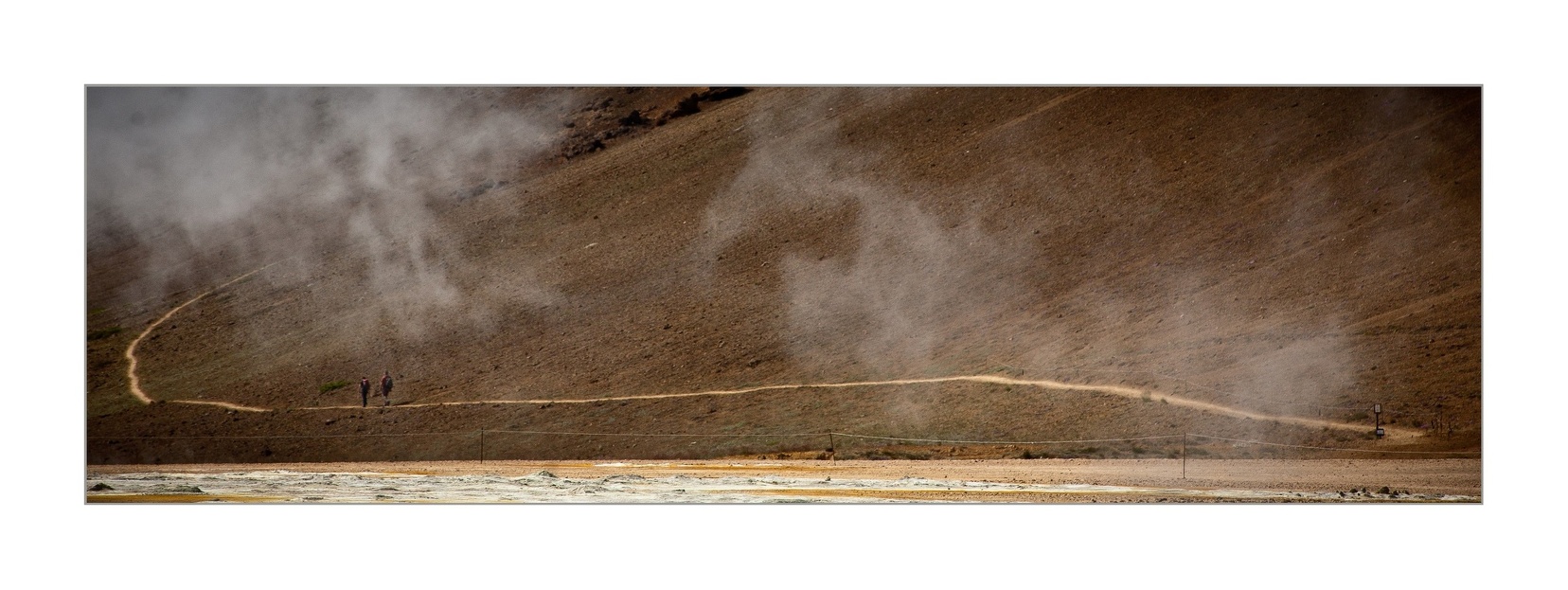
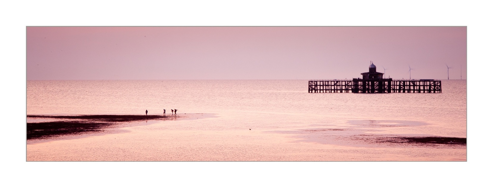
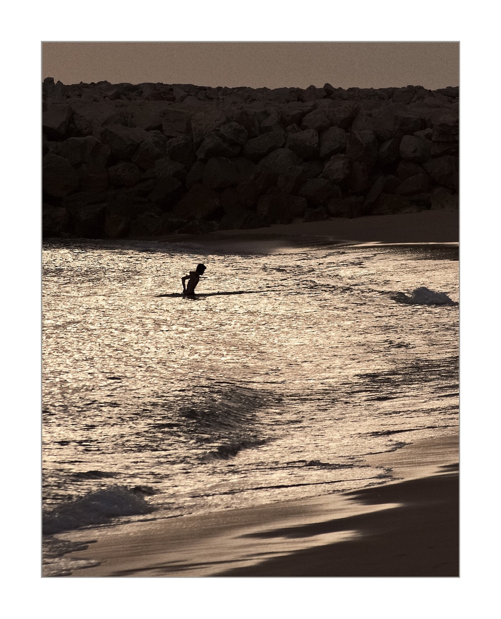
Landscapes with people in are a different kind of image and under-appreciated.
They have a different feel, may not really even count as landscapes exactly. Not sure what to call them.
--
Photo of the day: https://whisperingcat.co.uk/wp/photo-of-the-day/
Website: http://www.whisperingcat.co.uk/ (2022 - website rebuilt, updated and back in action)
DPReview gallery: https://www.dpreview.com/galleries/0286305481
Flickr: http://www.flickr.com/photos/davidmillier/ (very old!)
Last edited:
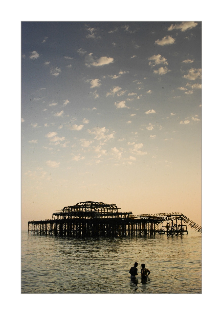
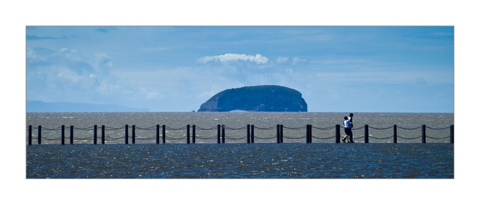
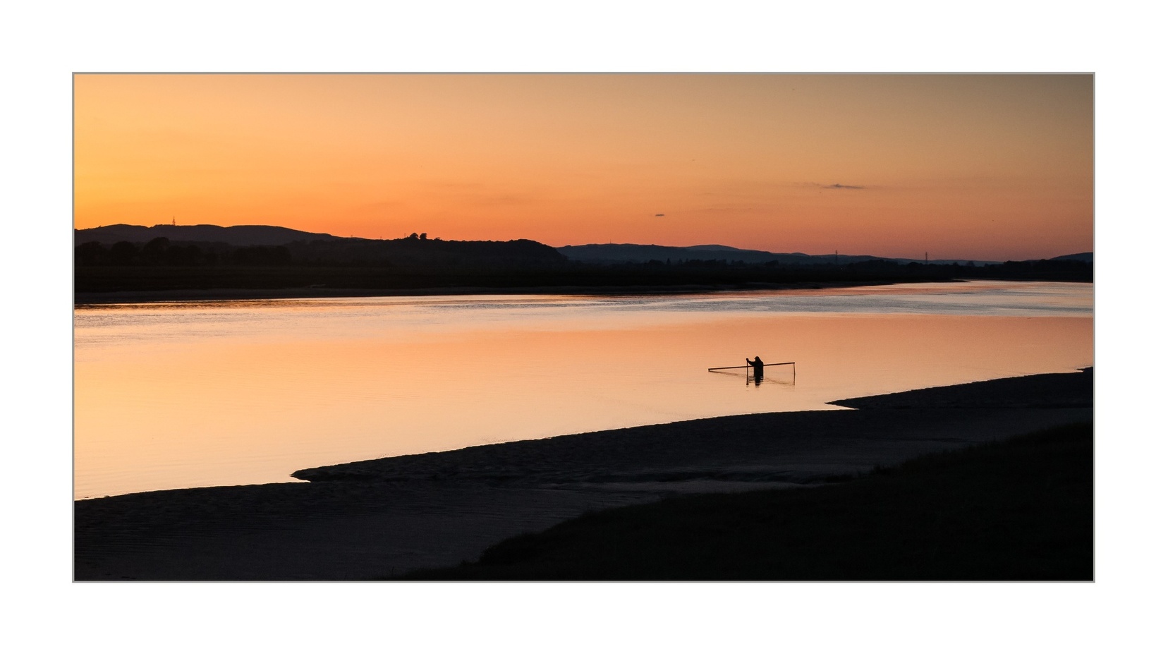
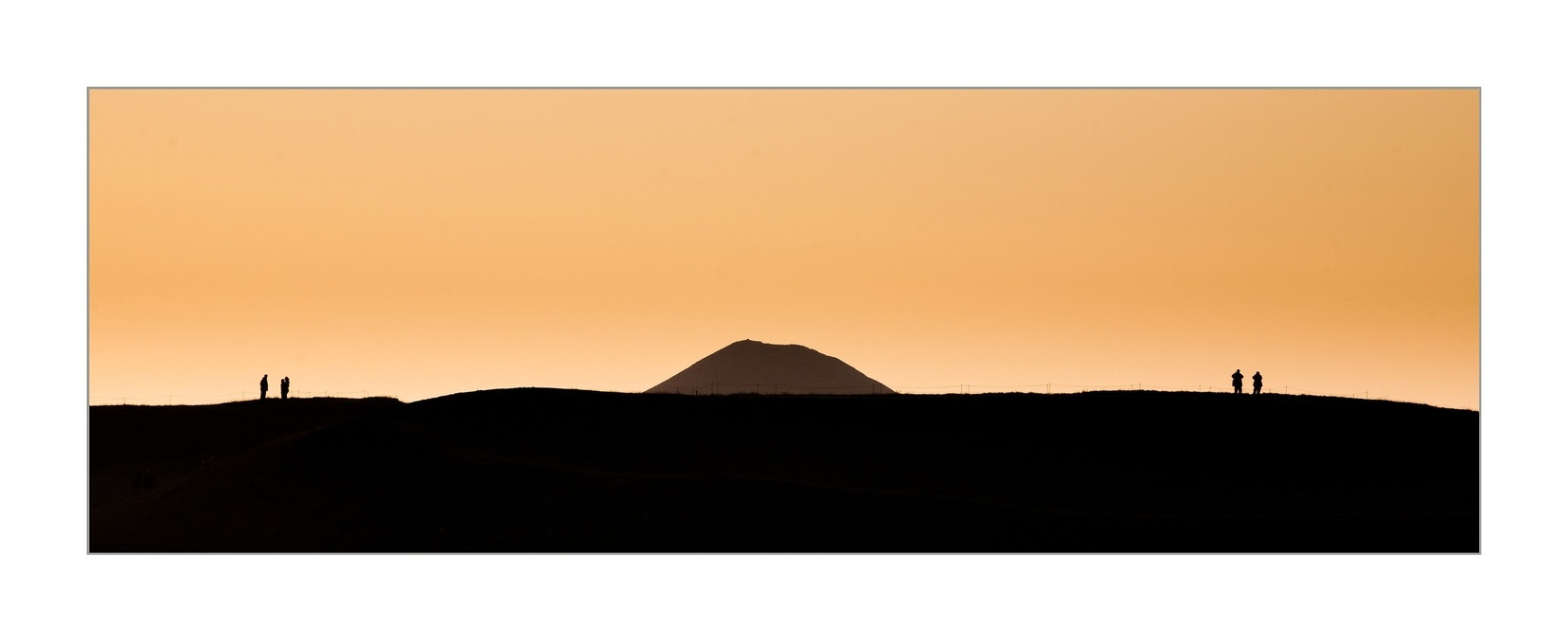
DavidMillier
Forum Pro
[No message]
Greg7579
Forum Pro
Something weird happened on those attachments. But those are very nice! Good work.
Rob de Loe
Veteran Member
I read once (can't remember where) that a fundamental difference between UK and North American landscape photography is that in the UK, landscape photography without the human presence strikes a lot of people as odd, whereas in North America, it's not uncommon for people to work very hard to eliminate the human presence.
I presume this is a function of the settled nature of the UK landscape. In a country like Canada, most of us are densely packed in a very tiny portion of the huge landmass, leaving a lot of space where you can find places to point the camera and not show human activity.
I presume this is a function of the settled nature of the UK landscape. In a country like Canada, most of us are densely packed in a very tiny portion of the huge landmass, leaving a lot of space where you can find places to point the camera and not show human activity.
Greg7579
Forum Pro
I work hard and am patient to try to get those annoying humans out of my shot.
But sometimes having a person in the landscape really works.
But sometimes having a person in the landscape really works.
Rob de Loe
Veteran Member
As with everything in this thread, "It depends!"I work hard and am patient to try to get those annoying humans out of my shot.
But sometimes having a person in the landscape really works.
Similar threads
- Replies
- 149
- Views
- 319
- Replies
- 19
- Views
- 2K
- Replies
- 18
- Views
- 51
- Replies
- 26
- Views
- 27
Keyboard shortcuts
- f
- Forum
About
Editorial content
Cameras & Lenses
All content, design, and layout are Copyright © 1998–2025 Digital Photography Review All Rights Reserved.
Reproduction in whole or part in any form or medium without specific written permission is prohibited.
When you use DPReview links to buy products, the site may earn a commission.
©GPS Media - Guides, Products, Services.
Reproduction in whole or part in any form or medium without specific written permission is prohibited.
When you use DPReview links to buy products, the site may earn a commission.
©GPS Media - Guides, Products, Services.