Reading mode:
Install the app
How to install the app on iOS
Follow along with the video below to see how to install our site as a web app on your home screen.
Note: This feature may not be available in some browsers.
-
Welcome to the new forums! Please read this first. For known issues we are working to resolve, click here.
You are using an out of date browser. It may not display this or other websites correctly.
You should upgrade or use an alternative browser.
You should upgrade or use an alternative browser.
This Month Through Your Adapted Lenses -- September 2019
- Thread starter Alan WF
- Start date
TripleCoatedBokeh
Leading Member


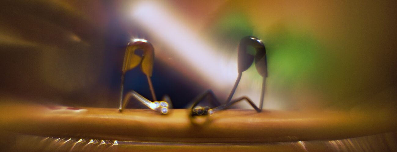
didnt have time to play with camera settings while taking them. if i had a little more time to play with my camera settings i think i would be a littler happier with the results. Also there's a consistent blotch in the upper right quadrant with this lens. looks like a piece of crud on one of the elements.
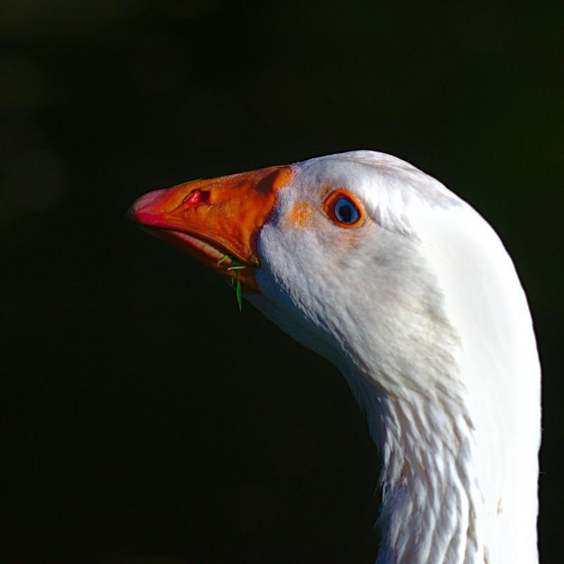
Great photo! Very sharp lens, too sharp for portraits
--

M_digicapt
Veteran Member
- Messages
- 3,294
- Solutions
- 2
- Reaction score
- 686
Thanks. The feedback has been consistent. I hope to find a way to change the laptop's color profile.The first one is cooler than the second one for sure. Second one has a lot of warmness in the white of the dog. I would go with the first one or somewhere in between.E-M10, Canon nFD 50mm f1.4, f2+/-, ISO 400, 1/1250ss
Can some of you tell me which of the two versions looks better? I'm having trouble with the WB. On my new computer the first one looks on on the cold side and ok on the tablet and phone. The second one looks ok on the computer and too warm on the tablet and phone...
TripleCoatedBokeh
Leading Member
Proplus888
Leading Member
- Messages
- 666
- Reaction score
- 313
That's exactly what I like about the Sonnar 1.5. It has internally only space between elements. Because his design predates coating at all, this was done to maximize contrast, but wheever there is light from any angle that gets into the lens but isn't supposed to (from the side), or in excess (aka as flare) it veils very adding this glow. In PP it can be removed 90% without anyone noticing, but it can never be added if you wanted to. I think it's a very beautiful design and has the best flare control of any lens. It just doesn't flare with some odd white patch, it either veils more globally or more cinematically. Today, we have the best multi coating ever. But you know what? When I look at bright light sources, my eye flares more like this lens, and less like the current lenses. Also, advanced multicoating ends up killing 2-5% of light through destructive interference. Waves that would reflect _but also some that would not_ get canceled in large proportions but as they go through a long pipeline of air-glass transitions, they add up, and I think it greatly affects the character of the color. That's why people talk about the color of the reflections or the color character.
Ok, long way to say I liked this portrait and others that veil like this!

Cam: Olympus OM-D E-M5
Lens: #284 Tamron BBAR MC02B f2.5 28mm ADAPTALL2
--
Best regards
Bernhard

Der Amateurphotograph
Ein experimentell kreativer Fotoblog über Optik und Photographie
 deramateurphotograph.de

Cam: Olympus OM-D E-M5
Lens :#284 Tamron BBAR MC02B f2.5 28mm ADAPTALL2
--
Best regards
Bernhard

Der Amateurphotograph
Ein experimentell kreativer Fotoblog über Optik und Photographie
 deramateurphotograph.de
M_digicapt
Veteran Member
- Messages
- 3,294
- Solutions
- 2
- Reaction score
- 686
I agree, love the dreamlike quality of this image. Spent a lot of time learning how to ''fix" this in post for wildlife shots, but recently I've exploring how to maximize it in my street and portrait photos.That's exactly what I like about the Sonnar 1.5. It has internally only space between elements. Because his design predates coating at all, this was done to maximize contrast, but wheever there is light from any angle that gets into the lens but isn't supposed to (from the side), or in excess (aka as flare) it veils very adding this glow. In PP it can be removed 90% without anyone noticing, but it can never be added if you wanted to. I think it's a very beautiful design and has the best flare control of any lens. It just doesn't flare with some odd white patch, it either veils more globally or more cinematically. Today, we have the best multi coating ever. But you know what? When I look at bright light sources, my eye flares more like this lens, and less like the current lenses. Also, advanced multicoating ends up killing 2-5% of light through destructive interference. Waves that would reflect _but also some that would not_ get canceled in large proportions but as they go through a long pipeline of air-glass transitions, they add up, and I think it greatly affects the character of the color. That's why people talk about the color of the reflections or the color character.
Ok, long way to say I liked this portrait and others that veil like this!
Very nice portrait and great rendering from the old Sonnar!
--

Raoul Duke
Well-known member
For correcting the images, it depends a lot on if it has any veiling at all. If I use a hood, usually the correction needed is about 0, and just apply a tad of sharpening. The Sonnar is a very sharp lens stopped down, because the design was already extremely good where stopping down makes everything sharp. If I want more modern look, I apply a tad (very small) of Dehaze in RT. Because it is very high resolution, but at the micro level is loses a bit of contrast due to the uncorrected circular aberration (but retains the detail) I also may apply Microcontrast adjustment, from 0.5 to 0.8 (max). I can't really tell much of a difference between this and any other lens.I agree, love the dreamlike quality of this image. Spent a lot of time learning how to ''fix" this in post for wildlife shots, but recently I've exploring how to maximize it in my street and portrait photos.That's exactly what I like about the Sonnar 1.5. It has internally only space between elements. Because his design predates coating at all, this was done to maximize contrast, but wheever there is light from any angle that gets into the lens but isn't supposed to (from the side), or in excess (aka as flare) it veils very adding this glow. In PP it can be removed 90% without anyone noticing, but it can never be added if you wanted to. I think it's a very beautiful design and has the best flare control of any lens. It just doesn't flare with some odd white patch, it either veils more globally or more cinematically. Today, we have the best multi coating ever. But you know what? When I look at bright light sources, my eye flares more like this lens, and less like the current lenses. Also, advanced multicoating ends up killing 2-5% of light through destructive interference. Waves that would reflect _but also some that would not_ get canceled in large proportions but as they go through a long pipeline of air-glass transitions, they add up, and I think it greatly affects the character of the color. That's why people talk about the color of the reflections or the color character.
Ok, long way to say I liked this portrait and others that veil like this!
But the lenses shine for portraits and street where one wants a detailed but flattering silky look. Note I speak of the Sonnar but I only have the 2/50 version (no 100% the same but very similar), as well as the 2/85 Contarex (exact same design as 1.5/50...really).
Similar threads
- Replies
- 81
- Views
- 202
- Replies
- 65
- Views
- 80
- Replies
- 103
- Views
- 104
- Replies
- 80
- Views
- 124
- Replies
- 149
- Views
- 150
Keyboard shortcuts
- f
- Forum
About
Editorial content
Cameras & Lenses
All content, design, and layout are Copyright © 1998–2025 Digital Photography Review All Rights Reserved.
Reproduction in whole or part in any form or medium without specific written permission is prohibited.
When you use DPReview links to buy products, the site may earn a commission.
©GPS Media - Guides, Products, Services.
Reproduction in whole or part in any form or medium without specific written permission is prohibited.
When you use DPReview links to buy products, the site may earn a commission.
©GPS Media - Guides, Products, Services.


