Color correction - what do you do?

I'd like for you to see how good you can make it look. And please -
only contrast / saturation / color corrections. No borders / frames
and no crops. That way, it'll be easier to compare the results.
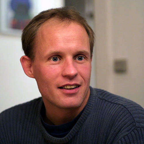
1 - Levels to pump up contrast, and remove some of the color cast

2 - Hue/Sat to desaturate the reds a little. Was too ruddy.

3 - Played with the curves a little bit to give it a little more snap.

4 - After curves, it seemed a little too yellow, so back to Hue/Sat
to fix it.

5 - Unsharp Mask. Just a little bit.

6 - Teeth start to bother me, so make a mask for them, Hue/Sat to
whiten them, then brightness/contrast to brighten them.

A question - What color was the sweater? Bluish or Grey?

Result:


Original


--
http://www.xfade.com
--
Chris:

You get my vote. The most natural look of all the attempts. Great job. Thanks for sharing your method.

Robert
Robert Williams
NAPP
PBase Supporter
http://www.pbase.com/robert8194
 
I am VERY new to digital photograpy and PS, so this is kind of a test for me, to see how my color correction of this photo looks posted on this forum. I noticed several complex methods were used to correct this picture. I tried using Eddie Tapp's 90 % method, which I think I found on one of these forums. It seems easy to use and I think the results are just as good as more complex methods. Have any of you guys used this method, and what do you think of it.


Eddie Tapp's site:
http://www.eddietapp.com
http://www.eddietapp.com/PDFs/ccmethod7.pdf
I've realised how much good color correction can help a picture -
and especially portraits. I have a pretty good method I think, but
I'd like to see/hear what you guys do. So I'm posting a portrait of
one of my friends taken in tungsten light with auto white balance
(which didn't do a great job).

I'd like for you to see how good you can make it look. And please -
only contrast / saturation / color corrections. No borders / frames
and no crops. That way, it'll be easier to compare the results.

Here's the image:


Here's the result with the workflow I currently have:


My workflow for this image was:
1) Add a curves layer. Use the grey dropper on the wall behind him
to color correct.
2) Add a levels layer to bring up the contrast.
3) Duplicate the image and convert it to B&W with my favourite B&W
method. It's important to get a B&W image with some 'snap' in it.
4) Copy the B&W image as a new layer and set the blending mode to
luminosity.
5) Add a 'warming filter' - a solid color layer with orange set at
5% opacity.

Cheers,
Hans
 
I am VERY new to digital photograpy and PS, so this is kind of a
test for me, to see how my color correction of this photo looks
posted on this forum. I noticed several complex methods were used
to correct this picture. I tried using Eddie Tapp's 90 % method,
which I think I found on one of these forums. It seems easy to use
and I think the results are just as good as more complex methods.
Have any of you guys used this method, and what do you think of it.
I can see why he calls it a 90% method. There's an old adage that goes something like: "90% of the work is in the last 10% of the job".

Here's your 90% method version:


Here's my hand corrected version from earlier in this thread:


It may take a little longer to hand correct, but I prefer the results. Once you get a little practice under your belt you can do this sort of correction pretty quickly. I think I spent all of 15 minutes on my version. If I hadn't bothered with the mask for the teeth it would have been somewhere between 5-10 minutes.

--
http://www.xfade.com
 
You get my vote. The most natural look of all the attempts. Great
job. Thanks for sharing your method.
Thanks a lot, Robert.

I have been doing this sort of thing a bunch lately. I recently put together a small book of stories and pictures, and a cd of pictures of a dear friend of mine who passed away suddenly. I started doing this as some sort of personal therapy, but I soon realized that all of her other close friends would get some comfort from it, too.

Some of the pictures that I scanned were pretty old and decrepit. There was a lot of work in cleaning them up and rescuing them from the mists of time. After cleaning up a couple hundred really difficult shots, pictures like this one, that don't really need much work, seem quite easy now.

Chris

--
http://www.xfade.com
 
Chris, Thanks for the response. A couple points in reply.

I still want to take and print pictures while I am learning ps, which I know will take some time! With this in mind, would you agree that this so-called 90 % system is pretty good for a beginner to use, while learning other methods? This Eddie Tapp guy claims that this technique and a few other minor adjustments would work 90 percent of the time.

Also, and please don't take offence, but I'm not sure i like the look of the washed out white wall on the left with the beige wall on the right. I understand there would be a distance from subj factor, but i don't think a flash was used for the photo. the face on your image looks a little too yellow and has some shinny spots, like at the tip of the nose. Mine is still red, but the guys face might have been a little sun burned to begin with.

It could be my monitor, and/or my still un-skilled eye for photography, but I think the 90 percent method did a FAIR job, and better than SOME of the more complex corrections posted by some others.

Thanks again!
Paul
I am VERY new to digital photograpy and PS, so this is kind of a
test for me, to see how my color correction of this photo looks
posted on this forum. I noticed several complex methods were used
to correct this picture. I tried using Eddie Tapp's 90 % method,
which I think I found on one of these forums. It seems easy to use
and I think the results are just as good as more complex methods.
Have any of you guys used this method, and what do you think of it.
I can see why he calls it a 90% method. There's an old adage that
goes something like: "90% of the work is in the last 10% of the
job".

Here's your 90% method version:


Here's my hand corrected version from earlier in this thread:


It may take a little longer to hand correct, but I prefer the
results. Once you get a little practice under your belt you can do
this sort of correction pretty quickly. I think I spent all of 15
minutes on my version. If I hadn't bothered with the mask for the
teeth it would have been somewhere between 5-10 minutes.

--
http://www.xfade.com
 
I still want to take and print pictures while I am learning ps,
which I know will take some time! With this in mind, would you
agree that this so-called 90 % system is pretty good for a beginner
to use, while learning other methods? This Eddie Tapp guy claims
that this technique and a few other minor adjustments would work 90
percent of the time.
I guess that my problem is that it only seems to tackle part of the problem with this image. I only skimmed the PDF that describes the technique, but if the result here is typical, it made the color better, but didn't do much for optimizing the dynamic range. Here's the image after using Photoshop's Auto Levels and Auto Color:


I'm not really crazy about the auto results, but I bet it would print better than the 90% method:


Also, and please don't take offence, but I'm not sure i like the
look of the washed out white wall on the left with the beige wall
on the right. I understand there would be a distance from subj
factor, but i don't think a flash was used for the photo.
I don't think that the walls were the same color in this shot, but I could be wrong. If the original photographer checks back in perhaps he could opine on this. I'm also curious what color the sweater really is.
the face
on your image looks a little too yellow and has some shinny spots,
like at the tip of the nose. Mine is still red, but the guys face
might have been a little sun burned to begin with.
As far as the face being too yellow, you may be right on this one... my favorite TV show is The Simpsons. I did take down the yellow at one stage, and I might not have taken it down far enough. The shiny spots are just there. They could be removed, but they are part of that image. They are brought out in my correction because I've increased the dynamic range of the data using levels.
It could be my monitor, and/or my still un-skilled eye for
photography, but I think the 90 percent method did a FAIR job, and
better than SOME of the more complex corrections posted by some
others.
Agreed that the 90% method does an ok job on color balance, but I recommend that you make prints from the 90% method and the Photoshop Auto tools method, and see which one you prefer. I do think that the Auto tools are too aggressive, but a little tweaking after their application can tame them down.

--
http://www.xfade.com
 
Paul,

It very well could be your monitor. I had done months and months worth of work on a bad monitor. The red gun was on the fritz and I didn't know it. So I put lots of red into all my pictures and to my eye they were just fine. Then the monitor completely died and I got a new one. I was aghast that all my "great" pictures were all overly red.

It wouldn't hurt to look at your work on another monitor, even if you have to go to a library or a friend's house.

(All that said, I think my entry is a tad too red, but I think I had looked at the monitor too long and temporarily "burned out my rods and cones". So it also helps to get up and do something else for a while to let your eyes reset to their normal state.

BTW, I did my version of this pic by eye, not by the numbers.

Bob Quinn

-----------------------
Chris, Thanks for the response. A couple points in reply.

I still want to take and print pictures while I am learning ps,
which I know will take some time! With this in mind, would you
agree that this so-called 90 % system is pretty good for a beginner
to use, while learning other methods? This Eddie Tapp guy claims
that this technique and a few other minor adjustments would work 90
percent of the time.

Also, and please don't take offence, but I'm not sure i like the
look of the washed out white wall on the left with the beige wall
on the right. I understand there would be a distance from subj
factor, but i don't think a flash was used for the photo. the face
on your image looks a little too yellow and has some shinny spots,
like at the tip of the nose. Mine is still red, but the guys face
might have been a little sun burned to begin with.

It could be my monitor, and/or my still un-skilled eye for
photography, but I think the 90 percent method did a FAIR job, and
better than SOME of the more complex corrections posted by some
others.

Thanks again!
Paul
 
It looks a bit different on the web than in my version of Photoshop, but here goes

 
I would appreciate some help to understand color theory and how white balancing could be done with an ordinary jpeg file.

If you don't have the possibilities to use RAW mode on the camera. If you then stay away from "auto white balance" and instead always stick to a manual setting, e.g. tungsten for indoor photos and daylight for outdoor photos. Then it should be able to find out exactly (using the manual) what color temperature is used. This is from Canon EOS 10D (which I unfortunately don't own):

• Daylight (5200 K)
• Shade (7000 K)
• Cloudy (6000 K)
• Tungsten (3200 K)
• Fluorescent (4000 K)
• Flash (6000 K)
• Custom (2000 - 10000 K)
• Kelvin (2800 - 10000 K in 100 K steps)

Now, IF i shoot an indoor picture using daylight setting (5200K) of the white balance. How can I convert this jpeg image using Photoshop or other image retouching softwares to a color corrected image (the correct WB should have been 3200K)??

My point is, it should be as easy to color correct JPEG images as RAW images given that you know what color temperature the JPEG was taken with.

My problem is that I don't know how to convert color temperature in Kelvin to something including curves or level adjustments.

Anyone?

BR,
Lars
Hans,
Good color correction can help an image but only if you have a good
workflow. Such a workflow starts with acquisition of the image and
progresses from there. Shooting a RAW format is the ideal way to
begin with as color correcting and WB is much easier with a RAW
file and you don't even need to do any more color correction in PS.
 
Maybe there exists a plugin for photoshop that has two inputs:

1. Existing color temperature (Kelvin):
2. Wanted color temperature (Kelvin):

Then press ok!

BR,
Lars
If you don't have the possibilities to use RAW mode on the camera.
If you then stay away from "auto white balance" and instead always
stick to a manual setting, e.g. tungsten for indoor photos and
daylight for outdoor photos. Then it should be able to find out
exactly (using the manual) what color temperature is used. This is
from Canon EOS 10D (which I unfortunately don't own):

• Daylight (5200 K)
• Shade (7000 K)
• Cloudy (6000 K)
• Tungsten (3200 K)
• Fluorescent (4000 K)
• Flash (6000 K)
• Custom (2000 - 10000 K)
• Kelvin (2800 - 10000 K in 100 K steps)

Now, IF i shoot an indoor picture using daylight setting (5200K) of
the white balance. How can I convert this jpeg image using
Photoshop or other image retouching softwares to a color corrected
image (the correct WB should have been 3200K)??

My point is, it should be as easy to color correct JPEG images as
RAW images given that you know what color temperature the JPEG was
taken with.
My problem is that I don't know how to convert color temperature in
Kelvin to something including curves or level adjustments.

Anyone?

BR,
Lars
Hans,
Good color correction can help an image but only if you have a good
workflow. Such a workflow starts with acquisition of the image and
progresses from there. Shooting a RAW format is the ideal way to
begin with as color correcting and WB is much easier with a RAW
file and you don't even need to do any more color correction in PS.
 

Keyboard shortcuts

Back
Top