Canon color?

The "you can make the colors in post anything you want" claim is a fallacy, please try to understand it finally.
When did I say that?

I said the color comparison here...

https://www.dpreview.com/forums/post/60670717

....wasn't valid due to color profile differences and white balance differences. Nothing more than that
I wouldn't have posted this if I have not seen hundreds of Sony photos with horrible greens. I have posted many of them in 3 threads which all maxed out. The latest exhibition is the Sony 18-xxx gallery. People were pixelpeeping corners and failed to notice the poor colors. Poor profiles, I know. Just another coincidence.
You posted an article which made no mention of color differences,,,,
Actually, it did, briefly but that was the beauty of it. When somebody is not testing for color, bias can be avoided.
Or in this case...your color bias may have not been avoided as you tried to compare color in a way the examples didn't lend themselves to. You saw a comparison that didn't really exist in the way you suggested.
LOL! I see neon greens, as simple as that.
to show color differences that you suggest made your point, They did not make that point...because of the different WB used and vastly different color profiles used.
This happens too often with Sony... Of course, you are just speculating. They used CO and the profiles are different because ... the CFA are different, which is my point.
Again, the examples do not in any way make that point or your original one. Best you can do from the examples you linked (regards color) is say take 3 cameras and shoot different WB/color profiles...and the colors will likely differ.
What if I have seen hundreds of Sony photos with neon greens taken by different people with different profiles and they all suck?
 
I mean, what reason is there to have such variation in standard color profiles between different models,
Because different cameras have different sensor array assemblies and processing algorithms.
What I mean, for example, is there a reason that their default color profile for color for a 6D2 is so different than for a 6D?
The CFAs are different and the profiles must be different. See also below.
...why the profiles aren't created in such a way to make the colors between the two as close as possible.
I guess they are. Let me ask the same question now. If that can be done as some people here religiously believe, how come nobody has done it so far (and many tried, like DXO).
So, going back to the photos in the OP, you are saying that represents Adobe's best effort to get the colors the same? And that changes in the default color profile represent continued effort in this regard? If so, I can completely understand that. But then I would have to ask what it means to talk about the colors of different brands.
I guess so, with "best" being subjective. There is no unique way to measure what is best. Also, they evolve with time. Unfortunately, not for good. The 5DS/R ones and the 5D4 "camera" ones have very strong contrast, which cannot be reverted by moving the contrast slider. Also, Adobe render reds as orange for some reason only they know.
and why would a profile for a given model change over time? That seems just so very odd to me!
Here is the thing which I think few photographers understand: a profile is like painter’s Palette. You should choose one that best suits the individual image you are working on. More to the point, there are people creating the profiles and either their opinion changes over time or concessions are made to user’s suggestions.
Absolutely -- I have no disagreement, there. I'm just wondering why *Adobe* doesn't have default color profiles that are consistent for all cameras, or, at the very least, consistent even within a brand. It's that which seems odd to me.
Because it cannot be done. Metamerism and other considerations related to noise and DR. See also the post to I linked to above.
But surely it's not arbitrary, right? There's a reason they use the profiles that they do. What is the reason?
Optimization. There is no unique way to do that and they have to choose what parameters to optimize and how much, roughly speaking.
Optimization how? What are they optimizing for? Color accuracy? Color accuracy in a particular circumstance (e.g. skin tones)? A particular look?
There is no easy answer because there are many ways to do it. I have seen posts by the main Adobe color guy (Chan, I believe). He talks about not just color fidelity but optimizing the DR. The best fidelity in the medium of the tonal range may blow the highlights in some channel sooner than a less accurate profile, etc. Optimizations like those are typically done with some choice of a functional (which is subjective) and subject to some constraints. They may just do it with a trial and error.

AFAIK, Canon would never comment on the way they created their profiles. My guess is that skin tones take priority there.
And, again, what, then, does it mean to talk about the colors of a particular brand if there's so much difference within a brand?
 
Last edited:
Or in this case...your color bias may have not been avoided as you tried to compare color in a way the examples didn't lend themselves to. You saw a comparison that didn't really exist in the way you suggested.
LOL! I see neon greens, as simple as that.
Which in no way makes your original point with the examples linked.
Again, the examples do not in any way make that point or your original one. Best you can do from the examples you linked (regards color) is say take 3 cameras and shoot different WB/color profiles...and the colors will likely differ.
What if I have seen hundreds of Sony photos with neon greens taken by different people with different profiles and they all suck?
And that still doesn't mean the examples you linked make your point. Just means you see green a lot
Can you spot the Sony here?


39830657392_49a751b407_h.jpg
 
Or in this case...your color bias may have not been avoided as you tried to compare color in a way the examples didn't lend themselves to. You saw a comparison that didn't really exist in the way you suggested.
LOL! I see neon greens, as simple as that.
Which in no way makes your original point with the examples linked.
Again, the examples do not in any way make that point or your original one. Best you can do from the examples you linked (regards color) is say take 3 cameras and shoot different WB/color profiles...and the colors will likely differ.
What if I have seen hundreds of Sony photos with neon greens taken by different people with different profiles and they all suck?
And that still doesn't mean the examples you linked make your point. Just means you see green a lot
Can you spot the Sony here?

39830657392_49a751b407_h.jpg
#1
 
And that still doesn't mean the examples you linked make your point. Just means you see green a lot
Can you spot the Sony here?

39830657392_49a751b407_h.jpg
Why would I even care to make any effort in that. I was only discussing why the images you linked do not make the color point you were trying to. These images don't seem to make that point either

--
My opinions are my own and not those of DPR or its administration. They carry no 'special' value (except to me and Lacie of course)
 
Last edited:
Or in this case...your color bias may have not been avoided as you tried to compare color in a way the examples didn't lend themselves to. You saw a comparison that didn't really exist in the way you suggested.
LOL! I see neon greens, as simple as that.
Which in no way makes your original point with the examples linked.
Again, the examples do not in any way make that point or your original one. Best you can do from the examples you linked (regards color) is say take 3 cameras and shoot different WB/color profiles...and the colors will likely differ.
What if I have seen hundreds of Sony photos with neon greens taken by different people with different profiles and they all suck?
And that still doesn't mean the examples you linked make your point. Just means you see green a lot
Can you spot the Sony here?

39830657392_49a751b407_h.jpg
The photos are so small I can't even see if anyone is carrying a camera at all, much less who has the Sony. Maybe if the people with a Canon or Nikon had a supertelephoto I could. ;-)
Well, Sony cameras are so compact that you would not be able to spot them even if those dinosaur Canikons had telephoto supertelephoto lenses.
 
Or in this case...your color bias may have not been avoided as you tried to compare color in a way the examples didn't lend themselves to. You saw a comparison that didn't really exist in the way you suggested.
LOL! I see neon greens, as simple as that.
Which in no way makes your original point with the examples linked.
Again, the examples do not in any way make that point or your original one. Best you can do from the examples you linked (regards color) is say take 3 cameras and shoot different WB/color profiles...and the colors will likely differ.
What if I have seen hundreds of Sony photos with neon greens taken by different people with different profiles and they all suck?
And that still doesn't mean the examples you linked make your point. Just means you see green a lot
Can you spot the Sony here?

39830657392_49a751b407_h.jpg
#1
LOL, that's funny. If these are the final results, I'd pick up #1 any day - better DR, more pleasing colors :-D without knowing which is from which camera actually. But for a fair game, post RAW files and let's each independently process and compare.

--
https://www.flickr.com/photos/55485085@N04/albums
http://pwphotography.zenfolio.com
 
Last edited:
I mean, what reason is there to have such variation in standard color profiles between different models,
Because different cameras have different sensor array assemblies and processing algorithms.
What I mean, for example, is there a reason that their default color profile for color for a 6D2 is so different than for a 6D?
The CFAs are different and the profiles must be different. See also below.
...why the profiles aren't created in such a way to make the colors between the two as close as possible.
I guess they are. Let me ask the same question now. If that can be done as some people here religiously believe, how come nobody has done it so far (and many tried, like DXO).
So, going back to the photos in the OP, you are saying that represents Adobe's best effort to get the colors the same? And that changes in the default color profile represent continued effort in this regard? If so, I can completely understand that. But then I would have to ask what it means to talk about the colors of different brands.
I hope I'm not changing the subject too much, but I recall that when the 5DS cameras first came out, the Adobe profiles were noted to be much different from what we had seen before, with steeper (more contrasty) curves, for example. This had a consequence of making the noise look worse than it was, among other things.

After some time of people discussing the issue, there was a post that someone made saying something to the effect that Adobe didn't know what all the hoopla was about. They changed the standard profile to one that was more pleasing. I'd look up the relevant post for a more accurate citation, but I don't have time at the moment.

The point is, the color difference was not a failed attempt to get colors to look the same, it was a purposeful attempt to get them to look different.

Thus began a discussion of whether the past practice of using Adobe profiles to align disparate cameras to each other was folly and a recommendation to make your own profiles.

Unfortunately, by that time, many people had already been using Adobe profiles as a sort of benchmarks to compare on the same footing, so it was not possible to continue a practice of using custom profiles, since that had not been done up to that point.

After much griping and gnashing of teeth, Adobe relented and published updated profiles.
 
I hope I'm not changing the subject too much, but I recall that when the 5DS cameras first came out, the Adobe profiles were noted to be much different from what we had seen before, with steeper (more contrasty) curves, for example. This had a consequence of making the noise look worse than it was, among other things.

After some time of people discussing the issue, there was a post that someone made saying something to the effect that Adobe didn't know what all the hoopla was about. They changed the standard profile to one that was more pleasing. I'd look up the relevant post for a more accurate citation, but I don't have time at the moment.

The point is, the color difference was not a failed attempt to get colors to look the same, it was a purposeful attempt to get them to look different.
Thus began a discussion of whether the past practice of using Adobe profiles to align disparate cameras to each other was folly and a recommendation to make your own profiles.
They did that for the 5DS/R only and no other camera after that.

The 5D4 Camera profiles are too contrasty but not the Adobe one.
 
I hope I'm not changing the subject too much, but I recall that when the 5DS cameras first came out, the Adobe profiles were noted to be much different from what we had seen before, with steeper (more contrasty) curves, for example. This had a consequence of making the noise look worse than it was, among other things.

After some time of people discussing the issue, there was a post that someone made saying something to the effect that Adobe didn't know what all the hoopla was about. They changed the standard profile to one that was more pleasing. I'd look up the relevant post for a more accurate citation, but I don't have time at the moment.

The point is, the color difference was not a failed attempt to get colors to look the same, it was a purposeful attempt to get them to look different.
Thus began a discussion of whether the past practice of using Adobe profiles to align disparate cameras to each other was folly and a recommendation to make your own profiles.
They did that for the 5DS/R only and no other camera after that.
An image from that camera is in the original post, so I think it is relevant.
The 5D4 Camera profiles are too contrasty but not the Adobe one.
I'll take your word for it. I've not looked.
 
I hope I'm not changing the subject too much, but I recall that when the 5DS cameras first came out, the Adobe profiles were noted to be much different from what we had seen before, with steeper (more contrasty) curves, for example. This had a consequence of making the noise look worse than it was, among other things.

After some time of people discussing the issue, there was a post that someone made saying something to the effect that Adobe didn't know what all the hoopla was about. They changed the standard profile to one that was more pleasing. I'd look up the relevant post for a more accurate citation, but I don't have time at the moment.

The point is, the color difference was not a failed attempt to get colors to look the same, it was a purposeful attempt to get them to look different.
Thus began a discussion of whether the past practice of using Adobe profiles to align disparate cameras to each other was folly and a recommendation to make your own profiles.
They did that for the 5DS/R only and no other camera after that.
An image from that camera is in the original post, so I think it is relevant.
I did not say it was not. My point is that this was an one time thing, hardly a new trend.
The 5D4 Camera profiles are too contrasty but not the Adobe one.
I'll take your word for it. I've not looked.

--
Victor Engel
 
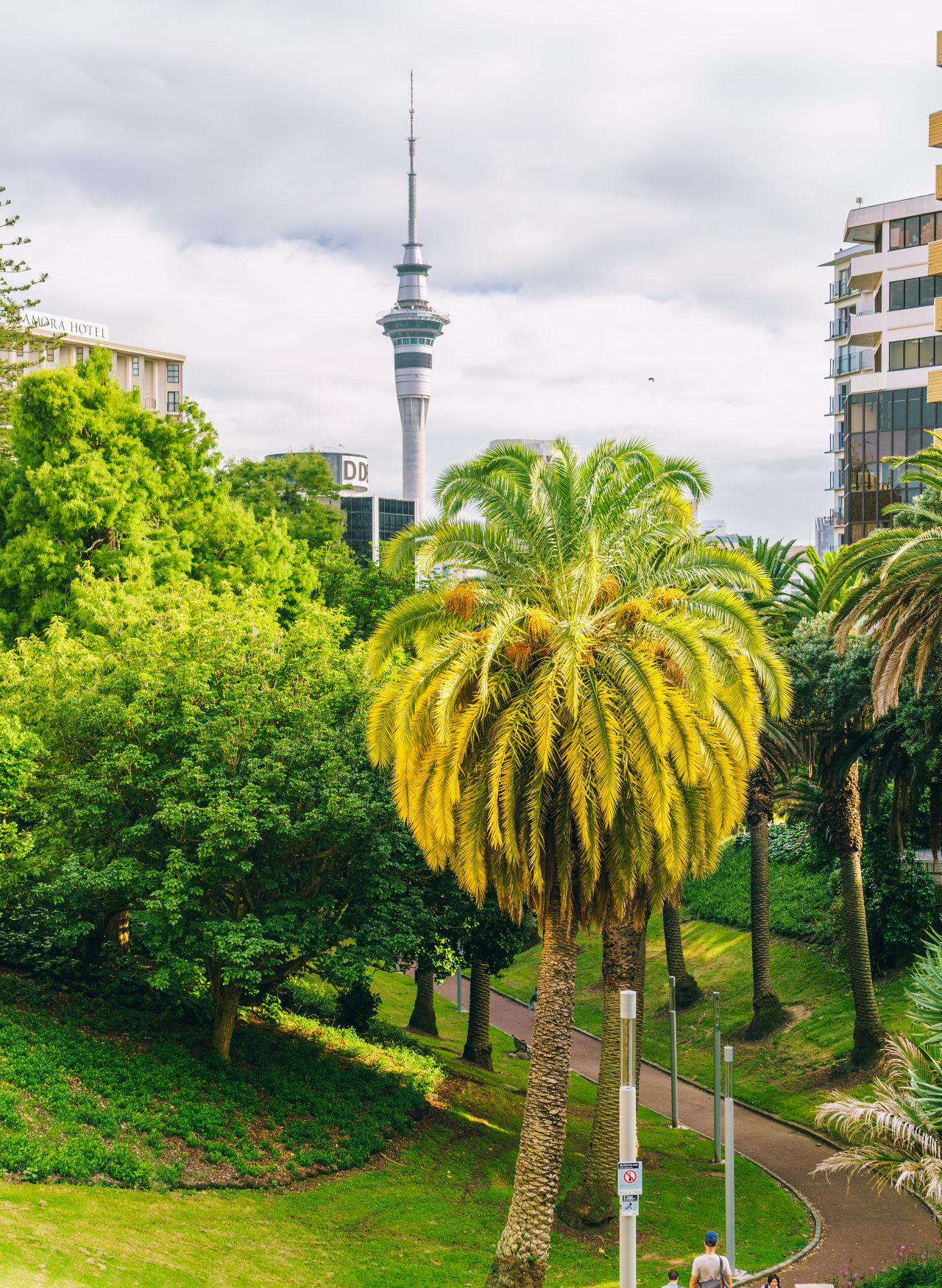
I wonder if somebody can make a wild guess which brand was used to take the photos in the latest new article with those disturbing greens:


I linked to the first set not to be accused of cherry picking.

Here is one of them:


copyright-paulstamatiou_com-DSC07541-1280.jpg
 

Keyboard shortcuts

Back
Top