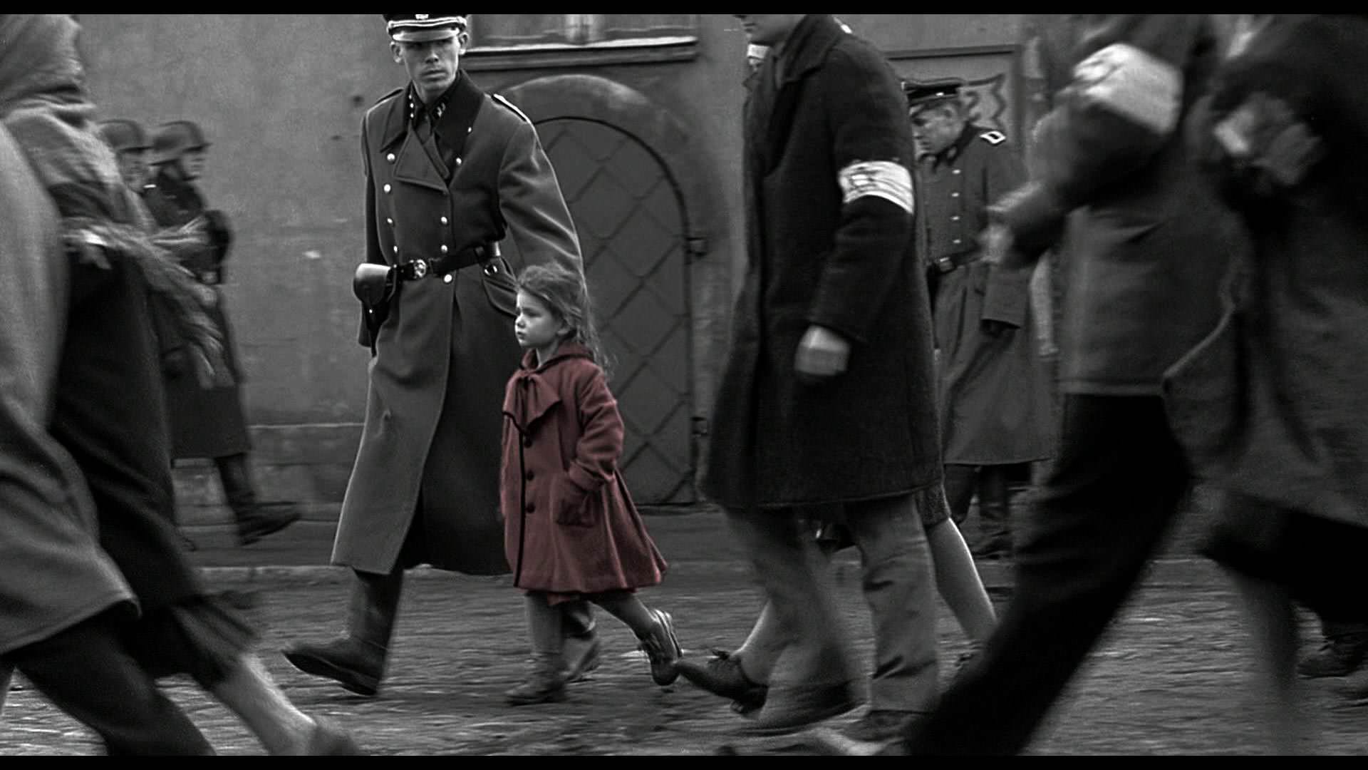
... my one of many and not shouldn't be considered any kind of arbiter of taste. I do graphic design as well as photography and I feel like selective color can work well in graphic kinds of situations where type might match the selective color in a photo. Without some kind of type or graphic element referencing it though, it comes off as rather gimmicky to me and I don't really care for the effect...
I will say though that I use a lot of B&W toning though, particularly a "split toning" effect where highlights are one tone and shadow detail is another (in my case highlights are generally sepia and shadows a deep blue). I try to use this effect subtly (with most of my stuff anyway) but nonetheless some people are bothered by it and will tell me that they'd rather see a more "pure" B&W treatment. To each their own... Everyone has a different idea of what works.
I will say though that I use a lot of B&W toning though, particularly a "split toning" effect where highlights are one tone and shadow detail is another (in my case highlights are generally sepia and shadows a deep blue). I try to use this effect subtly (with most of my stuff anyway) but nonetheless some people are bothered by it and will tell me that they'd rather see a more "pure" B&W treatment. To each their own... Everyone has a different idea of what works.


