MarkWW
Leading Member
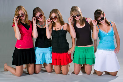
Cropped in the extreme out of deference to the model, who is quite lovely. We all know the Merrills are horrible at skin- they give a leathery look to even good looking skin.
We're starting from an OOC JPG with everything set to mid/default (sharpness, contrast, etc.) (anyone else have a problem with the DP3m where it says it's processing a file & keeps going for more than a minute? - well I had that happen to me, so I took out the battery and put it back in again & the camera was reset to JPG only, so I had no RAW files from a good portion of this shoot) that's been slightly processed in photoshop to adjust the color & contrast.
I was following along with a photoshop tutorial (on PHLEARN.com) that explains how to separate out the color data form the luminance data & then blur the color layer to even out skin tones, while still keeping texture. I thought - hey that sounds like a fun technique, let me try that. The results are below, a bit artificial looking, but it can be dialed back in photoshop.
Looking at the results I thought - wait, I've seen that look on skin before. A few weeks ago someone posted some photos of some surfers at the beach and I remember thinking that their skin looked simultaneously solid and textured, like a photoshopped Merrill.
And then it hit me. I'm blurring the color layer and adding in a luminance layer on top... This is Quattro.
Again, this is an extreme example with more blurring than the Quattro would do (and again I may dial it back before finalizing the image).

DP3m top, blurred color layer bottom.
Steps to reproduce in photoshop.
1. Copy your base layer & set a gaussian blur on it - not too much, just so that the details get smeared. Let's call this layer "Color".
2. Copy your base layer again and put it above the color layer. Now go to Image, Apply Image. Set the layer to the Color layer, the Blending mode to Subtract and the numbers below at 100%, 2, 128. Once you're done, set the blending mode to Linear Light. Let's call this layer Luma.
You now have a duplicate of your image with the colors blurred & the luma separated out. It should look identical to your original image. You've basically created a low pass layer (Color) and a hi pass layer (Luma), so it's not exactly the same as a Quattro, but the results are similar.
Right now you have a copy of your original image with two sets of data - color & luminance (or something approximating them). The next step is what makes it look like Quattro.
There's an action on the Phlearn website for this if this is too many steps to follow along.
3. Apply more blur to the bottom layer - either in patches (as you might for skin smoothing) or if you like, to the whole image. Again, just enough blur so that the details you wish you to smear get smeared.
What are you left with? It's Quattro.
This is a more extreme example with a lot more color blending going on than the Quattro does, but try it on a couple of your Merrill photos and let me know if you think the results look like Quattro.
Now I'm going to get back to editing this pic.
We're starting from an OOC JPG with everything set to mid/default (sharpness, contrast, etc.) (anyone else have a problem with the DP3m where it says it's processing a file & keeps going for more than a minute? - well I had that happen to me, so I took out the battery and put it back in again & the camera was reset to JPG only, so I had no RAW files from a good portion of this shoot) that's been slightly processed in photoshop to adjust the color & contrast.
I was following along with a photoshop tutorial (on PHLEARN.com) that explains how to separate out the color data form the luminance data & then blur the color layer to even out skin tones, while still keeping texture. I thought - hey that sounds like a fun technique, let me try that. The results are below, a bit artificial looking, but it can be dialed back in photoshop.
Looking at the results I thought - wait, I've seen that look on skin before. A few weeks ago someone posted some photos of some surfers at the beach and I remember thinking that their skin looked simultaneously solid and textured, like a photoshopped Merrill.
And then it hit me. I'm blurring the color layer and adding in a luminance layer on top... This is Quattro.
Again, this is an extreme example with more blurring than the Quattro would do (and again I may dial it back before finalizing the image).
DP3m top, blurred color layer bottom.
Steps to reproduce in photoshop.
1. Copy your base layer & set a gaussian blur on it - not too much, just so that the details get smeared. Let's call this layer "Color".
2. Copy your base layer again and put it above the color layer. Now go to Image, Apply Image. Set the layer to the Color layer, the Blending mode to Subtract and the numbers below at 100%, 2, 128. Once you're done, set the blending mode to Linear Light. Let's call this layer Luma.
You now have a duplicate of your image with the colors blurred & the luma separated out. It should look identical to your original image. You've basically created a low pass layer (Color) and a hi pass layer (Luma), so it's not exactly the same as a Quattro, but the results are similar.
Right now you have a copy of your original image with two sets of data - color & luminance (or something approximating them). The next step is what makes it look like Quattro.
There's an action on the Phlearn website for this if this is too many steps to follow along.
3. Apply more blur to the bottom layer - either in patches (as you might for skin smoothing) or if you like, to the whole image. Again, just enough blur so that the details you wish you to smear get smeared.
What are you left with? It's Quattro.
This is a more extreme example with a lot more color blending going on than the Quattro does, but try it on a couple of your Merrill photos and let me know if you think the results look like Quattro.
Now I'm going to get back to editing this pic.