I'm going to be less than polite, not at all diplomatic, and real straight...
You
can't fix those. They are a learning tool, not a bit of great art. Learn from them and go on to the next step.
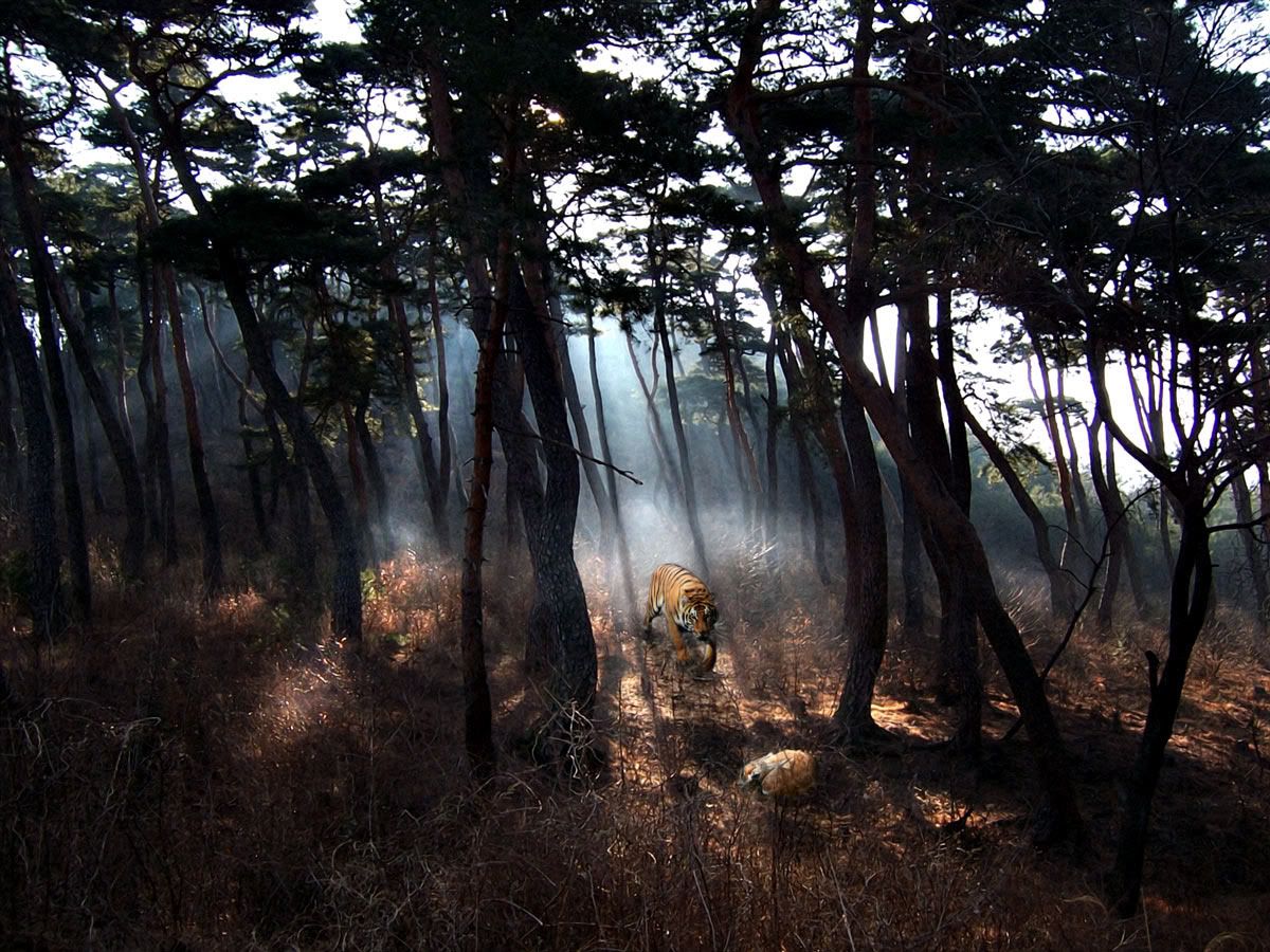
Why? Well, can you tell me what the subject of the photograph is? And then consider this quote, taken from Rudolf Arnheim's book "Entropy in Art" published in 1971.
- "When nothing superfluous is included and nothing indispensable left out, one can understand the interrelation of the whole and its parts, as well as the hierarchic scale of importance and power by which some structural features are dominant, others subordinate."
http://students.pratt.edu/~arch543p/readings/Arnheim.html
The problem that I see with your image is that it contains either way too much that is superfluous (pick out something in that picture, and photograph that instead of the composition as it is), or... it is missing something that is indispensable and was left out (perhaps a wider angle view? Or some way to emphasize to a much greater degree something, like the fog, that is there).
I am personally not into photographing that kind of scene, so I'm not sure I have any advice for a composition that will work. I can see why you wanted to capture it though! It must have been, and this does come through in the photographs, a very pretty scene. But there doesn't seem to be that "hierarchic scale of importance and power" apparent in the images. It needs something that a viewer's eye zeros in on.
") Could you please tell me some simple steps what to do with these photos?
Could you please tell me some simple steps what to do with these photos? 


")


 Grazie, Thank you, - Sal