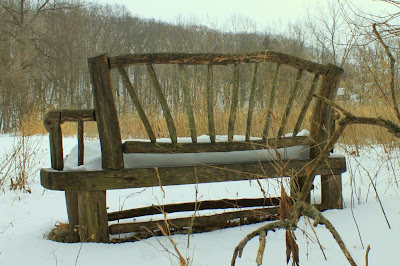
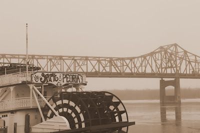
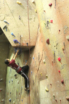
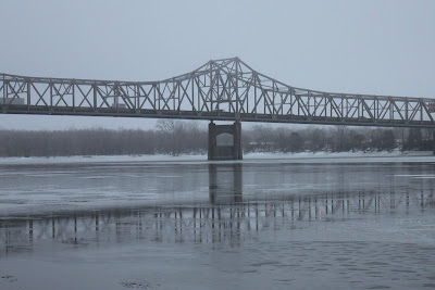
Ok, so my park bench photo wasn't grade A... here are 3 more I took recently... getting better, I hope/think!? Hey, at least I figured out how to embed images... baby steps my friends.
I didn't do a proper introduction. I'm a 30 year old female who is just learning photography beyond P&S. I love hiking but live in the midwest, so I dream via Backpacking magazine and at least one good hiking trip per year. I'm an engineer during the day but a musician and wanna be photographer at night. Look forward to posting here and learning from everyone!


I didn't do a proper introduction. I'm a 30 year old female who is just learning photography beyond P&S. I love hiking but live in the midwest, so I dream via Backpacking magazine and at least one good hiking trip per year. I'm an engineer during the day but a musician and wanna be photographer at night. Look forward to posting here and learning from everyone!
")
")