Reading mode:
Install the app
How to install the app on iOS
Follow along with the video below to see how to install our site as a web app on your home screen.
Note: This feature may not be available in some browsers.
-
Welcome to the new forums! Please read this first. For known issues we are working to resolve, click here.
You are using an out of date browser. It may not display this or other websites correctly.
You should upgrade or use an alternative browser.
You should upgrade or use an alternative browser.
Portraits for C&C
- Thread starter Ryon
- Start date


GO
Well-known member
First let me say great looking kids.
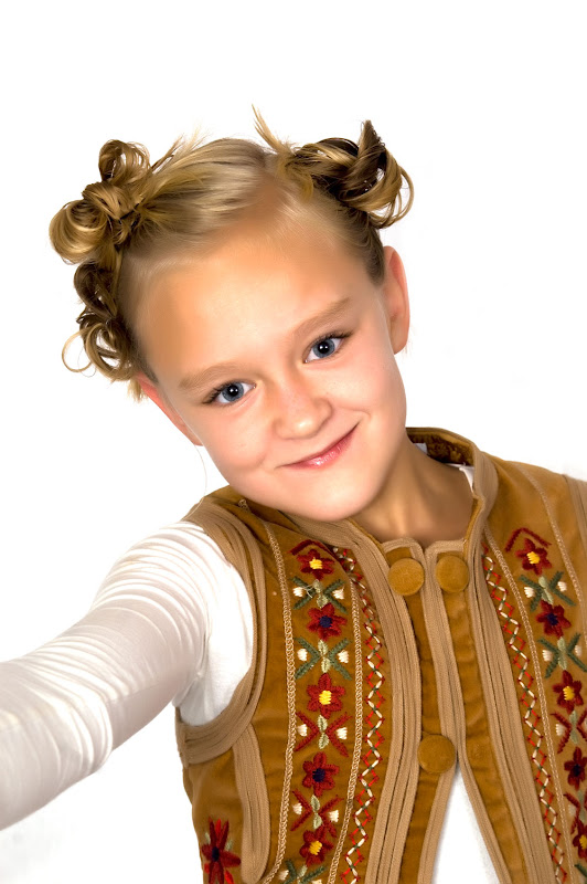
IMO just a little flat not much, also it looks like maybe about a 1/2 stop to much flash and even more on the girl (maybe 2/3 or so). Hope this helps a little.
Maybe Gene L. will see this and give you his view, he's a pretty good CC guy.
GO
IMO just a little flat not much, also it looks like maybe about a 1/2 stop to much flash and even more on the girl (maybe 2/3 or so). Hope this helps a little.
Maybe Gene L. will see this and give you his view, he's a pretty good CC guy.
GO
I like these. Is it my eyes or are the shots of the boy's eyes not completely sharp. The posed fist on chin is not my favourite pose. Other poses are nice and natural. Shot of girls is most interesting. Love the baby's smile and his hat. Thanks for sharing.
Jim Hammond
Senior Member
Kids are very cute, white seems bright enough. To me, these look a bit over processed- almost like a smudge. Highlights on the skin are a bit blown out and all skin texture is gone. If that's what you're after, then you nailed it. Everybody has different taste in processing so I'm sure you'll get a variety of responses. When using a polarizer, lots of folks want to crank as much blue in the sky as possible but sometimes moderation can work out better. Just because you can doesn't always mean that you should.
--
http://www.jhstudio.zenfolio.com
--
http://www.jhstudio.zenfolio.com
Lawrence Keeney
Veteran Member
I agree with Jim. The images look good to me except for the over processed skin.
--
http://www.blackcanyonsystems.com
--
Lawrence
--
http://www.blackcanyonsystems.com
--
Lawrence

")
Beautiful kids, of course. Nice expressions. Lots to like.
Two things jump out at me right away- both have already been noted in this thread. I am really wishing the eyes were in sharp focus. Second, very few young children need this much post processing. PP is, of course, a matter of personal taste. Do you feel the amount of PP truly enhances this set of images?
Regards,
-- Rob
nikond2000
Senior Member
Way to much processing done on these and blown out
Agree with the comments about too much noise reduction/smoothing.
Also, are all the light sources the same temperature? It kind of looks like maybe there is same white and tungsten light mixing together as the skin tones look warm, but the background does look whiite. Could just be the post processing that you did though.
Also, are all the light sources the same temperature? It kind of looks like maybe there is same white and tungsten light mixing together as the skin tones look warm, but the background does look whiite. Could just be the post processing that you did though.
Good looking passion killers!, my comments
- too much PP on their skin
- Need to increase overall ambient lighting in studio, It looks like the there was PP done on the overall background lighting to bring up the white.
- Need to increase overall ambient lighting in studio, part deux - While boosting ISO and opening up your lens increases the sensitivity and efficiency of the light, it has the side effect of opening up the pupil too much, and the catch lights look much more noticeable. The pupils in shots #1, #2, & #3 are just humongous.
- Need to balance their faces with some soft shadows, even lighting across the face will flatten them out.
RodneyBlair
Senior Member
The lighting looks good. The over processing of the skin and dark clothing on a white back ground are not the most effective.
Thanks for sharing!
Rodney Blair
Thanks for sharing!
Rodney Blair
RodneyBlair
Senior Member
It's good to see you are still participating, Lawrence!
Best regards,
Rodney
Best regards,
Rodney
Similar threads
- Replies
- 7
- Views
- 97
- Replies
- 1
- Views
- 554
- Replies
- 7
- Views
- 116
Keyboard shortcuts
- f
- Forum
About
Editorial content
Cameras & Lenses
All content, design, and layout are Copyright © 1998–2025 Digital Photography Review All Rights Reserved.
Reproduction in whole or part in any form or medium without specific written permission is prohibited.
When you use DPReview links to buy products, the site may earn a commission.
©GPS Media - Guides, Products, Services.
Reproduction in whole or part in any form or medium without specific written permission is prohibited.
When you use DPReview links to buy products, the site may earn a commission.
©GPS Media - Guides, Products, Services.