Olympus vs Panasonic Color: Blind Test

Left, left, left, although the #1 is much harder for me to call. Mainly the blue petals that have less of a reddish overcast on the left, and the paler yellows, which seem a bit cleaner.

Is there a way to get the center box (where the photos and text display) to appear wider in one's browser? (off topic, but I ended up needed to scroll back and forth)
 
Especially since I've advocated for a credible blind test several times, but there are few issues.
I agree it could be done better, but let's give it a try this way. Could be interesting!

--
-Amin
 
Olympus colo(u)r wins the day

The E-P1 was on the left in all three cases. GF1 on the right.

9 votes for E-P1 versus 17 for GF1 in the first image.
18 votes for E-P1 vs 8 for GF1 in the second image.
19 votes for E-P1 vs 7 for GF1 in the third image.

Obviously this was uncontrolled, doesn't account for all JPEG settings, isn't color managed (most people's browsers disregard color profile info and most people's displays are uncalibrated, etc) and may be totally irrelevant depending on which RAW converter you choose, but it was a fun poll to take!

Personally, I tend to prefer Olympus color to Panasonic color, in general, but I would have picked the Panny in 2 out of 3 of these!

--
-Amin
 
Brian, I don't know. I just used their Comparometer, which should have been done in a controlled way since that is the whole point of the Comparometer. I assume that they manually WB on the card for the outdoor shot (first), otherwise why include it?
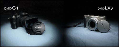
Are these all AWB? or did they do a manual white balance on the whibal?

Also, which jpeg settings did they use?

Cheers

Brian
--
Join our free worldwide support network here :
http://www.ukphotosafari.org/join-the-ukpsg/
UK, Peak District Local Olympus Safari Group : http://snipurl.com/bqtd7-ukpsg
Keep up with me here : http://twitter.com/alert_bri
--
-Amin
 
Sorry, my office computer is locked down (I can't install software), and I had very little to work with! Most people are still using color profile naive browsers, so take this all with a grain of salt!
But god damn, whats with the horrible jpeg compression. Did you use prntscrn + paint? lol
--
-Amin
 
--

'If you can imagine sharing a waterbed with a baboon that's just been doused in itching powder.' J.C. Reg. the suspension of the Lincoln Town Car '82
 
1. Difficult one. But I would say left based on colors (reds and greens) and smoother highlights.

2. Clearely left, based on reds (deeper and smoother). The reds look a bit blown out in the right one, but it's difficult to say at thei size.

2. Left again. The right image have a strong magenta cast
--
Cheers,

Frederic
http://azurphoto.com/blog/
I decided LLL, then saw your post. Agree with your comments.
 
Not really significant. Only first had big difference and it was due to exposure (right was darker, richer colors).

As I have written many times, jpegs are just a maker's choice, I bet if you use two different models from same maker the differences would show up as well. The really important thing is that the color separation at RAW level is not handicapped, then you can do anything in conversion.

--
Renato.
http://www.flickr.com/photos/rhlpedrosa/
OnExposure member
http://www.onexposure.net/

Good shooting and good luck
(after Ed Murrow)
 
1. Left
2. Right
3. Left

cheers
radix
 
Things are really close, and I wonder if the Panny shots being sharper swayed me a bit since I was a firm believer in the whole 'olympus colors' idea.
 

Keyboard shortcuts

Back
Top