** Weekly C & C Thread #61 ** Give as Good as You Get !!

rgmwa

Veteran Member
Messages
1,970
Reaction score
0
Location
Perth, Western Australia, AU
Inspired by the kindly folks over at the Olympus forum, who remind us that their thread is not camera specific!

So here's the idea:

· Use Threaded View for this thread

· Submit any photo for which you'd like comments and critique

· Post the photo you're submitting by replying to the main topic post. Make sure to change the subject heading to your photo's title...otherwise, it gets confusing fast!

· Once you post, you must give C & C for someone else! Otherwise, you'll be called out next week for posting without C & C. Make sure you reply to their thread to keep it all organized.

· This thread will stay active for 36 hours from the time of posting. At that point, the thread will be closed. A new thread will be started the following week. Comments can continue until dpreview shuts it metaphoric door.

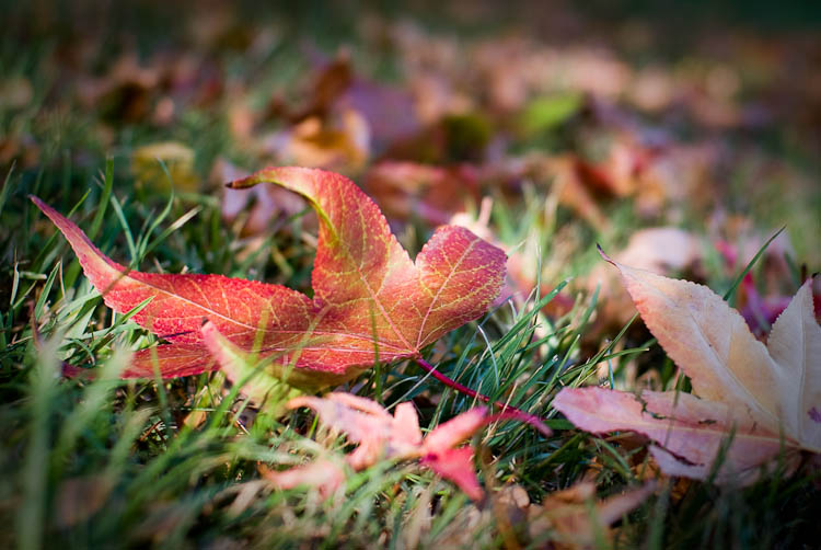
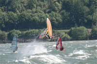
As for the C & C: This part is the most important. Please don't just say "Nice photo!" and leave it at that. Look at the photo. Figure out what you like and what you don't like. Tell what you would have done differently. Think about the exposure, the composition, the processing, the focal point. Be constructive, but be critical. This is the place to learn.

-- hide signature --
--
Robert
rgmwa
(Just minding the shop for our favourite Pentaxian)

 
Colors seem a little "harsh" to me.

It makes a nice B&W waterfront with a little added vignetting and aging for a view camera look.

H2
 
I'm not at all a good critic. Please take anything I say with a grain of salt.

An image might have something front and center (or not center) that grabs our attention. Another image might be an expansive landscape where the entire scene grabs our attention. Then there are images that land somewhere in the middle.

Your image, for example, has this rock front and center, but it's not filling the scene well enough (for me) to be the main focus. I keep wanting to look at it, but it's too distant to keep my attention, and it's overwhelmed by the busy scene directly behind it.

If I'm to take in the entire image, it's too tightly cropped and crowded for me. When I look at it this way I find myself unable to breathe. I have this feeling there is more, back there, somewhere, but you're not letting me see it.

What might work for me? Get lower and closer. Get sand on your elbows. Show me an angle that I won't see while standing on my feet. Give me both more of the interesting rock up front, and tease me with the rocks in the background disappearing into the distance.

T

--
In heavy rotation:

Kenny Burrell/Midnight Blue (vinyl)
Bill Evans Trio/Sunday at the Village Vanguard (vinyl)
Chet Atkins and Les Paul/Chester and Lester

GMT minus 7
http://www.gorgephotos.com/
http://www.pentaxphotogallery.com/terryalford

 
Taken while kayaking and wind and current makes shooting difficult.....I shoot and hope for the best.


--
Brian

 
It just goes to show ...

I like this for the things T dislikes: there has to be a lot more on the beach but you make me focus on this section. The rocks are crowded but the grass provides relief. Most of the view is selfcontained though the rocks at top right prove there is more to be seen - but the square crop prevents us seeing it.

--
Gerry


First camera 1953, first Pentax 1983, first DSLR 2006
http://www.pbase.com/gerrywinterbourne
 
Disclaimer: I am not a good critic.

I like the idea here, but this might be a case of less is more. Or should I say more is too much. I guess I'd like to see fewer elements. The fence is especially distracting for me. Show me what you want to show me with the fewest elements possible.

T
--
In heavy rotation:

Kenny Burrell/Midnight Blue (vinyl)
Bill Evans Trio/Sunday at the Village Vanguard (vinyl)
Chet Atkins and Les Paul/Chester and Lester

GMT minus 7
http://www.gorgephotos.com/
http://www.pentaxphotogallery.com/terryalford

 
I like this shot. A little dodging on the red leaf might be something to consider.

For some reason, I'm somewhat sensitive to out of focus foreground elements. The oof blades of grass are a bit distracting. But that's probably my problem.

T
--
In heavy rotation:

Kenny Burrell/Midnight Blue (vinyl)
Bill Evans Trio/Sunday at the Village Vanguard (vinyl)
Pink Martini/Sympathique (vinyl)

GMT minus 7
http://www.gorgephotos.com/
http://www.pentaxphotogallery.com/terryalford

 
I agree that the overall impression is a bit harsh. More important to me, though, is the fact that the horizon looks to be tilted by about 1 degree from L to R. Also, with so much cropped away top and bottom I think you shopuld correct perspective to avoid the buildings tilting inwards.

--
Gerry


First camera 1953, first Pentax 1983, first DSLR 2006
http://www.pbase.com/gerrywinterbourne
 
I like this shot. A little dodging on the red leaf might be something to consider.

For some reason, I'm somewhat sensitive to out of focus foreground elements. The oof blades of grass are a bit distracting. But that's probably my problem.
Ditto for me. I think I'd have either moved the leaf a bit or pulled some blades of grass up to give a clear view of it.

I do like the way the OOF leaves run away behind the subject.

--
Gerry


First camera 1953, first Pentax 1983, first DSLR 2006
http://www.pbase.com/gerrywinterbourne
 
This is a recent rejection from the PPG. Any thoughts or comments?

Shot with a 12-24 on the South Bank of the Thames, looking towards Canary Wharf as the sun was setting. PP in Lightroom. EXIF info should be intact.
I like it as is with the harsh colors/vignetting.

As far as rejection from PPG, probably too processed for them.

Eric
--
I never saw an ugly thing in my life: for let the form of an object
be what it may - light, shade, and perspective will always make it
beautiful. - John Constable (quote)

See my Blog at: http://viking79.blogspot.com/ (9/9/09)
Flickr Photostream: http://www.flickr.com/photos/28177041@N03/ (updated daily)
See my PPG Shots: http://www.pentaxphotogallery.com/erictastad (8/31/09)
 
Taken while kayaking and wind and current makes shooting difficult.....I shoot and hope for the best.
Nice shot. I like the simplicity and the soft look of the waves. I wouldn't mind the front edge of the leaf being a little sharper (it looks like the back edge of the leaf is more in focus).

Eric
--
I never saw an ugly thing in my life: for let the form of an object
be what it may - light, shade, and perspective will always make it
beautiful. - John Constable (quote)

See my Blog at: http://viking79.blogspot.com/ (9/9/09)
Flickr Photostream: http://www.flickr.com/photos/28177041@N03/ (updated daily)
See my PPG Shots: http://www.pentaxphotogallery.com/erictastad (8/31/09)
 
How about cropping, just to the left of the blob at the end of the pier, just to the right of the large block on the right side. And take some of the bottom away, maybe have the building tops be at or just below center.

The left quarter or fifth does nothing for me, almost as if it is another place, another photo tagging along for the ride. I wonder if this is because I do not know the location at all? That what this place is like for you, what you see and think is important there, is different than for someone like me with no relation to the actual place?
--
Dan Daniel
http://dandaniel.zenfolio.com/
WSSA #180PX
 
I like the simplicity of this, though I wonder if you haven't overdone the OOF effect. Maybe just one stop difference would have left the second post more distinct without being fully in focus. I also find it's too slightly tightly cropped on the left - just a little dark space to the left of the bolt would be enough.
--
John
 

Keyboard shortcuts

Back
Top