★ Wed C&C No Theme Thread 090923 - ed 76 ★

Roel,

first (in case you missed that post) a link to more photos from last Sunday:
http://forums.dpreview.com/forums/read.asp?forum=1022&message=33094304
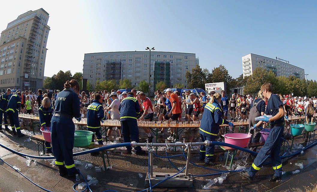
I ahd seen that series, and I even remember posting a comment. To me, the best image was the one with sunlit cups of water and splashing drops. I am certain I wrote that, but I notice now, following back your link in puzzlement, that for some bizarre reason it seems that my post got not registered by DPR.
Thanks for finding the word: detached. I like this photo because of the detail and the scene (looks great in the original size). But somehow I felt something odd and couldn't name it.

But, of course, I'm still strong with this photo...
Rightly so. But it is at its best as part of the series.
Cheers,

Claus.

--

... when the photograph annihilates itself as medium to be no longer a sign but the thing itself...

--
Roel Hendrickx

lots of images : http://www.roelh.zenfolio.com

my E-3 user field report from Tunisian Sahara: http://www.biofos.com/ukpsg/roel.html
 
Magnificent! I could only dream about getting a shot like that. Was that "sand fall" a natural thing, or did it have some help?

I seem to only be able to pick at nits on your shots, but there is a small bright diagonal line of the left edge that catches my eye. If you're doing a big print, would it be better to have cloned that out?

Keep it up - these are great.
--
-Mike
Success is a self-correcting phenomenon
 
Rapidly becoming one of my favorite spots, and I havent even been there!
--
Larry In Mystic Connecticut, USA
Equine Event shooter
Sometimes Wildlife shooter
Sometimes 'Street' Shooter
A clear conscience is usually the sign of a bad memory..

Nothing animal, mineral, or vegetable was harmed in the placing of this post
 
The angle of capture and the shade gave me nice back lit photograph of this little guy...just a little pp in Picasa to finalize the RAW file....taken with the E-520 + 70-300mm ZD...........

 
I absolutely adore that silhouette.

the only thing I can think of that would have improved on it, was if the bird would have been a bit farther away, showing his fine beak.

(Your shot reminds me that I need to process some images of dragonflies, also some backlit. Time. Time. Time...)

But I wonder about the corners. They look like you applied vignetting, but not with a rounded effect, but with almost straight lines cutting off the corners. While some moderate vignetting would work on this image, I don't really like the effect created here. Or was that something natural?

--
Roel Hendrickx

lots of images : http://www.roelh.zenfolio.com

my E-3 user field report from Tunisian Sahara: http://www.biofos.com/ukpsg/roel.html
 
Nice first effort. I agree with Bill's comment about the sky. That has always messed up my feeble efforts at panoramas. How did you find Hugin? Was it straightforward to use?

Another thought about composition, it feels to me that the people and cross at the far right are misplaced. If you had included more image to the right - enough that those people could be placed at about 1/3 of the way from the right edge, it could have been a stronger composition IMHO. As it is, they don't seem to participate in the story.

Just my $.02
--
-Mike
Success is a self-correcting phenomenon
 
This is a pic of a new suburb they're building next to my own residential area. I'll go shooting there some another day because it started pouring almost immediately after taking this pic, but would like to hear your comments. I know it might not be the most interesting in this world, but I think the site might make a nice series. There's couple of more pics in my Flickr photo stream
http://www.flickr.com/photos/14985843@N08/


Taken with EP-1 & 12-60 @ f/8
 
Great shot! The darkness gives a sense of foreboding, and yet the little girl doesn't look to be frightened. Sort of makes me want to shout out a warning.

I'd just be curious to see what you started with. Did you darken this significantly?
--
-Mike
Success is a self-correcting phenomenon
 
OK, I think I get what you were trying to do. But this particular shot doesn't bring to mind an abrupt change in the weather. The clouds aren't that dark, and I see no hint of rain, etc. Therefore the jagged line between monochrome and color seems not to fit. If it were mine, I'd try experimenting with a gradual desaturation through the middle of the photo to see if that gets the message across.

The tilted shore line bugs me, but that could just be me. :)
--
-Mike
Success is a self-correcting phenomenon
 
Good one. I agreed with Claus. One thing that someone on this forum pointed out to me - that you also might want to think about - camera position. It looks like you were standing up to take the shot. If you had kneeled down or sat down, you might have had enough of a different vantage point that this could have been more of a winner. It also might have given you the opportunity to frame out that shadow at the bottom.

Just a thought.
--
-Mike
Success is a self-correcting phenomenon
 
Simon - I like the colors, so I'll leave those comments for others to make. The stitching looks good, however it's a bit difficult to critique at this size. I understand that large image dimensions are difficult for online viewing, though.

In general, I never use 12mm for panoramas, especially on the 12-60mm. The reason is that there's so much curvature and distortion at 12mm that 1) it makes stitching difficult, and 2) it makes blending the exposures more difficult as well.

I almost always use 25mm as a standard for stitching panoramas, but each to his own. I would have really liked to see a bit lower on this panorama as well. I believe you mentioned this is a 4x1 pano (4 images in 1 row). I would really liked to have seen a 4x2 pano (2 rows of 4 images each), to give a better perspective.

For a first time pano, I think it's great and works really well. Here's a few tips to help speed up the stitching and blending (even if you're using automated software):

1) Use longer focal lengths if possible - this reduces distortion and makes rendering the pano much easier and faster, not to mention with better per-pixel image quality

2) Stop down whichever lense you use to about f/5.6-f/8.0. This reduces vignetting (which is most prevalent on every lense when wide open), which increases the quality of blending the exposures.

3) If you don't have a pano-head and tripod, don't bother with a ball head. I get equivalent or better stitches without using a ball-head tripod than with.

Great pano!
Pictures were taken in the french part of switzerland during a short walk in the alps. Pictures were taken with the E-510 and 12-60mm at 12mm and a polarizer.
--
Tim
'I haven't been everywhere, but it's on my list.'
E3/7-14/12-60/150/50-200/25/25/EC-14
http://www.flickr.com/photos/timskis6/
 
Claus A shared:


(E450 + FE8mm)
Claus I do like the Fisheye, that lens is probably my favourite one and this is as good a picture as any to show the greatness of this lens, and of course your ability to use it. It is an interesting image with lots happening and a fine documentary as to what is going on and as part of a series about the marathon it works really well, as a stand alone maybe not as well but I still like it...

--
Daniel
 
This is one of the best IR's you've posted! :D

--
-Mike
Success is a self-correcting phenomenon
 
I do like my waterfalls and this one is a really nice image, I like the dark tone which gives this image a very nice feel to it, nothing here to complain about really, well done...
--
Daniel
 
RoelHendrickx shared:
Roel, I like the angle here, it is very interesting. If it was a picture of mine however I would probably try to have a little more contrast, as this image is, I think it lacks a bit of contrast. Light and composition looks good though.

--
Daniel
 
The vignetting is actually the lens blurring of the fence hole from where I was shooting...I debated whether I should leave it or crop it; it's one of those where you like the effect and you kind of not....you know what I mean???...at any rate, let me post the version without the blur effect...Myself, I like the original image...


Here's also an image showing the little guy's beak....


I absolutely adore that silhouette.

the only thing I can think of that would have improved on it, was if the bird would have been a bit farther away, showing his fine beak.

(Your shot reminds me that I need to process some images of dragonflies, also some backlit. Time. Time. Time...)

But I wonder about the corners. They look like you applied vignetting, but not with a rounded effect, but with almost straight lines cutting off the corners. While some moderate vignetting would work on this image, I don't really like the effect created here. Or was that something natural?

--
Roel Hendrickx

lots of images : http://www.roelh.zenfolio.com

my E-3 user field report from Tunisian Sahara: http://www.biofos.com/ukpsg/roel.html
 
I personally like both of these better than the original. Just a matter of personal taste. For a silhouette, I like to be able to see the beak. It helps define the bird better, I think.
The vignetting is actually the lens blurring of the fence hole from where I was shooting...I debated whether I should leave it or crop it; it's one of those where you like the effect and you kind of not....you know what I mean???...at any rate, let me post the version without the blur effect...Myself, I like the original image...


Here's also an image showing the little guy's beak....

--
-Mike
Success is a self-correcting phenomenon
 

Keyboard shortcuts

Back
Top