FA31: Triptych in the fields (4imgs)

Ishpuini

Veteran Member
Messages
6,226
Solutions
3
Reaction score
202
Location
Antwerp, BE
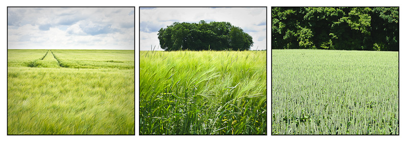
I visited the French Champagne area again a few weeks ago. This is a recurring annual trip for my wife and I as we go restock our cellar. ;-)

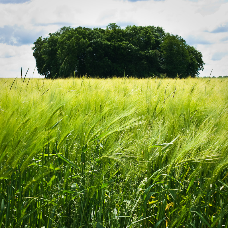
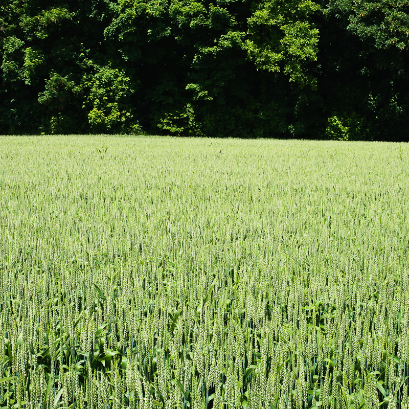
I shot this triptych in the fields near the place we always stay. No vines, just wheat/barley/?? fields.


All three images were shot with the FA31/1.8 limited on my K20D. It had been a while since I used the FA31 (using the DA21 and FA43 combo more recently), but I'm happy I did this time. I hope it will balance out as nicely on the K-7 as it does in the K20D.

Here are the individual images:


Comments are welcome!

Wim

--
Belgium, GMT+1

 
I like the idea and the pictures.

I would say however I find the third one lacking in punch, maybe more contrast or colour in the lower part of the frame.

As a triptych, i would also move the first one to the middle. The second two photos have a dark/light element that the first doesn't have and i think if it was in the middle it would make the three more balanced ?
--
Peter Schluter

http://www.flickr.com/photos/peter_schluter/

 
I like the idea and the pictures.
Thanks Peter!
I would say however I find the third one lacking in punch, maybe more
contrast or colour in the lower part of the frame.
Indeed, the other two have a point that attracts the attention that this one lacks. But I feel it works as a complement to the other two, even if it doesn't work as well as an individual image.
As a triptych, i would also move the first one to the middle. The
second two photos have a dark/light element that the first doesn't
have and i think if it was in the middle it would make the three more
balanced ?
Good idea. I'm not sure I tried other combinations when I made the composite 10 days ago, but this happens the be the order I shot the images in so it could be I didn't. I just tried your suggestion but didn't really feel that it worked better. I think I still prefer the order as presented. But tastes differ... ;-)

Wim

--
Belgium, GMT+1

 
Great work ! The triptych is really nice, but I absolutely love the first shot on its own. The OOF/blurred foreground, the tracks in the middle, and the cloudy sky all just combine in something extremely pleasing to my eyes.
 
Ahh, only now I understand your comment on my barley pics fully! Missed this before.

The first two show definitely barley, the third one doesn't.

The first one is my favourite, I can sort of feel the field looking at it. The last one has amazing detail. Good use of the FA31!
--
Phil

GMT +1
http://picturesandstories.blogspot.com
 
Very, very nice. They work far better as a series than separately.
Like the pavements ones in this thread from BrentIris

http://forums.dpreview.com/forums/readflat.asp?forum=1036&thread=32151342
Thanks Paul,

I hadn't seen that thread. Indeed, images in series often work differently that presented individually. Often a series can become very suggestive, even completely unrelated images can sometimes tell a story just by putting them together.

Wim

--
Belgium, GMT+1

 
Great work ! The triptych is really nice, but I absolutely love the
first shot on its own. The OOF/blurred foreground, the tracks in the
middle, and the cloudy sky all just combine in something extremely
pleasing to my eyes.
Thanks!

The first one is a favourite indeed, and it took some walking to and fro to get the lines exactly as I wanted them. Glad you like it!

Wim

--
Belgium, GMT+1

 
Very nice, mate. I particularly like the first shot! Nice composition.
Thanks mate! For some reason I personally prefer the second, but the first one is a very close second for me.

Wim

--
Belgium, GMT+1

 
--
Belgium, GMT+1

 
Ahh, only now I understand your comment on my barley pics fully!
Missed this before.
Hehe, indeed. It was your images that made me remember to post these actually. I had uploaded them onto my gallery close after shooting them, but hadn't gotten round to posting yet.
The first two show definitely barley, the third one doesn't.
Thanks for pointing out. I believe the third one is wheat, at least that was what I was told by a friend walking with us.
The first one is my favourite, I can sort of feel the field looking
at it. The last one has amazing detail. Good use of the FA31!
Thanks Phil! As I wrote I personally prefer the second one, but it seems the first one does connect to people more. Goes to show that being too involved in the process of making the images does cloud our judgement...

And that FA31... it will remain one of Pentax's best lenses. I just have to remember to use it frequently enough. Perhaps I'm too spoilt in having the more compact FA43 as well...

Wim

--
Belgium, GMT+1

 
I like it a lot, got to try this with some of my old landscape series.

But imho it feels a little bit unbalanced with the two first images showing the sky and then the last one showing just the forest. Hmm, but then you have the theme with only sky - some trees - only trees...

Btw I also think it would look great as a b&w image.

--
Regards,
Johan - Swe

http://dickensurl.com/4613/Whatever_was_required_to_be_done_the_Circumlocution_Office_was_beforehand_with_all_the_public_departments_in_the_art_of_perceiving__HOW_NOT_TO_DO_IT
 
Beautiful shots, Wim! I love the first one, like many others--it is
very atmospheric and peaceful. But the triptych is great! Looks
like a nice trip, too. Cindy
Thanks Cindy!

The Champagne area is one of France's many beautiful regions. Landscape, climate and of course the Champagne wine! Us Belgians are fortunate to have this beautiful area only 3 hours driving away.

Wim

--
Belgium, GMT+1

 
I like it a lot, got to try this with some of my old landscape series.
Thanks Johan!
But imho it feels a little bit unbalanced with the two first images
showing the sky and then the last one showing just the forest. Hmm,
but then you have the theme with only sky - some trees - only trees...
That was the idea indeed. But I see what you mean with the unbalanced feeling. I'll be continuing this project of agriculturescapes, so I'll probably find other images that may suit the series better...
Btw I also think it would look great as a b&w image.
I tried it in B&W, but in this particular case the colours added considerably to the atmosphere.

Wim

--
Belgium, GMT+1


Keyboard shortcuts

Back
Top