Going back to the E-400...

This is brilliant - objective conformation of what I've always thought. Well done!

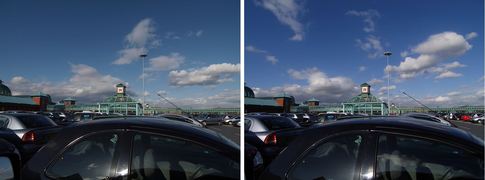
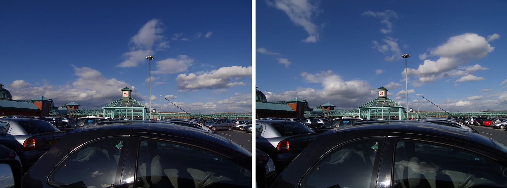
Interestingly, to me the Panny cameras have better saturated colours - I don't see an obvious green tint to the E-330 images, but to my eyes, it and the E-510 have better saturation than the Kodak cameras.

It's also good to see the E-330 confirmed as the low noise champ, as I always thought, and it also good to see that the 5MP E-1 really does fall significantly short on resolution, with the jump from 7.5/8 to 10 MP being much less significant - also just as I thought.
 
Once again, you are dealing with the different RAW conversion profiles here (which as Roberts says emulate the camera's JPEG engine), not the sensors.

You really need to try an E-330. It has the original "Kodak style" conversion profiles, and I'm sure you'll find it produces more "Kodak like" colour than the later Panny sensored cameras, even though the E-330 itself has a Panny sensor.
 
To my eyes the E-330 is the clear winner on highlight recovery as well (as long as the highlights are only slightly blown as per the first set of samples - otherwise they're all pretty much a dead loss). So as the low noise champ and the highlight range champ, it is also therefore clearly the DR champ. Once again, just as I'd always thought.

BTW, I can see the slight "green tinge" more clearly in the highlight recovery samples, but to me it looks more natural! The skies produced by the E330 are just lovely. Also, the E-510 has it too (relative to the Kodak cameras), just to a lesser extent.

It would be great if you could run the same tests on the E-3 and E-30 to see how they stack up!
 
That's right - it isn't the sesnor per se (as Robert's tests show), it is the version 1 conversion profiles (which are also used by the Panny sensored E-330) versus the version 2 profiles (used from the E-410 onwards).

Thing is, I'm not convinced the colour really is more accurate in the version 2 engine. The version 2 cameras also have a lot less chroma noise -I suspect the loss of saturation has something to do with this (nudging it more toward Canon colour).
That Olympus decided to go more 'colour accurate' with the later
Panasonic sensor cams... I think it must be a choice in colour
profiling. I just wish that there was a 'kodak' colour option in
Studio for those of us who like the old style also.

Kind Regards

Brian
--
Join our free worldwide support network here :
http://www.ukphotosafari.org/join-the-ukpsg/

UK, Peak District Local Olympus Safari Group :
http://snipurl.com/bqtd7-ukpsg
 
Around the time the E-410/510 came out, a Japanese photography magazine noted the difference between the Panasonic and Kodak images. They said the Kodak blues were darker and contained more red.

Based on that, I sometimes rework my Panny images to play up the blues. Brian, I hope you don't mind, but I applied the same principles to your shot. First your originals, Panasonic on the left, Kodak on the right (you may want to zoom out to view):


I took the left-hand shot and in Saturation/Hue I went to the blue channel and darkened it a bit (5-10%?), increased the saturation (5-10%?), and moved the slider a little toward the red side (3-4%?). Then I did the same thing for the cyan channel. Then I opened up levels and added a touch of magenta to the whole picture (2-3%). Here's the result, again, Panny on the left, Kodak on the right:


I didn't spend a lot of time on this, so they're not perfectly matched, but they look pretty close to me. I only concerned myself with the blue sky, but I suppose you could add a bit of yellow overall and get an even closer match.

This is an animated GIF showing the Panny shot before and after:


If you want me to take down these reworked images, I'll do so ASAP.

Julie
 
It's surprising how different the skies are... and your adjustment brings them much closer. Well done, and thanks for taking the time to put up the demo.

I suspect that, boosting certain colour channels will cause clipping at lower exposure levels... but at least you've shown the earlier colour profile can be approximated in the later cameras.

I will request a v1 profile option for in-cam jpegs/Studio for future cams.

Kind Regards

Brian
--
Join our free worldwide support network here :
http://www.ukphotosafari.org/join-the-ukpsg/

UK, Peak District Local Olympus Safari Group : http://snipurl.com/bqtd7-ukpsg
 
Nice work Julie. Your post shows what many of us realized a long time ago, there is no such thing as Olympus (= Kodak CCD) colours. While Kodak colours out of the camera with default settings may be different to Panasonic, they are perfectly replicable if one is interested to spend time on it. I bet you if you had access to the raw files and really wanted to then you could have created identical images fooling the eyes of anyone on this forum and probably elsewhere as well. Even with the small effort and the very limited possibilities the small JPEGs gave you you did an excellent job.
--
http://www.olyflyer.blogspot.com/
 
Once again, I'm surprised that you think a single image can prove anything.

It's not that simple imho. The differences in image character are more than a few tweaks on colour channel saturation... although Julie has shown that a single image can be tweaked given a genuine Kodak image to copy, to approximate closely enough for the casual observer.

Kind Regards

Brian
--
Join our free worldwide support network here :
http://www.ukphotosafari.org/join-the-ukpsg/

UK, Peak District Local Olympus Safari Group : http://snipurl.com/bqtd7-ukpsg
 
reminds me of what I saw on the Fuji F810 compared to the S3/S5 Pro. It's very similar and yet a P&S with a completely different sensor (not even an SR variant).

That said, I am inclined to think that there may be some characteristics on "edge conditions" - like if a camera handles uniform channel clipping (or worse) better, and also how the sensor reacts to blooming and its nominal noise characteristics.

--
Raist3d (Photographer & Tools/Systems/Gui Games Developer)
Andreas Feininger (1906-1999) 'Photographers — idiots, of which there are
so many — say, “Oh, if only I had a Nikon or a Leica, I could make great
photographs.” That’s the dumbest thing I ever heard in my life. It’s
nothing but a matter of seeing, and thinking, and interest. That’s what
makes a good photograph.'
 
First of all, let me blow up the "jpg emulation" myth. Here are some photos taken with the E1 and the E3. They were shot in manual in Raw and then had the exact same settings put on them in Studio. Can you tell the difference?


And this was the first point missed. Even though he posted an attempt at a blatant example, Brian said the difference was subtle.

The fact is, the dies on the sensors create a different colour profile and no matter what your software is doing, there will be subtle colour differences between cameras. Kodak spends a fortune developing their dies and is one reason why they're a leader in medium format sensors.

Sometimes, the difference is not so subtle. If anyone has had an E1 they will tell you it has a unique response to red.

So here are E1 v E400 v E3.


If you have a properly calibrated monitor, the E1 will jump out at you. Anyone who has used an E1 in earnest will tell you that no matter what RAW developer you use, it has a unique red response.

So ...
I'm currently shooting the E-400 alongside the E-30, and the extra
couple of megapixels are certainly delivering beautiful extra detail
with the ZD 50 macro and ZD 11-22 at f4...
No doubt.
What the CCD delivers though, is a subtly different and more pleasing
colour character... which I'm seeing particularly in blues and reds.
Yes. And even more interestingly, it offers more colour detail. But the differences are subtle and you have to look at them carefully to see it.
At the end of the day, things are close enough not to worry either
way when you have such exceptional glass to use, and good quality
light!
Absolutely.

--
Seeing is believing.
 
Hi all, I'm an italian beginner and I have an E400.
Thanks to all: I learned really much from this discussion!
Great post.
Luca
 
Its colour response is more like the Kodak sensored models than the later Panny sensored ones.

Before anyone tries to say that the colour differences we see here are due to the sensor, please get your hands on an E-330 and compare. Then see what you think.
 
please get your hands on an E-330 and compare.
Then see what you think.
I've never seen two different makes of sensor have the same colour response, but I'll be glad to test them. I'll see what I can do about either borrowing an E330 or getting someone else to test.

As you say, I can't say if I've never used an E330.

--
Seeing is believing.
 
Sorry for the results, I must learn.
I love my E400 even if I'm thinking for moving to E620.
ciao

Mountains around Cortina: Tofana I


The three Tofanas: I, II and III: Rozes, Middle, Inside

 
Once again, I'm surprised that you think a single image can prove
anything.

It's not that simple imho. The differences in image character are
more than a few tweaks on colour channel saturation... although Julie
has shown that a single image can be tweaked given a genuine Kodak
image to copy, to approximate closely enough for the casual observer.
Honestly Brian, it doesn't matter to me since I don't miss the Kodak CCD at all and I am perfectly happy with the Panasonic. The only thing I'd like to get is better high ISO without detail loss, but that was not really what Kodak was known for, so all in all, I think everything is better now, even the high ISO images.

If I wanted, I bet you I could produce those Kodak colours, not just from one image, but from any images. Of course, the comparision must be made in similar images, like in yours, which you don't accept as proof, yet you throw them in as examples once again, just like image number one in this thread.
--
http://www.olyflyer.blogspot.com/
 
I've e-mailed you a version adjusted to enhance the colour and
contrast, using Lightzone. It's a spectacular shot.

Thanks for sharing.

Kind Regards

Brian
--
Join our free worldwide support network here :
http://www.ukphotosafari.org/join-the-ukpsg/

UK, Peak District Local Olympus Safari Group :
http://snipurl.com/bqtd7-ukpsg
Thank you very much Brian, you are very kind, but in my opinion, as I wrote, I had to put a bit down the camera!
Unfortunately I use it only during my trekkings, a few times every year.
 
Hi Brian!

On the other hand, you were so sure that you could show the whole difference by using the exactly same image until your "small theory" backfired on you. :-)

Regards
Haris
Once again, I'm surprised that you think a single image can prove
anything.

It's not that simple imho. The differences in image character are
more than a few tweaks on colour channel saturation... although Julie
has shown that a single image can be tweaked given a genuine Kodak
image to copy, to approximate closely enough for the casual observer.

Kind Regards

Brian
--
Join our free worldwide support network here :
http://www.ukphotosafari.org/join-the-ukpsg/

UK, Peak District Local Olympus Safari Group :
http://snipurl.com/bqtd7-ukpsg
 

Keyboard shortcuts

Back
Top