It's getting loud in here!! ( 2 imgs) FZ50

That's a nice, fine grain application that definitely gives a
film-like look. The only thing I would try is taking out the color
noise and see if that makes it even more film-like. I like the
experiment. It has its uses when looking for a certain mood.
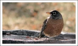
Thanks Marriott. I was looking for an almost "stippled" effect, I wanted a texture to it. I think it can be used in certain situations for mood, but also to add texture..or at least that is was what I was aiming for. II will try the colorless application to see how that looks. Thanks for the suggestion, I always appreciate your input, and always nice to hear from you !

Robin-Lee
 
These are very pleasing.

The texture/grain/noise works perfectly with organic material such as
earthenware. I'm not sure #1 isn't woodenware, though. An
intriguing aspect of #1 is that the large item looks almost flat, as
if it were a disk, but the shadow tells the story. Or does it? This
is an instance where visual dissonance intrigues the eye. Apparent
simplicity gives way when one begins to contemplate placing the small
object atop the larger. I very much like the slightest touching of
the shadows of the two items. This is a wonderfully subtle yet
powerful way to state a relationship. Mystery is intensified by
floating the objects on the rust background; there is no clue to
their actual size. I am free to wonder. Excellent!
The vessel in the 1st. is actually pottery. I'm glad you liked this, and you see what I was trying to accomplish! Thanks!!
In #2, a propped-up position introduces into a pottery study an
unexpected element of tension. This technique beautifully exploits
the crazed interior. That rich blue/blue-green is the star of this
earth-tone show. I feel slightly cheated by the close crop on this
picture; more shadow revealed--even more "air" all 'round the
bowl--would be welcome. This bowl is plenty strong enough to draw me
in; this crop makes me feel a bit I'm being pushed, rather than
invited, into the bowl's personal space. The background in two
colors forms a straight-line counterpoint to the bowl's curves. The
addition of a squiggly (pulled wire from a spiral notebook?) to this,
the sole straight line in the composition, is a clever bit of whimsy.
Again, there is no cue to scale, which provides space for imagination
to play.
I agree with you about the tight crop... My background didn't allow for more space, though I could have shot further out, or cloned in some background.
The warm tones of these pictures, and the materials of the subjects,
suggest that these items could be enjoyably handled, an inviting
prospect.

I think I take from these a fresh awareness of the benefits of
uncluttered composition. I admire your patience and planning prior
to the shutter button moment.
Thank you so much for taking the time to explain how these images made you feel. I am thrilled they did for you what I was trying to express. Thank you so much! ~ Robin-Lee
 
Robin-Lee

Sheesh! If that stuff floats your boat, you'd love an FZ30... Just minus the EV some, when no minus would otherwise be needed & it'll be ingrained to great artistic heights.... Bet it would cut your noise adding PP time in half....

Thanks for the tip! LOL!

Robin-Lee :O)


'Keep a song in your heart & a camera in your hands'
 
These are very pleasing.

The texture/grain/noise works perfectly with organic material such as
earthenware. I'm not sure #1 isn't woodenware, though. An
intriguing aspect of #1 is that the large item looks almost flat, as
if it were a disk, but the shadow tells the story. Or does it? This
is an instance where visual dissonance intrigues the eye. Apparent
simplicity gives way when one begins to contemplate placing the small
object atop the larger. I very much like the slightest touching of
the shadows of the two items. This is a wonderfully subtle yet
powerful way to state a relationship. Mystery is intensified by
floating the objects on the rust background; there is no clue to
their actual size. I am free to wonder. Excellent!
The vessel in #1 is also pottery. Thanks so much Don, glad you can see what I was trying to accomplish!
In #2, a propped-up position introduces into a pottery study an
unexpected element of tension. This technique beautifully exploits
the crazed interior. That rich blue/blue-green is the star of this
earth-tone show. I feel slightly cheated by the close crop on this
picture; more shadow revealed--even more "air" all 'round the
bowl--would be welcome. This bowl is plenty strong enough to draw me
in; this crop makes me feel a bit I'm being pushed, rather than
invited, into the bowl's personal space. The background in two
colors forms a straight-line counterpoint to the bowl's curves. The
addition of a squiggly (pulled wire from a spiral notebook?) to this,
the sole straight line in the composition, is a clever bit of whimsy.
Again, there is no cue to scale, which provides space for imagination
to play.
I agree with you about the crop. My background didn't allow for enough space which would have been preferred. I could have shot it further out and cloned in some backgroungd, though I would have preferred more background.
The warm tones of these pictures, and the materials of the subjects,
suggest that these items could be enjoyably handled, an inviting
prospect.

I think I take from these a fresh awareness of the benefits of
uncluttered composition. I admire your patience and planning prior
to the shutter button moment.
Thank you so much for taking the time to explain how these made you feel! I'm glad you saw what I was trying to express in these! Always appreciate your comments and input! ~ Robin-Lee
 
HELLO!!! Don't fix it - add it! Who would have thought grainy
pictures can look this good! It almost appears they've been printed
on leather. Yes, I like the effect, applied to a chosen few it does
add to your repertoire as a photographer. I think you chose very
suitable subjects, too, I for one enjoyed your foray into pumped-up
volume.
LOL!! you have such a wonderful way with words..and always make me smile!!

Hey, what can I say..noise happens! This time on purpose for purpose! Glad you like them.
(I shall dig up a few of my less-than-perfect shots and try to post
them as "artsy"). Great idea!
I'm looking forward to them Ella!!!
Thanks so much, I'm always thrilled to see your post!! :O)
Robin-Lee
--
Cheers, Ella
(effzed 30)

FZ30

 
Hello everyone, I'm just curious how Image #1 would be in B/W, I like
the way the pottery in #2 showed just enough grain, so as to appear
natural on the outside.
Thanks Gene...I was curious too, and did a quick conversion, but I really thought the warm tones worked best in this particular image. Thanks for stopping in and for your comments!
Robin-Lee :O)
All in all a very good set.
Gene in Florida.
zed50 olytc17
 
Maybe because of all this noise! I know these won't be everyone's
cup-o-tea,
See previous thread:

http://forums.dpreview.com/forums/readflat.asp?forum=1018&thread=23833807
Thanks for the link! I'll check it out!
Example (Larry Berman):


Robin-Lee, how did you exaggerate the noise (other than using an
FZ30, or my FZ8!)? How can we make it more extreme?
I did it in PP. The shots were actually taken in decent light, so I had to add the grain.
Other Forums will think it hilarious that the Panasonic Forum is
trying to generate noise ... like eskimos trying to develop ice ...
LOL!! Well. I'm not sure the forum is looking to generate noise, but I sure think it's a pretty good tool on occasion!
Thanks bunches Mike! 'Robin-Lee
Mike

Mike
 
Very nice, Robin-Lee. These really push the line between photography and drawing. Imagine, something people are always trying to avoid, and how it can add to a photo. I remember how grain in film photography was not such a big deal, it would often add to the photo, not distract from it. Boy, how we have gotten spoiled in this high definition world.
Excellent shots.
Daniel
--
http://danielsonkin.smugmug.com/
 
Hi Daniel, I'm so glad you like them! I'm always trying something! I was happy with them!

I just left your galleries, and I have to tell you I was delighted! There are so many there to love! Horse reflection in a galvanized water bucket. The Norway-Fjord refelction shots are just some of the best reflection shots I've seen! Too many to mention, but it was a treat to visit..and full of inspiration!

Thanks so much for taking a peek..I'll be a happy camper whem my images make me as happy as yours did LOL!!

Robin-Lee
Very nice, Robin-Lee. These really push the line between photography
and drawing. Imagine, something people are always trying to avoid,
and how it can add to a photo. I remember how grain in film
photography was not such a big deal, it would often add to the photo,
not distract from it. Boy, how we have gotten spoiled in this high
definition world.
Excellent shots.
Daniel
--
http://danielsonkin.smugmug.com/
--

Robin-Lee :O)


'Keep a song in your heart & a camera in your hands'
 
...without all the noise each time a new camera is announced... ha!

Looks like both would make fine prints. :)
Maybe because of all this noise! I know these won't be everyone's
cup-o-tea, but after reading about noise/grain and how it can make
"certain" images, I thought I'd try it to the extreme! I was aiming
for more of an "art" type photograph. I'm trying to learn to
appreciate noise/grain...and applied it to a couple of shots I
thought it might work with. If you prefer earplugs, I'll understand.
:O)


Robin-Lee


'Keep a song in your heart & a camera in your hands'
--


Regards,
Kirwin
http://timebandit.smugmug.com
 
and I agree with ya!!

Thanks for posting this image..I like it, you did what you set out to do, and I love the mood!

Robin-Lee
There's a film grain effect there that's very artsy. It's when I
can't control noise that I don't like it, but under control- or
noise you can justify as the desired effect- can be great.
--I added film grain effect to the shot below of Liberty Island and
Ellis Island to make it look like an old post card.


Kelly M

--

Robin-Lee :O)


'Keep a song in your heart & a camera in your hands'
 
Nope... This is the first time, but I'm glad you did. 'Wags' is not my dog. He's a mascot for a Rat Terrier club. He's been a great avatar for me these last few years. You've probably seen my lil' ratty... Skip. I've only posted him several hundred times on this forum... heh! Take care.


--


Regards,
Kirwin
http://timebandit.smugmug.com
 
Very creative Robin-Lee. I used to do things like this in the good old film days. The grainier the better.

--
Best regards,

Andy

FCAS Member/Masters Category
Pbase Supporter

 
For me, the relative position of the foreground "lid" (?) directly "below" the large ceramic's black top piece has profound effect in the composition. The two black elements combine to establish a bold vertical component, which always suggests strength, as does black. Moreover, the eye cannot resist connecting the two black pieces, and in a kind of domino effect, the mind then ponders whether there would be a fit. This would be the beginning of consideration of actual handling of the items, and supposing about the heft, surface textures, etc.

It's interesting that a still life superbly done can reveal so much about how one experiences the physical world, and by extension, determines what is "true."

There is a bit of magic in this picture. I will not be surprised to learn more from it tomorrow. Or next week.

Don
 
tell me robin, is any of this noise directly off the camera sensor or was it all added in post processing?

Its very well done as everyone else has commented and ads a lot of character to the image.

The pallette is also really sublime. How much of the color pallette was determined by your lighting vs. how much was came from your post processing emphasis?

Bravo either way, but Im curious to learn about your still life methodology.

thanks for sharing
kirk
 
Those are some great images! One thing I've noticed personally in conducting some low-light tests is that, when shooting RAW with the FZ50 and then using a de-noising program, what I end up with is more along the lines of film grain than blotchy noise. I'm not sure how much of your noise was added in PP or came from the camera ;-)
 
Very creative! Aside from documentation, isn't that what photography is all about? I really like #1. Looks like a painting -- but not in the sense that people talk about the Venus engine -- it really looks like a still-life painting! Excellent.

--
JF


Keyboard shortcuts

Back
Top