Larry Berman
Senior Member
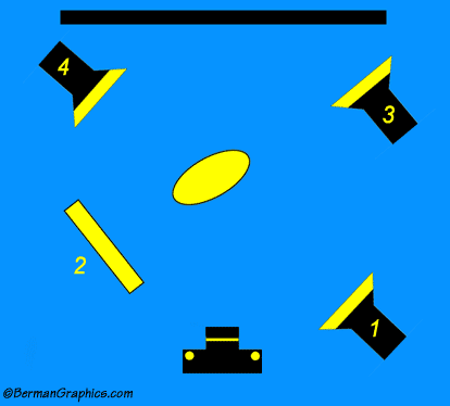
Here's a modification of a diagram I came across on the internet.

Light #1 is the main light at 45 degree angle to the subject
Reflector is #2 which can easily be replaced with a second light
The ratio of light from #1 and #2 should be different. Light #1 should be the main light and be more powerful. The reflector should be the fill for a more pleasing portrait. That's why the professional studio flash power packs allow independent incremental settings for all attached heads. I'd suggest starting with ratios of 1:2 or 1:3 and see what strikes you. But never balance them so the light on both sides of the face is equal. That makes for boring pictures.
Light #3 is pointed at the background. It's more preferable to let the background be uniformly wrinkled for a more natural and pleasing portrait.
Light #4 is a hair light or rim light. it separates the hair from the background making the portrait look more natural and life like. The rim light should be elevated to look down on the hair. You don't want to do the entire head, just the edge that meets the background in camera.
All of this is open to personal interpretation and artist judgements but it'll give people a starting point when considering where to place the lights.--Larry Berman
http://BermanGraphics.com
")
