Opinions Please!!!!!!!!!!

either version is good onscreen - though I tend to favor #2. If you were to get them printed, I think #1 would look too dark and underexposed in the shadow areas.
--
-Jerry
Sony V1 and H5 - Still learning...

'The camera is an instrument that teaches people how to see without a camera.'
-- Dorothea Lange

http://www.pbase.com/icicle50/root
 
First of all, congratulations on the shot.

I have enjoyed reading the other replies and getting educated as I examined the picture in their light.

The only definite and immediate problem I saw was the colour of the bird's head in the second one. It seemed to be glowing a bit.
I'd be interested what the head of such a bird wold look like in full light.

I would like that in order to moderate my comment. But first sight, I would pull back very slightly on the lightening of the head.

Best wishes

Glyn
 
In my book, it all depends on where you want to go with it. There are a lot of groups on Flickr devoted to Photoshop processed images & much of the work is absolutely amazing. But it only works if it works for you. It's gotta be fun!

I started with Elements, then got a used copy of PS 5.0 & just kept upgrading thru 7.0 to CS2. I love it, man. As much as shooting with the R1 & you know how much I love that.

Take care, buddy. Your birds are always a pleasure to view.

jp
--
http://www.flickr.com/photos/inframan
 
Thanks Rich, I'm still working my way through both Software programs trying different features and didn't notice what you showed me.
Dave
 
Hi George. You know I also noticed what you saw when I uploaded the shots here. When I was looking at them on my full screen I didn't notice it? The detail out of the camera was what blew me away as I don't seem to notice that much. Thanks for your reply.
Dave
 
Thanks JP & everyone else for your comments. Sorry I'm just getting back to your replys but I never could get connected to the STF last night :-(. I've learned a great deal just from what you all have said and also understand everyone see's things different. I liked #2 better at first but looking at it more I'm not so sure. I have a lot to learn on the use of an Edit program.
JP, nice to see you back at Home.
Thanks, Dave
 
Not to sharp for me, very nice.

I would have, personally, brought up the lighter parts the way you did, and left the shadows darker though.

I like the PSP XI one step, but it usually brightens my shadows a little too much, thinking I'm guessing that shadows are usually mistakes.

Very nice shot though!

dave
--
Amazing what we can do with just three crayons, red green and blue!
http://diamondmultimediagroup.com
 
I agree with Gary, #3 is the best. #3 is half-way between #1 and #2. #3 was created the old fashioned way (I don't trust automatic one-step editing buttons). I would simply adjust the shadows to bring them up a bit, but not as much as in #2. I would apply a tiny bit of USM, but not as much as in #2. I would use my PTlens plug-in to remove the green CA on the tree. Or I might crop it to remove the tree on the left (where the CA is slightly visible)? Hmmm...

--
Charlie Davis
Nikon 5700 & Sony R1
CATS #25
PAS Scribe @ http://www.here-ugo.com/PAS_List.htm
HomePage: http://www.1derful.info
'I brake for pixels...'
 
You won't see what I showed you using "one step fix". Try "Smart photo fix" and select "advanced", you will be able to adjust all the settings including white balance....
--
Rich
Young Harris, GA
 
I like then both but for overall greatness.........the scond one for me .
Excellent detail. please tell me you were using a tripod!
Kenny S.
 
The second shot is more like how I would present the photo, so I think it is the better of the two. The histogram still shows some lack of blacks, and I think you can get away with a little more contrast in curves. It is plenty sharp, and not too sharp - I had a hard time finding anything I could say 100% were sharpening halos. I can see why people might call over-sharpening though, especially if they don't take a lot of bird shots; those breast feathers can look oversharpened right out of the camera. In fact, I usually mask the breast to a lower sharpening level, to keep the highlights in control. A "darken" sharpening layer might help control that too.

I agree about cropping off the branch to the left, the overall composition would be improved. Great shot, all of my woodpeckers fly away when I get on the same BLOCK that they are on.

Erik.
 
Sorry about getting back to you late. Had an artist's reception yesterday evening for a show. And the evening before had to prep and print 2 images for our annual juried photoclub contest. Been busy busy busy.

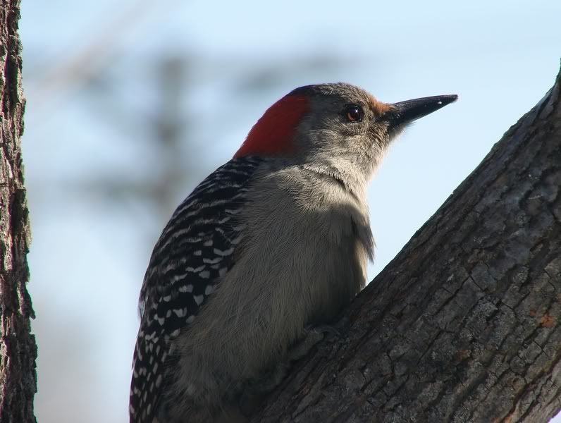
When I first opened your thread, I began by reading your account of the shot and the post processing. The image of the woodpecker was visible in the bottom half of my screen. My very first impressions were...
  • What an excellent portrait of a bird. Not the boring old shot you often come across, taken in direct sunlight, from a poor angle, with no special attributes other than it was in focus. Kinda like if a person had taken a picture of an ordinary stop sign out their car window.
  • Instead, I was treated to the amazing image of your Red-bellied Woodpecker, taking a moment out of its day to ponder the rest of the afternoon. The wonderful angle of the light, with the bird looking off into it, creates a special mood ordinarily reserved for professional portrait photography of human beings. What a moment captured. It's what makes the photo.
  • I also immediately noted that the exposure, color and contrast were spot on. And that the post processing that you described was Exactly how I would have handled it. Exactly.
  • And the last of the first impressions was that I had better finally order that DH1758. What a sterling example of that lens.


Then I scrolled down.

And the photograph that I described above simply vanished into the ether.

The picture grew flat. The drama was gone. The color became radioactive (especially in the red head, the iris of the eye, and the bark on the tree on the left). And moreover the body feathers grew that synthetic "hatched" look typical of oversharpening.


Sharpening is probably one of the hardest aspects of post processing for the novice to get right. I look back at some of my first images and see it all over the place. It's just too easy to try to make up for other shortcomings in technique or equipment by sliding that Sharpening slider a bit further right. As you develop a more discerning eye, you'll be able to look back at your own early PP technique and spot the obvious flaws. I do with mine all the time.

One thing to keep in mind when sharpening is that not all parts of the subject need be perfectly sharp. Sometimes even, having only one point in perfect focus is entirely sufficient for that photo (in portraits, it's often just the eyes). In fact, the term "Focal Point" is used to describe that very concept.

So to my eye, having the head and shoulders of the bird sharp and in perfect focus is all my eye needs to see (to know that the rest of the bird in shadow is also very sharp). I simply do not need to see the bird in its entirety for my mind to complete the picture.

Now if you were shooting this photo for a textbook, you might want to lighten the image as you did, to make all details clear. That's why many images in textbooks to this day are often still done in pen or pencil, because the inherently variable factor of lighting is removed. But for pure aesthetics, I think that the dramatic lighting is key to the great success of this image.

If you do want to tweak your original, I wouldn't suggest removing the tree on the left (it frames the bird nicely), but rather set your "Burning-in" tool to about 5% opacity (Mid-Tones), and run it over the tree to tone it down some.

That would be my choice.

However, the others are correct in saying that whatever manipulations you perform should be your own decision, whether in-camera, or in post. Going forward with what your own Eye tells you, is what gives your own photography its uniqueness. I personally really love your original shot. Other opinions may differ. That is entirely OK.

Hope I've given you a bit of food for thought.
R2

--
*
You are free to offer critique of any of my images.
Editing and reposting them on this forum is permitted, and even encouraged.

http://www.pbase.com/jekyll_and_hyde/galleries
 
Dave my friend,

both nice but imho maybe a bit to much ... maybe a slightly lighter touch would have been enough.

i personaly would have done some work on the colour temp and fill light in PP.

cheers Marti ( check ur e-mail )
--
  • living in harmony with nature and other people ...will create an better world for all * marti58 -2006
Sony DSC H1 Nikon F90 F80 F50 Nikon D80 Canon A95 Samsung GX L
http://www.flickr.com/photos/marti58/
 
First I want to thank each and everyone of you for the replys and tips. I think many are right that maybe something between #1 & #2 would look just right. I also agree with R2 on the Mood of the original straight out of the camera. As I looked at the shot more I felt the same way that she was looking forward to what lies ahead and really feel I made a mistake trying to bring more red out of her head. With my lack of expertise with PP programs I try to get my exposures dead on as much as I can although I never seem to, lol. This thread has been a great learning experience for me and this is what makes the STF so great.
Marti, got your e-mail and I like it....Very Much. Thanks.
Thank you all for your contributions.
Dave
 

Keyboard shortcuts

Back
Top