Ed Leys20479
Veteran Member
Autumn chaparral

Webster's says that "chaparral" is "a community comprising shrubby plants widely distributed in Southern California that are especially adapted to dry sunny summers and moist winters."
I say, "Close but no cigar, Webster." I'm here to tell you that we got it in Northern California, too...
Notes:
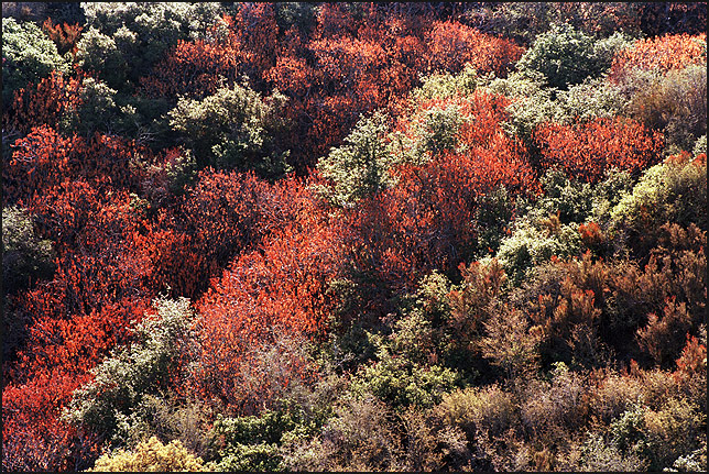
Webster's says that "chaparral" is "a community comprising shrubby plants widely distributed in Southern California that are especially adapted to dry sunny summers and moist winters."
I say, "Close but no cigar, Webster." I'm here to tell you that we got it in Northern California, too...
Notes:
- Yep, I'm still working off of photographs I took a week ago Saturday. More will be rolling out in time. Stay tuned.
- This photograph has real high-frequency intensity and color changes. When you start shoving that stuff into a small pixel mapping, it starts to look just a bit impressionistic. Also, the high-frequency changes can cause big jpegs. I cut my typical jpeg quality down a bit for this one, and it still made a file larger than my normal. (Looks pretty much the same as my uncompressed PhotoShop version of this, though. That's something I pay attention to.)
- This was my first attempt at scanning color negative film - you've been seeing my slides, you've been seeing my digital. Who knows what the future holds...
")