proudfather
Veteran Member
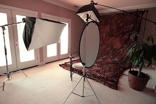
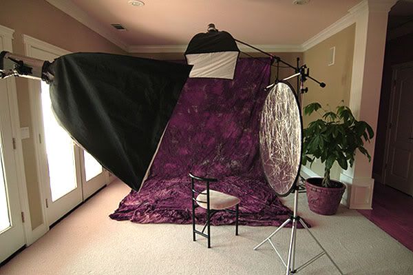
This is a colleague of mine I shot for a professional brochure. This is not the final image used. But I thought I'd seek the opinions of others for my own sake. One thing that I notice, which isn't too significant I imagine, is the displaced margin of his right facial line due to the lens of the glasses. I don't get the opportunity of shooting a lot of people with glasses; and I was emphasizing lens flare, or rather lack there of, throughout the shoot. The softbox is a 30x48 positioned horizontally and to the camera left, almost parallel to his face [see setup below] with a reflector for fill.
-proudfather


-proudfather