In RawTherapee and other Editors it is possible to change the said Profile.
I compared the standard sRGB to one randomly selected from RT's list
sRGB:

Random:
Then I opened these two in ColorThink along with ColorThink's 'Demo' sRGB:
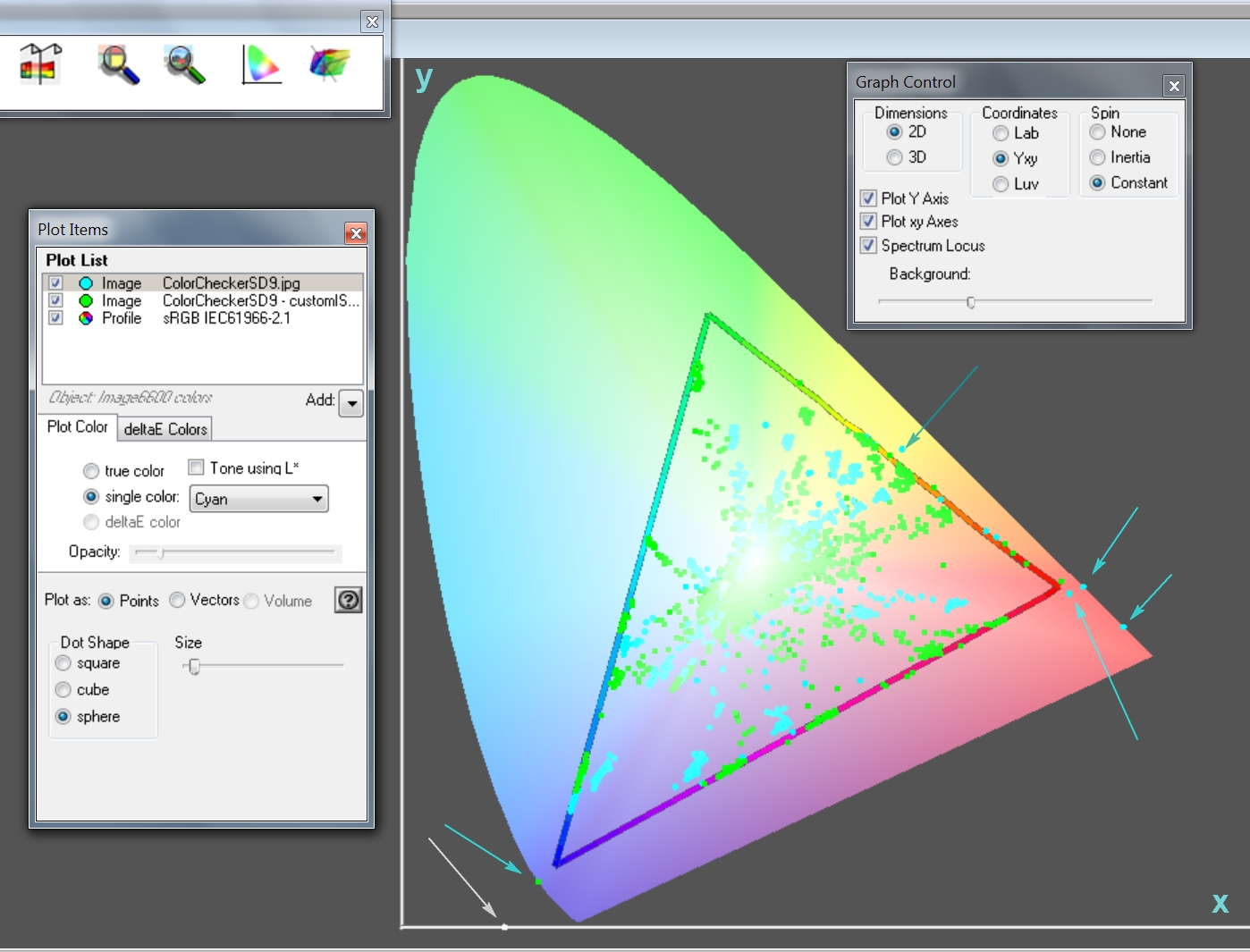
The Cyan dots are from the Standard sRGB input profile - observe that there are five colors well outside of the sRGB triangle. Observe also that the 'random' profile green dots are all inside the triangle but do notice that many are bang up against the sides of the triangle - indicating the dreaded gamut or saturation-clipping.
And, finally, the white rogue dot that appears at the bottom on the x-axis is perhaps due to a bad pixel or two on the sensor or perhaps not.
I believe that a) just sticking with whatever profile your system embeds automatically is not necessarily a Good Thing and that b) pedants are repaid by going much deeper than "how it looks on the monitor or in the print".
ColorThink ... don't go home without it ...
I compared the standard sRGB to one randomly selected from RT's list
sRGB:
Random:
Then I opened these two in ColorThink along with ColorThink's 'Demo' sRGB:
The Cyan dots are from the Standard sRGB input profile - observe that there are five colors well outside of the sRGB triangle. Observe also that the 'random' profile green dots are all inside the triangle but do notice that many are bang up against the sides of the triangle - indicating the dreaded gamut or saturation-clipping.
And, finally, the white rogue dot that appears at the bottom on the x-axis is perhaps due to a bad pixel or two on the sensor or perhaps not.
I believe that a) just sticking with whatever profile your system embeds automatically is not necessarily a Good Thing and that b) pedants are repaid by going much deeper than "how it looks on the monitor or in the print".
ColorThink ... don't go home without it ...
Last edited:
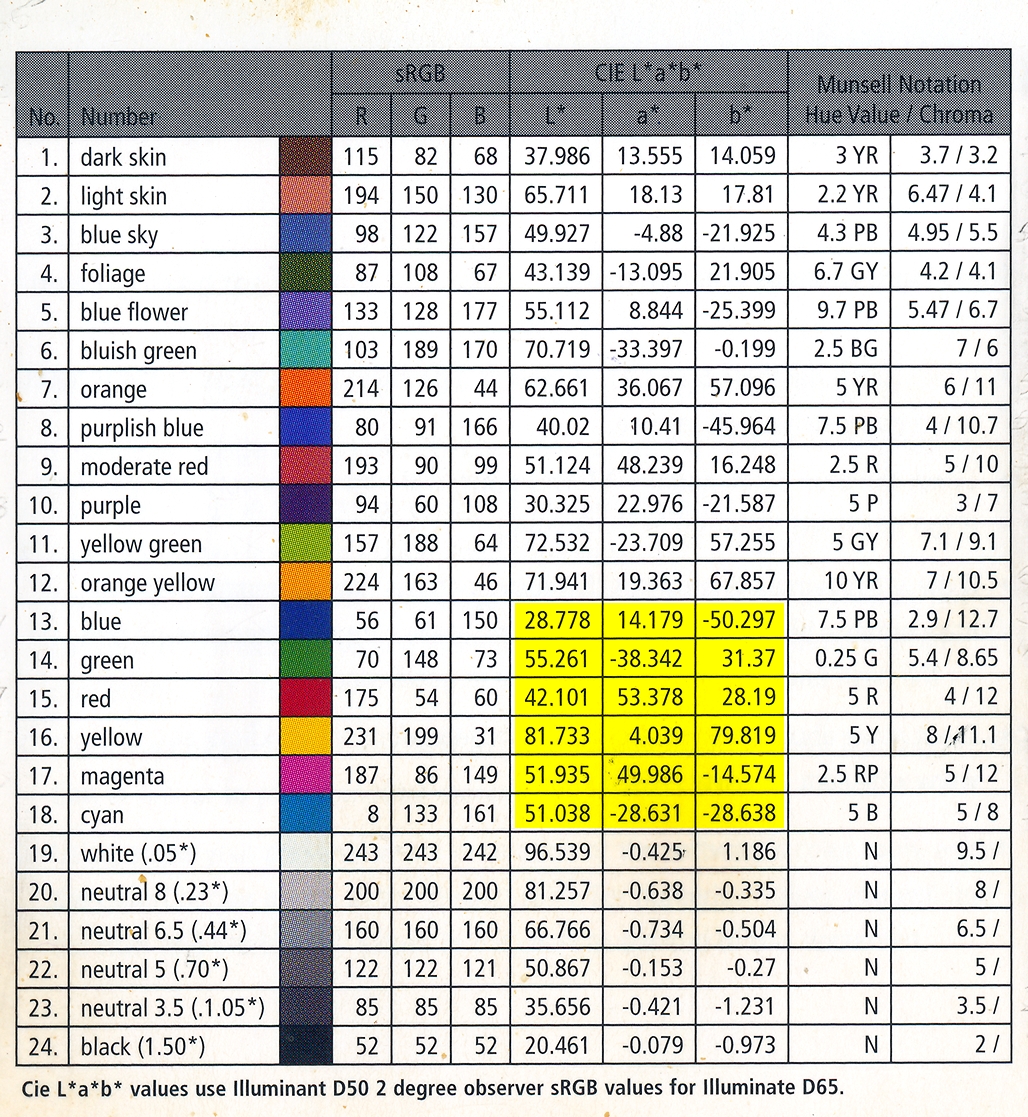
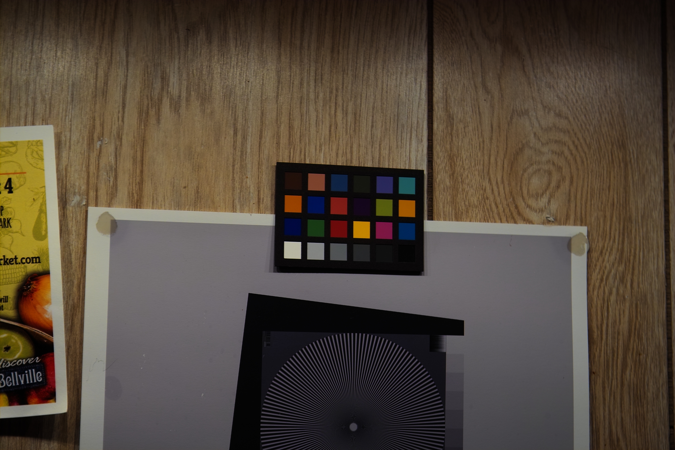


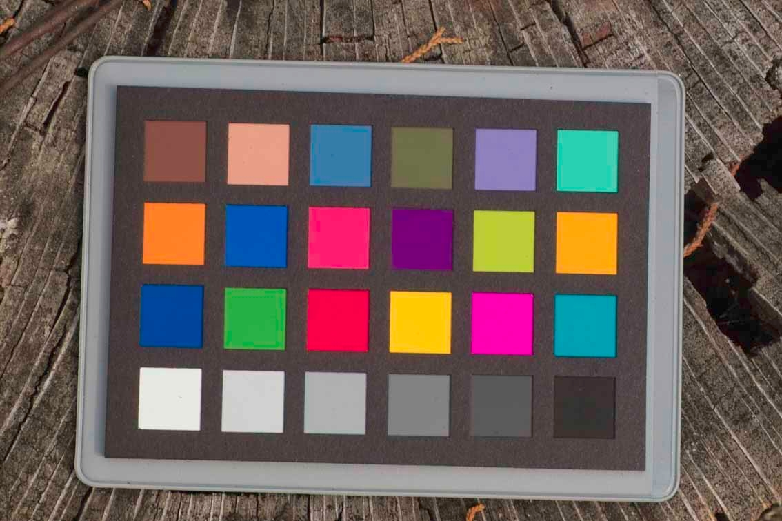
") ) shoot something which has a known color or colors. By "known", that something is an artifact which has a published value. The published value should be given for a certain lighting e.g. daylight, warm light, cool light, da-di-daa ...
) shoot something which has a known color or colors. By "known", that something is an artifact which has a published value. The published value should be given for a certain lighting e.g. daylight, warm light, cool light, da-di-daa ...